Build a Desktop Menu with Min Height and Max Height
Creating an intricate web design isn't as daunting as it seems. With Framer, you can unlock a variety of desktop navigations and utilize viewport units within the Min and Max height properties. These connections facilitate a smoother workflow, allowing you to set up stunning designs effortlessly.
Jumping into Action
To vividly illustrate this concept, let's walk through developing a desktop navigation from scratch. Take an everyday top-bar, featuring a logo and a button. Through Framer, we can convert this basic model into a component, forming the backbone of our desktop navigation.
Crafting Component Variants
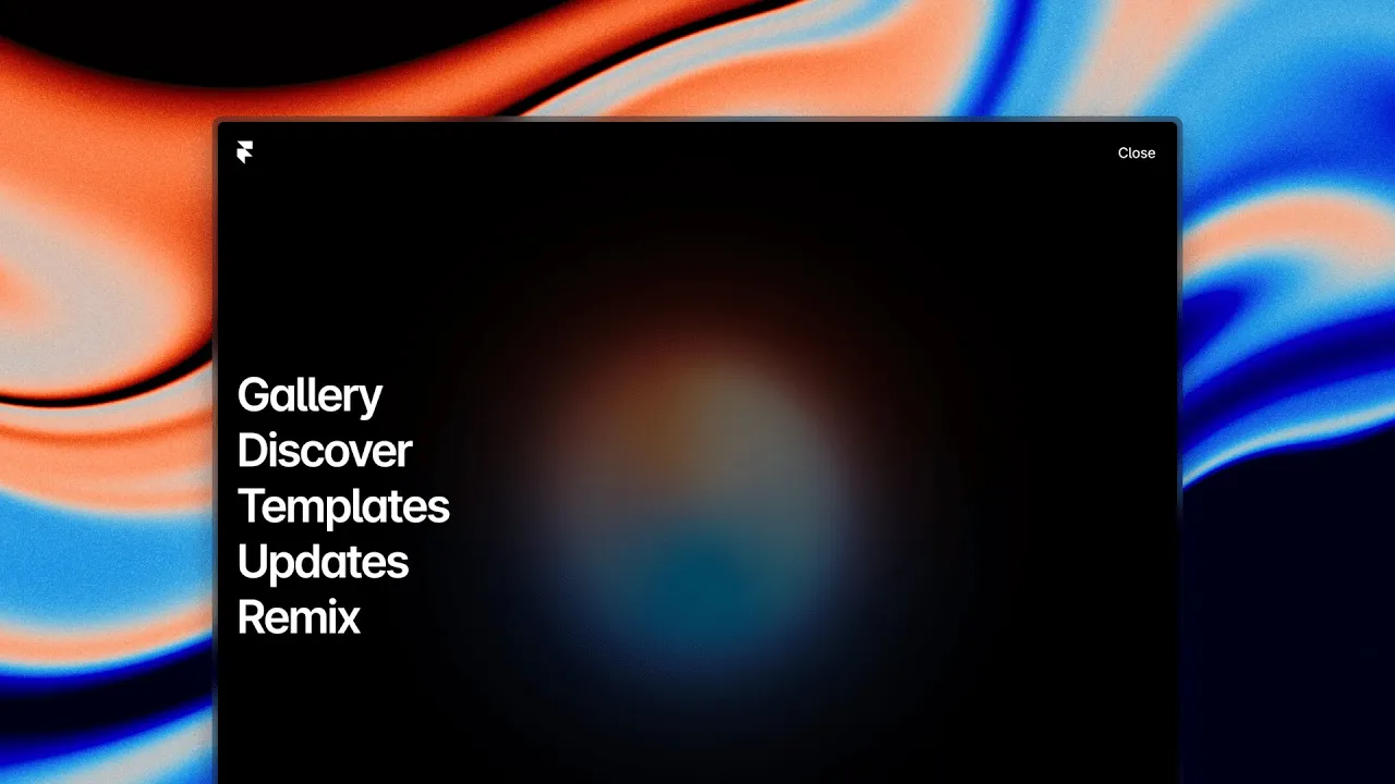
Two variants are constructed- the 'open' (or expanded navigation) variant and the 'closed' one. The 'open' variant captures the expanded navigation state, while the 'closed' variant denotes the initial state of the top bar. To adapt these features to your design seamlessly, you ought to name your variants appropriately. Doing so gives you less hassle as you apply the design across different layouts, and allows your design to become responsive based on viewport height.
Interactions and Adding Links
Framer isn’t just about static designs. Interactive elements bring user interfaces to life. By turning the layer labels in each variant into clickable links, we optimize our design for navigation, leading users seamlessly between the two states using Framer's interaction feature.
Next on the agenda is enriching your menu. You can add links to a text layer. Ensure to give each navigation item a distinctive and intuitive label. This quick tip goes a long way in promoting an effortless user experience.
Optimizing Height Properties
A critical objective is to ensure that the component animates from its 'closed' state of 64 pixels to an 'open' state that spans the viewport, when the links are set to fill. Applying the "Min height" property to the links and switching them to viewport ensures that they occupy the entirety of the viewport. This results in a smooth transition from a 'closed' state to an entirely filled viewport.
Finalizing your Design
With the basics in place, it’s time for refining.
Set the initial variant to the 'closed' variant.
To keep your navigation at the top of the viewport regardless of scrolling, set the position type to 'fixed'.
To facilitate the animation of the height, set the 'height' property to 'auto'.
These adjustments enable your menu navigation to animate successfully from 64 pixels to fill the entirety of the viewport. It's highly advised to experiment with your transition settings, to attain an animation speed that feels natural to your design. Consider elements like stiffness and damping to promote fluidity in your work.
Think about the aesthetics of your navigation too — adjusting the alpha of the background allows you to modulate the transparency, permitting the underlying design elements to subtly shine through. This adds a sophisticated layer of complexity and depth to the user interface.
But remember, this is only scratching the surface of what can be accomplished with Framer. Consider exploring and adding custom appearances, hover variants, and much more to take your design to the next strata. In the realm of Framer, the only limit is your imagination.


