About 3D Service carousel
Description
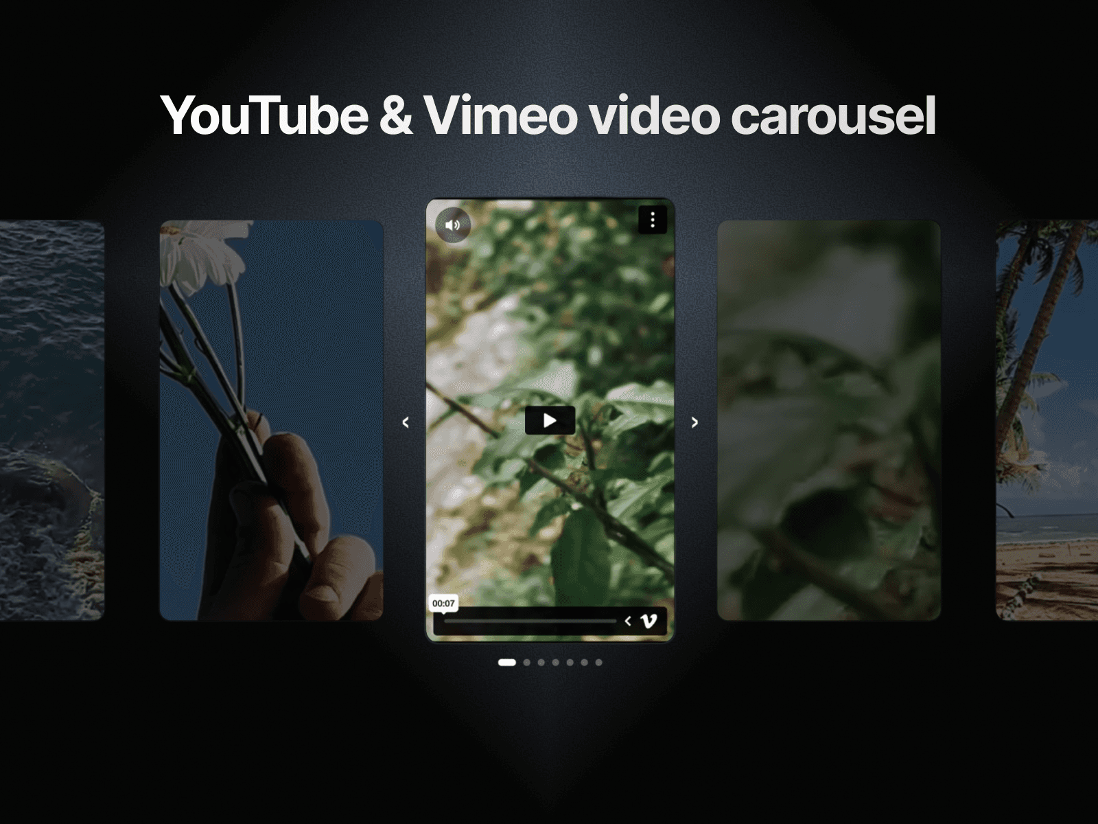
3D Service Carousel is a fully interactive, code-powered component that displays your service cards in a dynamic 3D perspective layout. The active card sits front and center at full scale, while the previous and next cards flank it at depth with a natural perspective tilt, creating a carousel with real visual weight. Navigate through up to 8 service cards using left and right arrow buttons or the dot indicators below.
Each card supports a background image, badge label (e.g. "Popular", "Premium"), service title, short description, and a "Learn More" CTA link. All text, images, links, and colors are fully editable through Framer's property controls, no code knowledge required.
What's included:
3D perspective card layout with depth-offset side cards
Arrow navigation (left and right)
Dot indicator navigation with active state
Up to 8 fully customizable service cards
Per-card: background image, badge, title, description, CTA text and link, accent color
Smooth transition animations between cards
Hover effects on cards and interactive elements
Responsive behavior: flat layout on mobile
Clean, dark-themed default styling that adapts easily to any brand
Built for agency sites, SaaS landing pages, and portfolio websites where showcasing multiple services with visual impact matters.