About Aisol Before/After
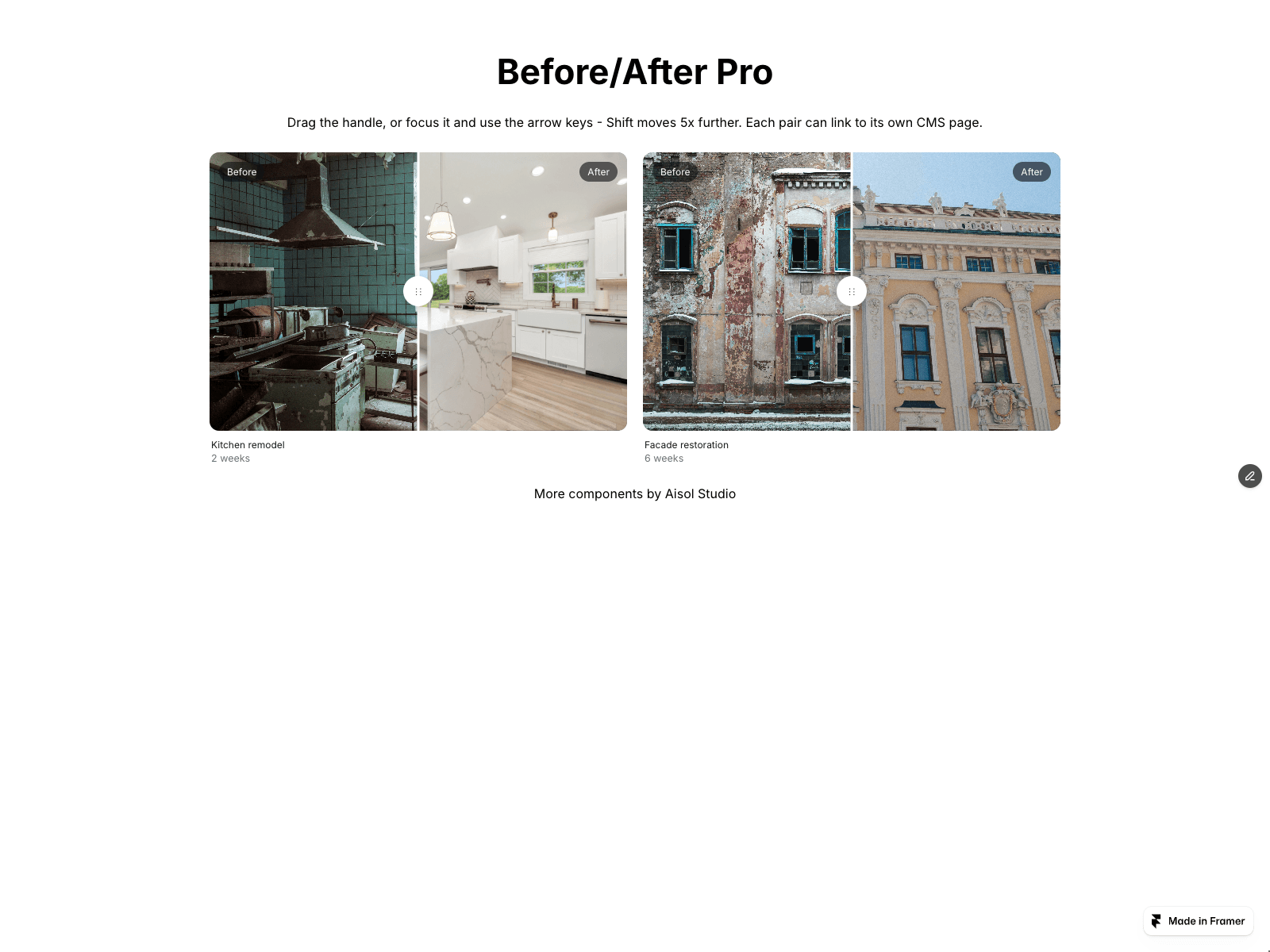
Aisol Before/After shows one or more before/after image pairs, each with a draggable divider. Pick a horizontal or vertical split.
The handle is a real slider (role="slider" with aria-valuenow, aria-valuetext such as "55% Before, 45% After", and a name you set). Tab to it, then use the arrow keys (1% per press by default), Shift + arrow or Page Up/Down for 10x steps, and Home/End to jump to either end.
Drag the handle, or click anywhere on the image to jump there. The handle follows the pointer even outside the image. On touch screens, a sideways swipe on the image moves the divider and a vertical swipe scrolls the page. The handle has a 44 px touch target.
- Pairs list: before and after images, title, caption and a CMS Link for each pair
- Before image / After image controls that accept CMS image fields, plus alt text controls
- Responsive 1 to 4 columns, based on the component's own width
- Before/After labels, divider width and colour, handle icon and shadow, radius, aspect ratio
- A single demo nudge on load, which stops as soon as someone touches the slider and is skipped with reduced motion
- Snap to 50% when released near the middle
- No layout shift while the divider moves, and no horizontal overflow at 390 px
- Listens only on its own elements, with no window or document listeners
- The Framer canvas renders a still preview with no timers or observers