About Animated List
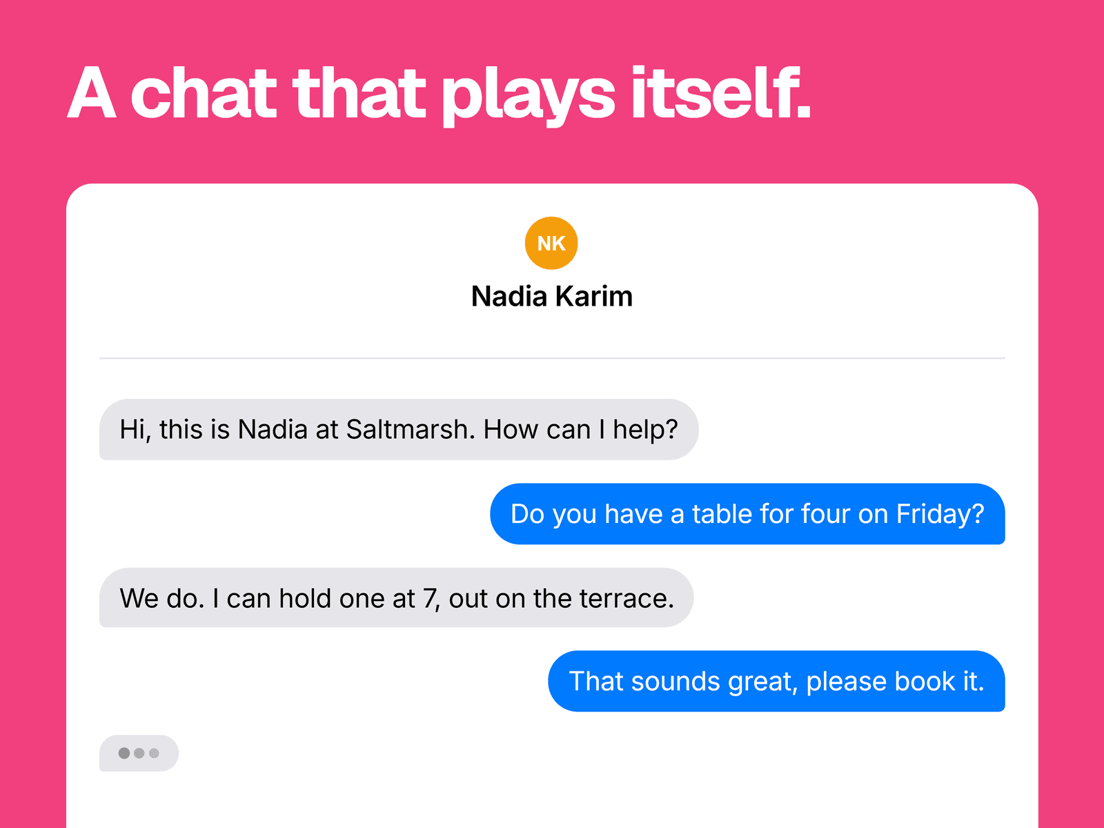
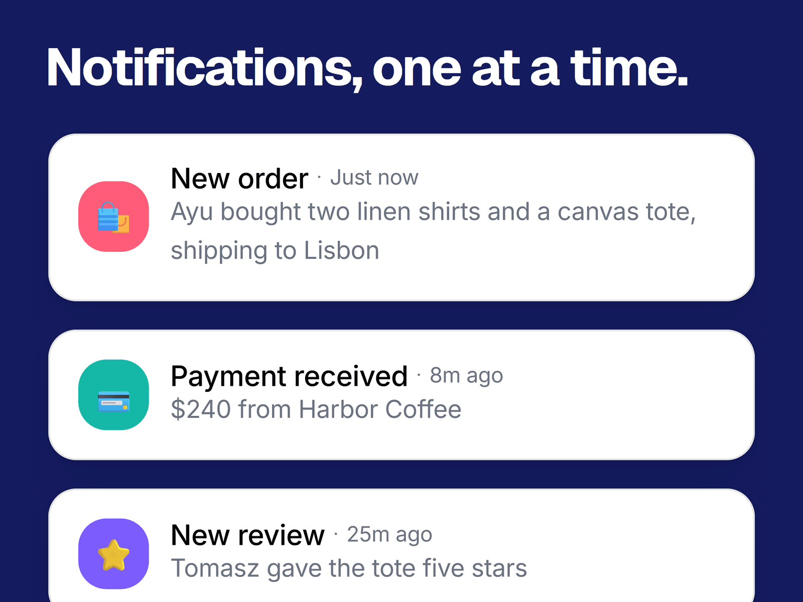
A stack of notification cards that arrive one at a time. Each new card springs in at the top and pushes the others down, so the list looks like a live feed.
What you can change
Every card: name, description, time label, an emoji or character for the icon, and the icon's background color.
The delay between cards, from 100 ms to 5 seconds, and whether the list plays once or loops.
Card, border, text and secondary text colors, with separate fonts for the name, description and time.
The screen width where it switches to smaller cards, icons and spacing.
An optional fade along the bottom of the frame, in a color you pick.
Where it fits
Product pages that need to show activity, such as alerts, orders, signups or messages, in a hero or a feature section.
Good to know
The cards are the ones you enter. It doesn't connect to a data source.
Cards stop growing at 400 px wide, or 320 px on small screens, and sit centered in the frame. The frame clips anything that doesn't fit, so set its height to the number of cards you want seen.
Cards grow slightly on hover, but they don't link anywhere.
It starts when the page loads, not when it scrolls into view.