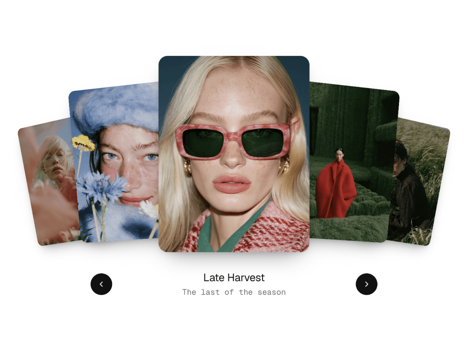
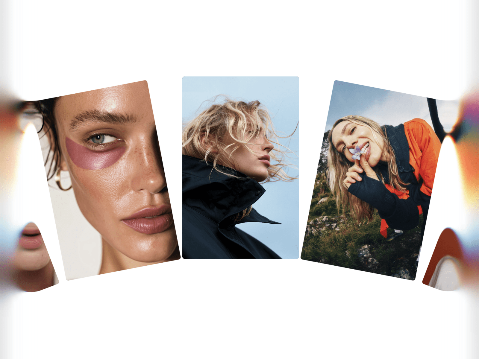
About BeforeAfterImage
✨ Features
🖱️ Two interaction modes
Drag — visitors grab the handle and pull to compare
Hover — the divider follows the cursor for instant feedback (auto-falls-back to drag on touch devices)
↔️ Five reveal directions
Left → Right, Right → Left, Top → Bottom, Bottom → Top
Plus a radial reveal that opens from the center outward
🎨 Fully styled to your brand
Native Framer typography controls for all text (font family, weight, size, color, letter-spacing)
Custom colors for handle fill, handle border, and divider
Five built-in handle icons (arrows, dots, lines) plus the option to upload your own
Adjustable handle size, divider thickness, corner radius, and label placement
📱 Mobile-ready out of the box
Larger handle target on touch devices for easier tapping
Optional swipe hint that disappears after the first interaction
Separate text for horizontal vs. vertical reveals
Smart gesture detection prevents conflicts with page scrolling
⚡ Polished by default
Spring-based animation for natural-feeling movement
Backdrop-blurred labels that read clearly on any image
Sensible defaults that look great immediately — no setup required
Use cases
Designer portfolios · Photo retouching showcases · Web redesign comparisons · Interior design before/after · Skincare and beauty results · Real estate staging · Product configurators · Restoration projects · Map and satellite comparisons
🚀 Getting started
Drop the component onto your canvas, swap in your before and after images, and adjust the size to match your layout. Everything else is optional — the defaults are tuned to look professional from the first render.