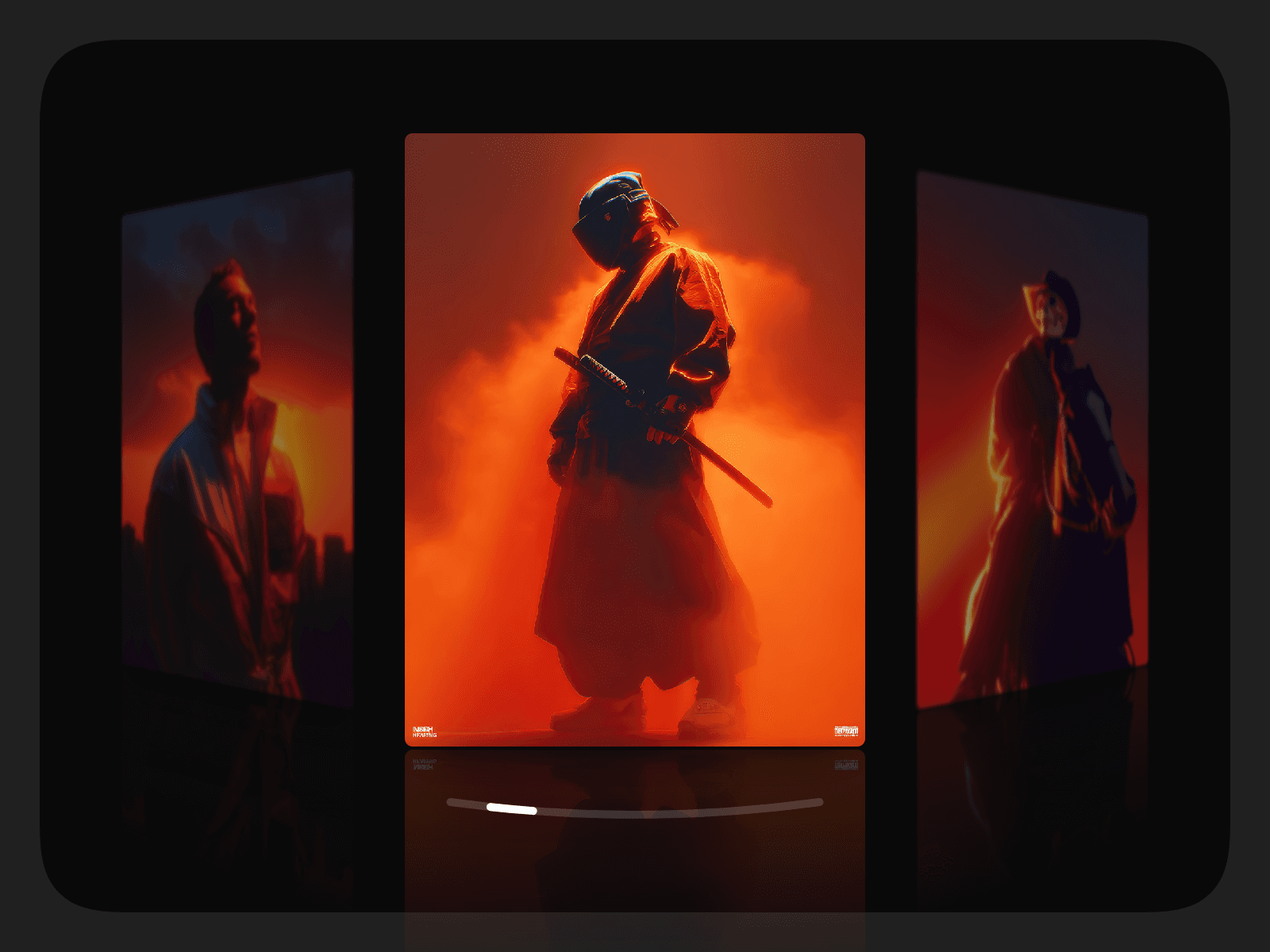
About Blur Vignette
Perfect for hero sections, media-heavy layouts, and cinematic compositions.
With full control over shape, edges, colour, and intensity, Blur Vignette adapts effortlessly to both minimal and expressive designs.
Demo
Features
Blur-based vignette overlay using backdrop blur
Works seamlessly over images, videos, and layouts
Supports ellipse, circle, and rectangle vignette shapes
Independent edge control for rectangular vignettes
Adjustable inset and smooth falloff for precise control
Colour and intensity controlsare compatible with all CSS colour formats
Lightweight and visually subtle—enhances focus without distraction
Customisations
Shape selection: ellipse, circle, or rectangle
Per-edge toggles for rectangle vignettes (top, right, bottom, left)
Blur strength
Inset distance
Transition smoothness (falloff softness)
Vignette color
Vignette intensity
Usage
Place Blur Vignette on top of an image, video, or layout inside a Frame or Stack.
Set the component to fill the parent (pin it to all sides), so it fully covers the content.
Select a vignette shape and adjust the blur, inset, and smoothness to define the desired effect.
Experiment with the properties to achieve the desired look.
That's it!