About Corner Button
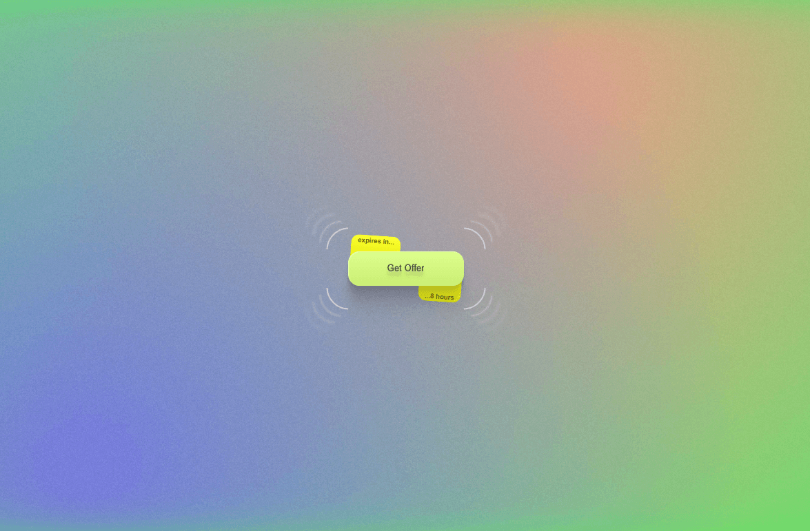
Corner Button is a clean, minimal button component with elegant L-shaped corner accents on all four edges. When you hover over this button, something awesome happens - the corner accents animate and the button comes alive with a smooth transition that instantly elevates any design. Features two variants - Default (transparent) and Hover (subtle white fill) - with "Discover" as the default label using Poppins Regular. Perfect for dark backgrounds, hero sections, and premium landing pages.