About Expand Cards
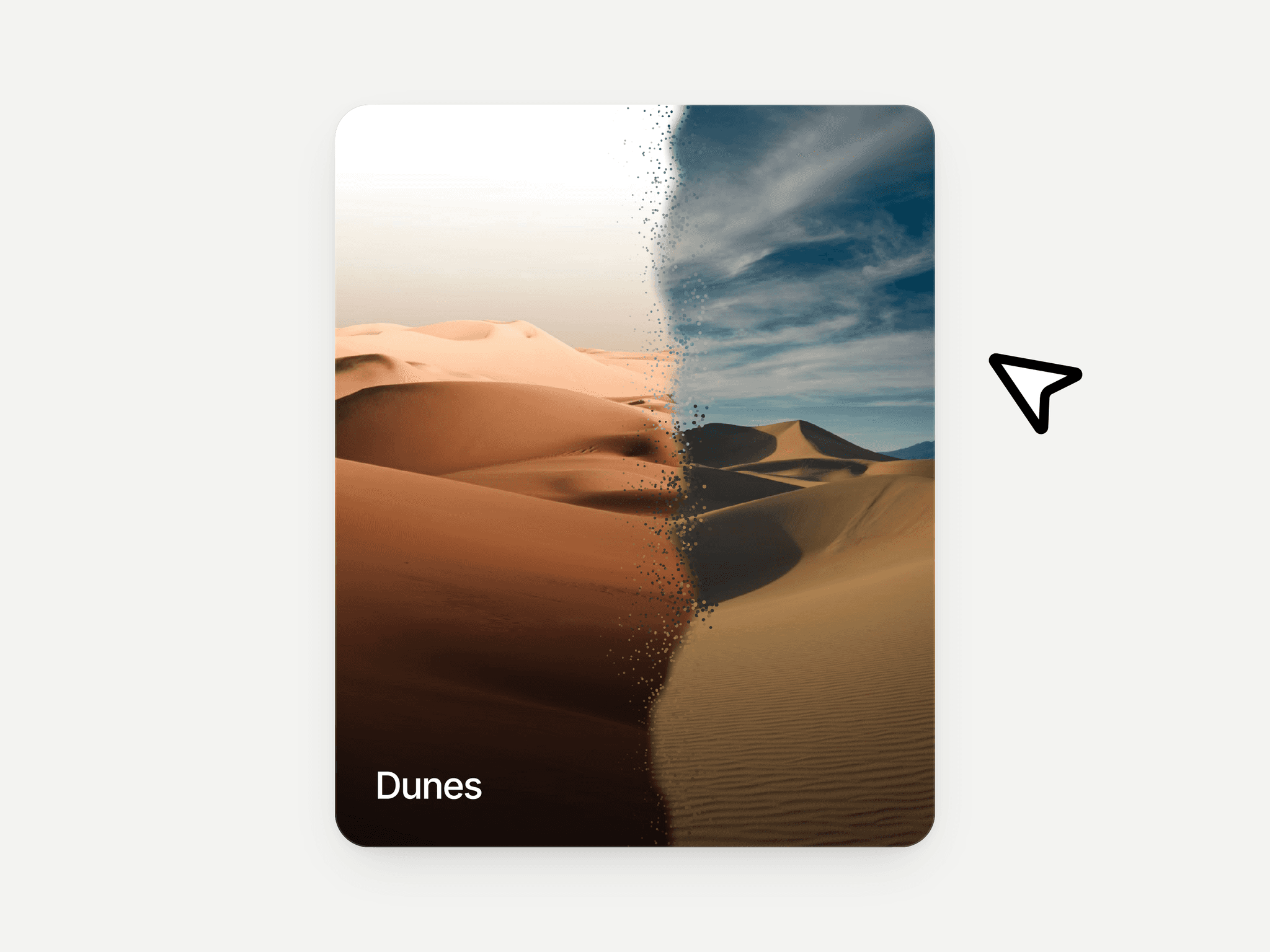
Expand Cards turns a row of images into an interactive, cinematic showcase. One card sits wide and active while the rest collapse into slim vertical columns — hover or click any collapsed card and it smoothly expands while the others fold back down.
Every visual detail is a property control, so you can restyle it completely without touching code: font, size, weight, line-height, letter-spacing, and color for the title, subtitle, badge, and label — each fully independent. Add up to 6 cards, drop in your own images, and optionally link each card to a URL.
Fully responsive: on narrow frames, the layout automatically switches from side-by-side panels to a vertical accordion stack, so it looks right on both desktop and mobile.
Features:
Smooth hover or click-to-expand animation, 7 easing curves
Up to 6 fully customizable cards (image, title, subtitle, badge, link)
Independent typography controls per text element
Automatic mobile stacking — no separate breakpoint variant needed
Zero code required — every value is a property control
Great for: course platforms, portfolios, team/instructor pages, product category selectors, and editorial feature sections.