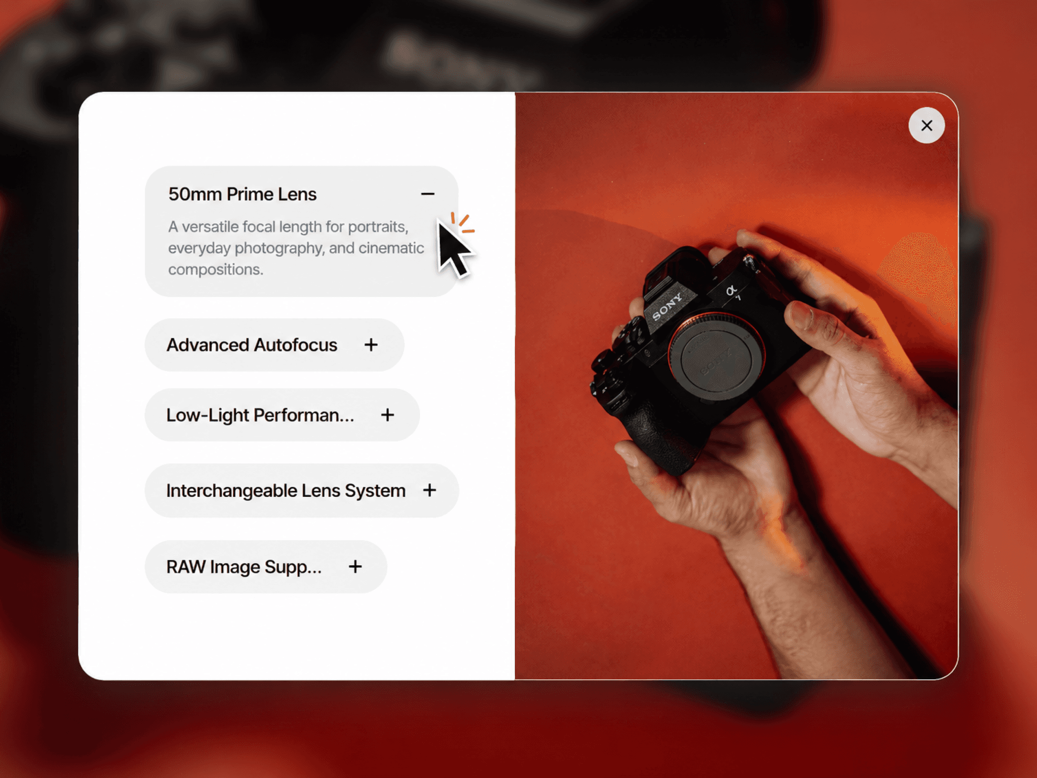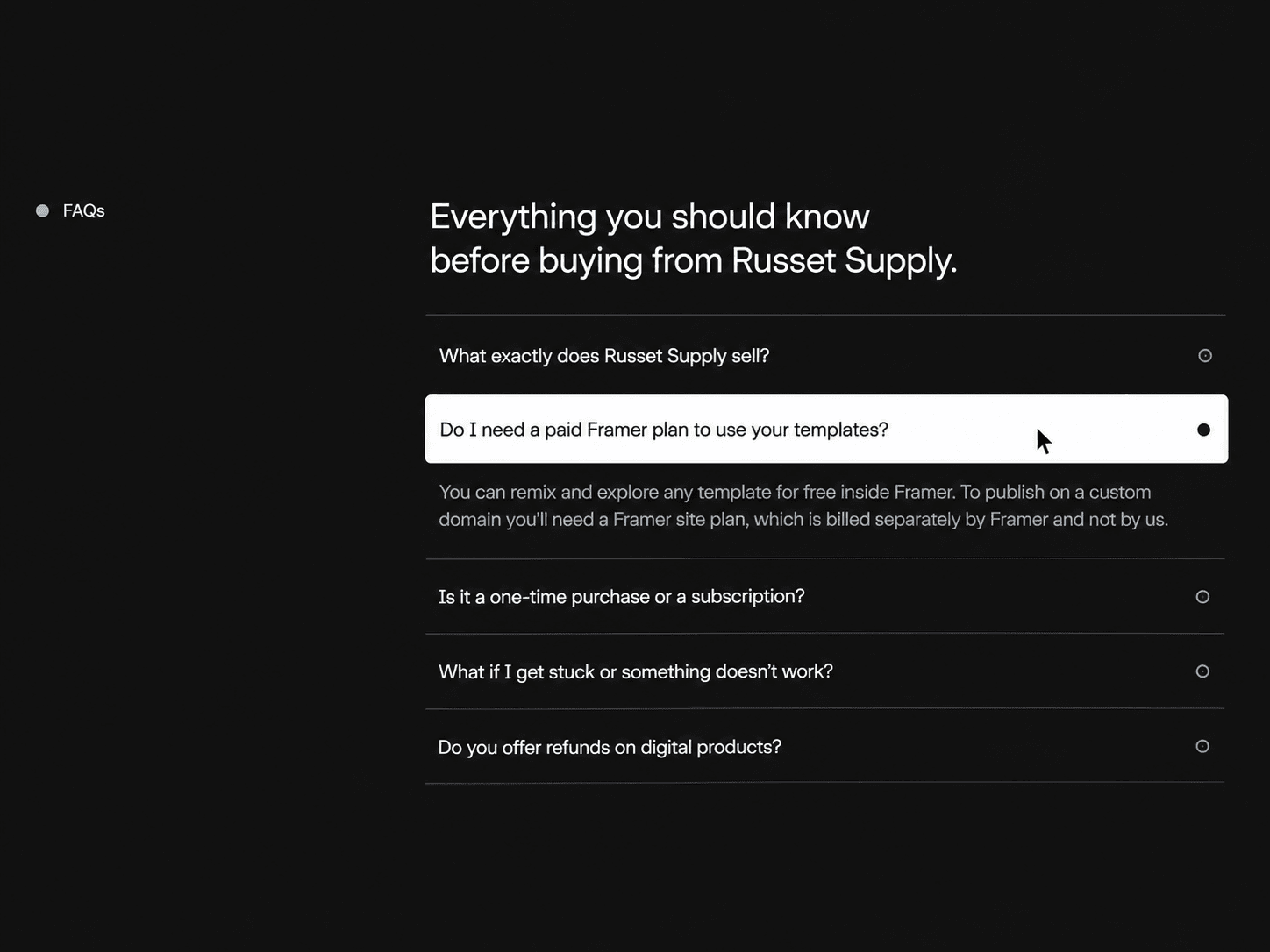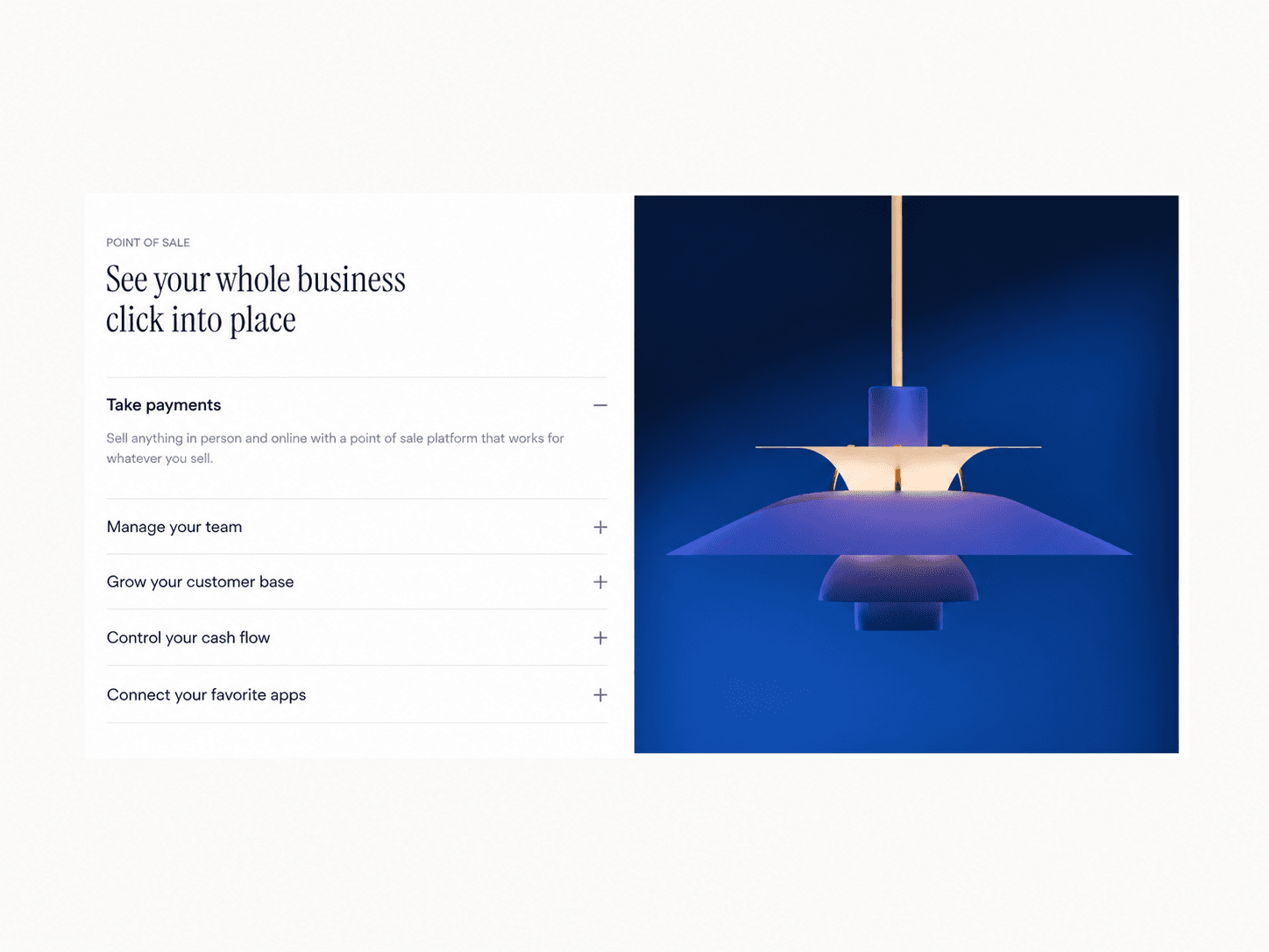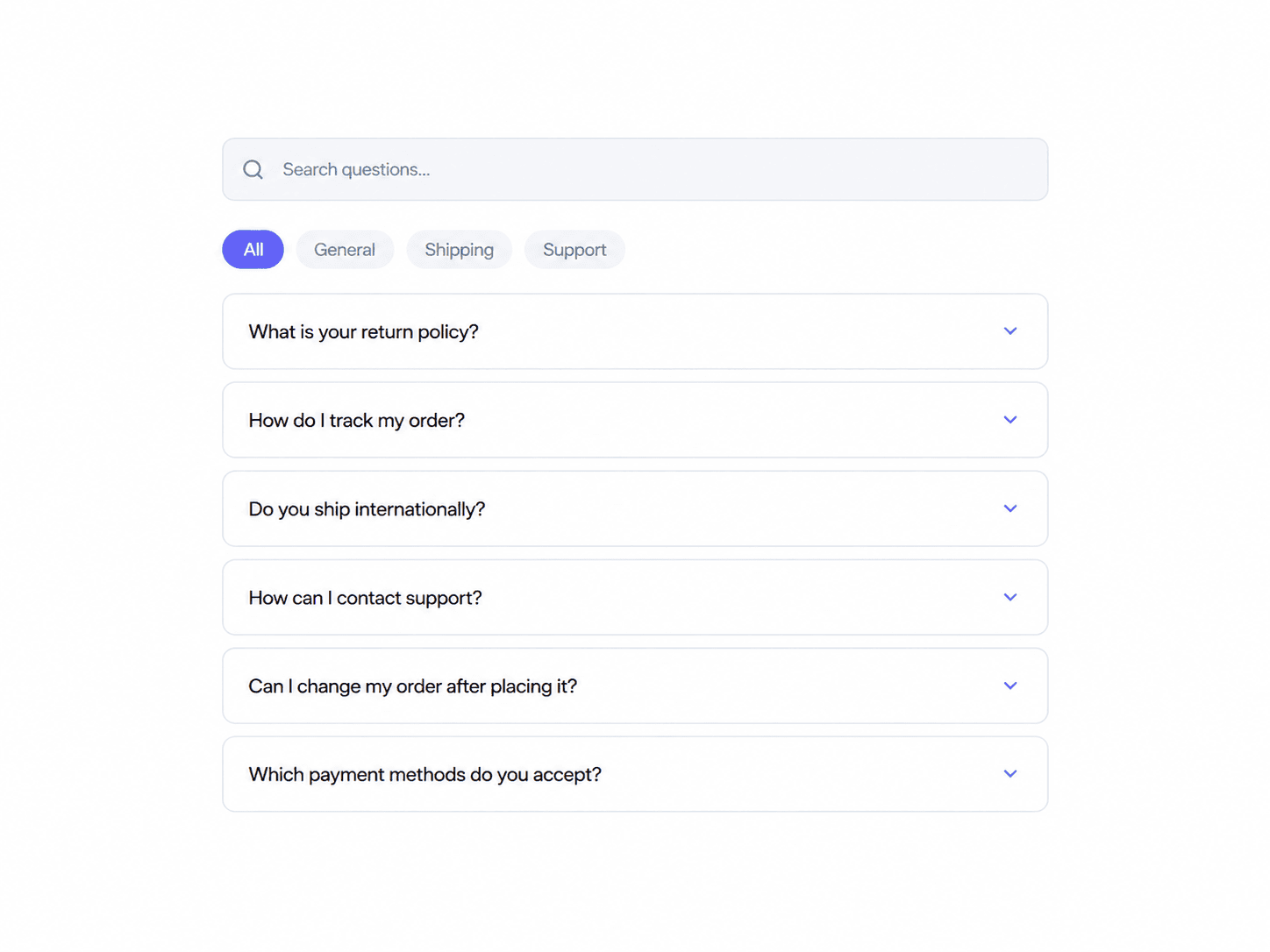
About Expanding Panels
Stacking Cards – Scroll-Driven 3D Card Stack
Stacking Cards is an interactive Framer component for presenting services, projects, features, or other content through a scroll-driven card stack.
Interactive Experience
Scroll to bring each card to the front.
Keep the active card centered inside the stage.
Recede previous cards into the stack with 3D depth and scaling.
Introduce incoming cards with a smooth rise and scale transition.
Add subtle tilt and darkening to cards behind the active card.
Customize the scroll distance assigned to each card.
Enable optional smooth scrolling.
Use spring-based transitions for natural motion.
Customize
Cards — Add, remove, reorder, and customize each card.
Content — Edit titles and descriptions.
Images — Assign an image to each card.
Colors — Customize individual card backgrounds, title colors, description colors, page background, and stage background.
Typography — Control title and body fonts, sizes, weights, line heights, and letter spacing.
Layout — Adjust card width, height, padding, frame padding, header gap, and image radius.
Shape & Shadow — Customize card radius, enable or disable shadows, and adjust shadow styling.
Scroll — Set the scroll distance per card, top and bottom spacing, and vertical stage position.
How it works
Add Stacking Cards to your Framer canvas.
Add your cards, images, titles, and descriptions.
Customize the layout, colors, depth, and animation settings.
Preview your page and scroll through the stack to see each card take the front position.
Good to know
Built with React and Framer Motion.
Cards stay within a centered stage while scrolling controls their transitions.
The final card remains at the front when the sequence ends.
License: Unlimited personal and client projects. No resale or redistribution.
Questions? support@russetsupply.com