About Flexi Menu
Overview
A bold, full-page navigation experience built for modern brand websites — especially fashion, lifestyle, agency, and product-led companies. This component reimagines the classic hamburger menu by transforming it into a cinematic split-screen moment: a dark menu panel on the left, and a dynamic brand image reveal on the right.
When users click the "Menu" trigger, the overlay expands to display a clean, vertically stacked navigation list alongside a full-height visual panel — giving brands a powerful moment to make an impression before the user even lands on a page.
Design Philosophy
Most menus are purely functional. This one is part of the brand experience.
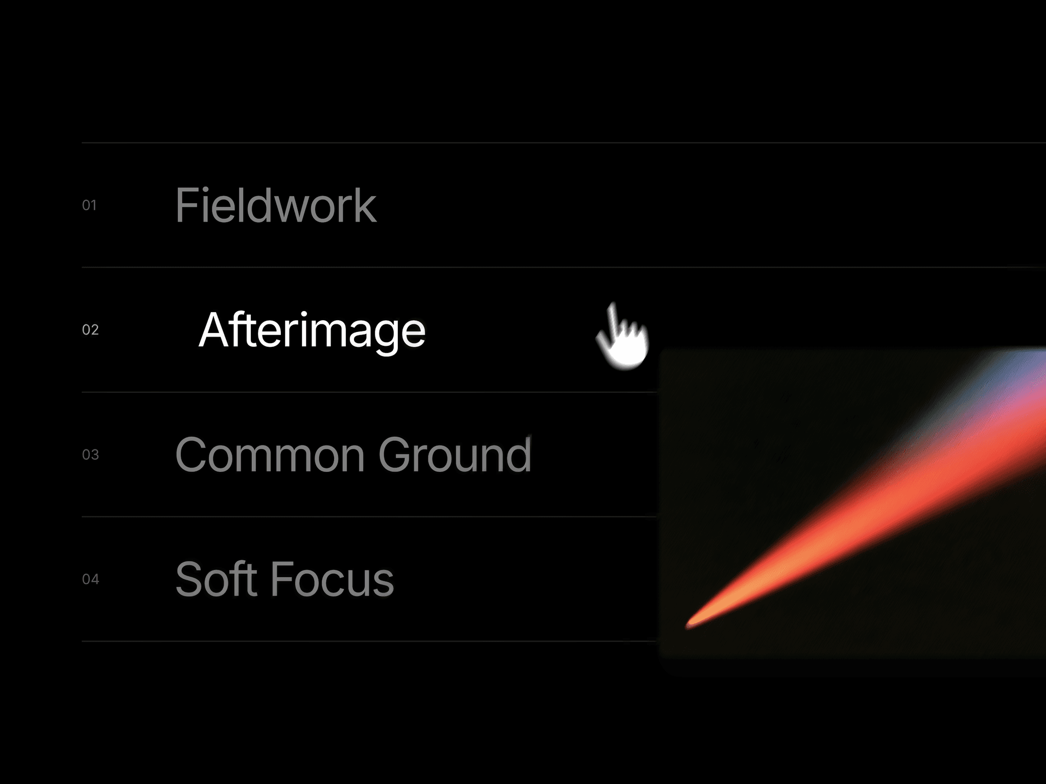
The left panel uses a deep charcoal/black background with large, readable navigation links separated by subtle dividers — creating a structured, editorial feel. Each item has a right-pointing chevron to signal interactivity. The right panel is reserved for brand imagery: a mockup, campaign photo, product visual, or anything your brand wants to say without words.
The "Menu × Close" pill button sits centered at the top in a high-contrast black pill with a hot pink close icon — a deliberate design choice that makes the trigger feel modern and tactile, not like an afterthought.
Ideal Use Cases
Fashion & apparel brand websites
Creative agency portfolios
Lifestyle and wellness brands
Product launch pages
Photography or studio websites
Any site that wants navigation to feel like a feature, not an afterthought
How to Use
Drag the component onto your Framer canvas
Click the "Menu" trigger to preview the open state
Replace the right-panel image with your own brand visual
Edit navigation link labels directly on canvas
Connect each nav item to your page targets using Framer's link properties
Customize colors and font to match your design system