About Hover Reveal Tabs
Flow Reveal Rows – Hover Image Reveal List with Sliding Highlight
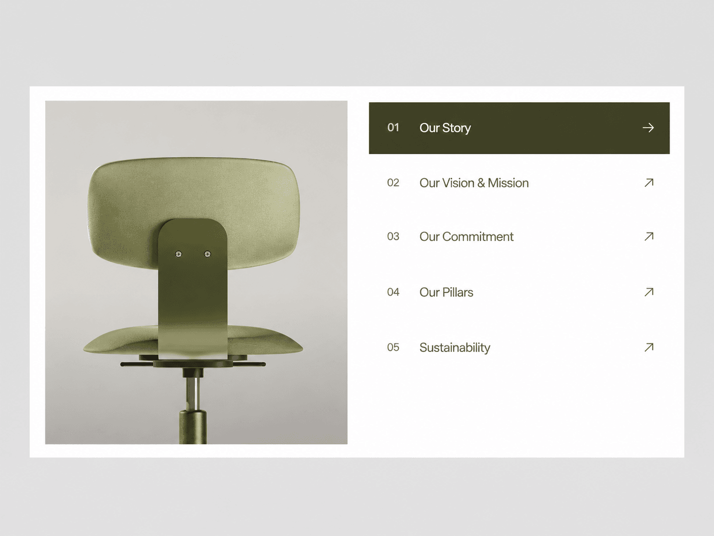
A numbered list of rows beside a large image panel. Hover a row and a highlight slides to it, the number nudges over, the arrow rotates, and the image changes with a soft slide and fade. It cycles through the rows on its own until someone hovers. Add your own rows and images, link each row to a page, and match the look to your brand with a few colors.
What you get
Full source code (.tsx), ready to paste
Framer remix link with the demo project
README with step-by-step setup
Free lifetime updates
Support within 24 hours
Customizable
Rows: add as many as you need, each with a title, an uploaded image, a link and a “new tab” option. Row numbers are added automatically
Layout: padding on all four sides, container radius, image radius, gap, image height, mobile image minimum height, rows max width
Font + Rows: title font, number font, row height, row spacing, row padding, arrow icon size
Colors: background, row highlight, text, active text, divider
Auto Speed: seconds per row, or 0 to turn autoplay off
How it works
Remix or paste the code into Framer
Drag the component onto your canvas
Edit your rows, images, colors and fonts directly in the properties panel
Good to know
Code component for Framer, not a standalone download
No libraries to install. The arrow icon loads automatically in Framer
Autoplay starts when the component scrolls into view, pauses while someone hovers or when it’s offscreen, and resumes from the last hovered row
On screens 480px wide or less, the image and rows stack to full width and the highlight follows autoplay, since there is no hover on touch devices
Images are preloaded, so the transition never waits on a download
License: Unlimited personal and client projects. No resale or redistribution.
Refunds: Not working? Email us first and we’ll fix it within 24 hours. If we can’t, you get a full refund.
Questions? support@russetsupply.com