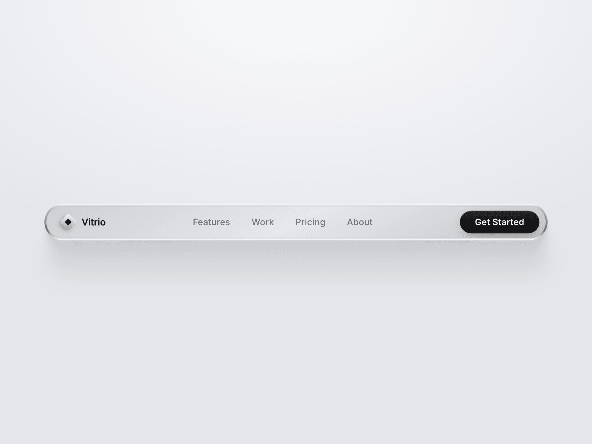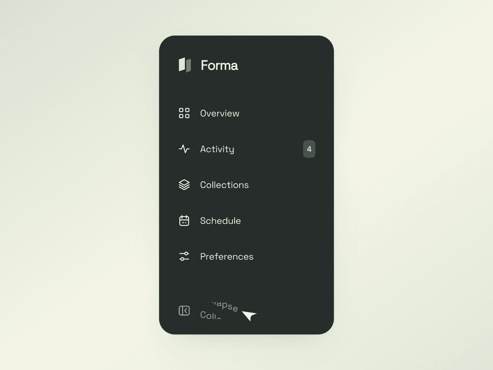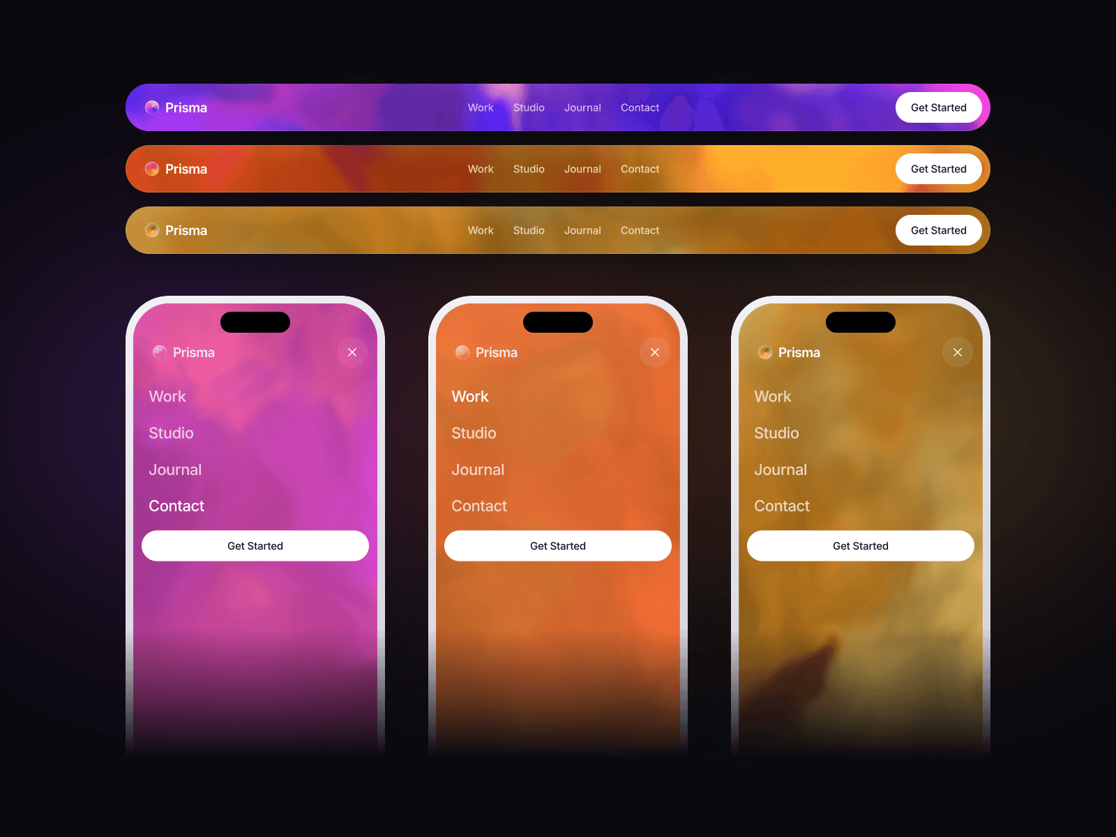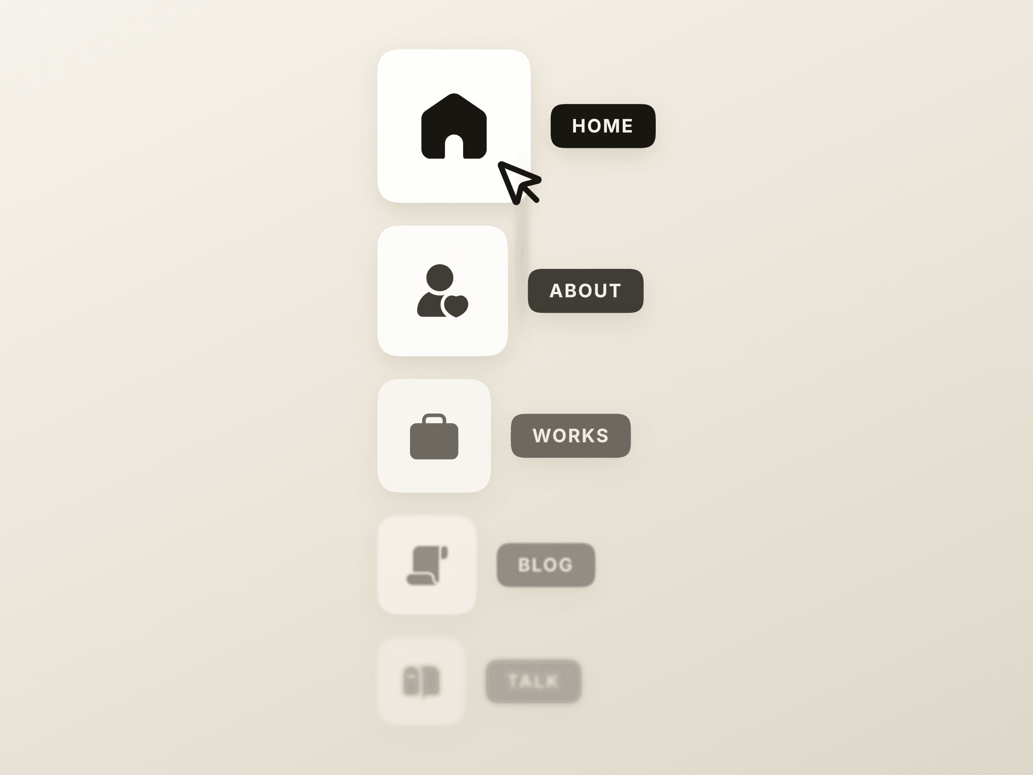
About Motion Hamburger
Explore the best Framer components ↗
About
Motion Hamburger is a responsive animated menu icon that smoothly morphs three lines into a close X. Use the built-in toggle event to control mobile menus, fullscreen overlays, sidebars, and navigation drawers. It includes an optional ring, hover growth, keyboard support & accessible labels.
What you can customize
Choose the initial open or closed state and customize the size, line thickness, icon color, animated ring, ring color, ring thickness, and hover growth. The scalable Framer Code Component works from 24px to 500px and respects reduced-motion preferences.
Great for (examples)
Just a few ideas, use it anywhere you need an animated hamburger, menu toggle, or responsive navigation trigger:
Hamburger menus and animated menu icons
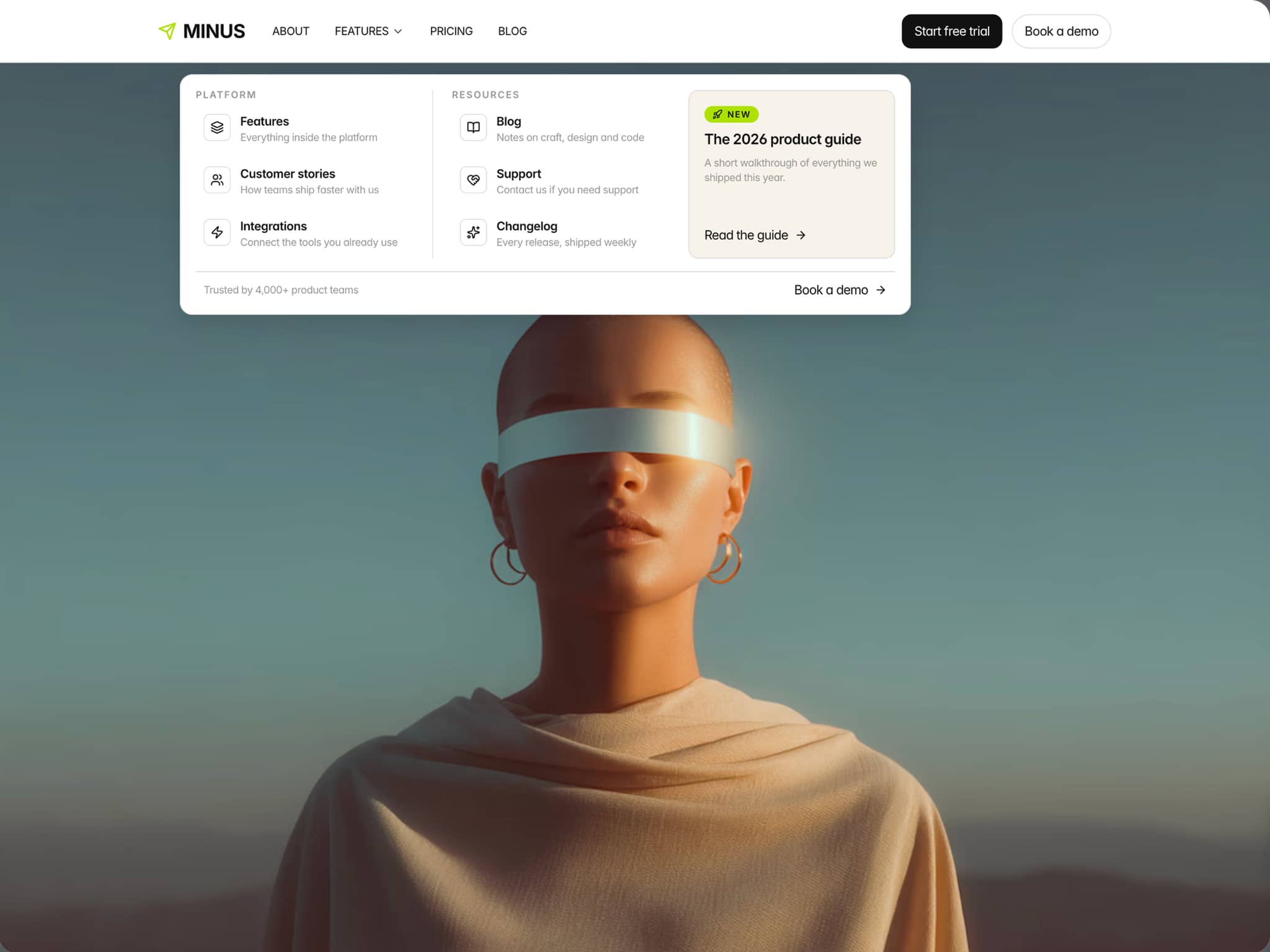
Mobile navigation and responsive headers
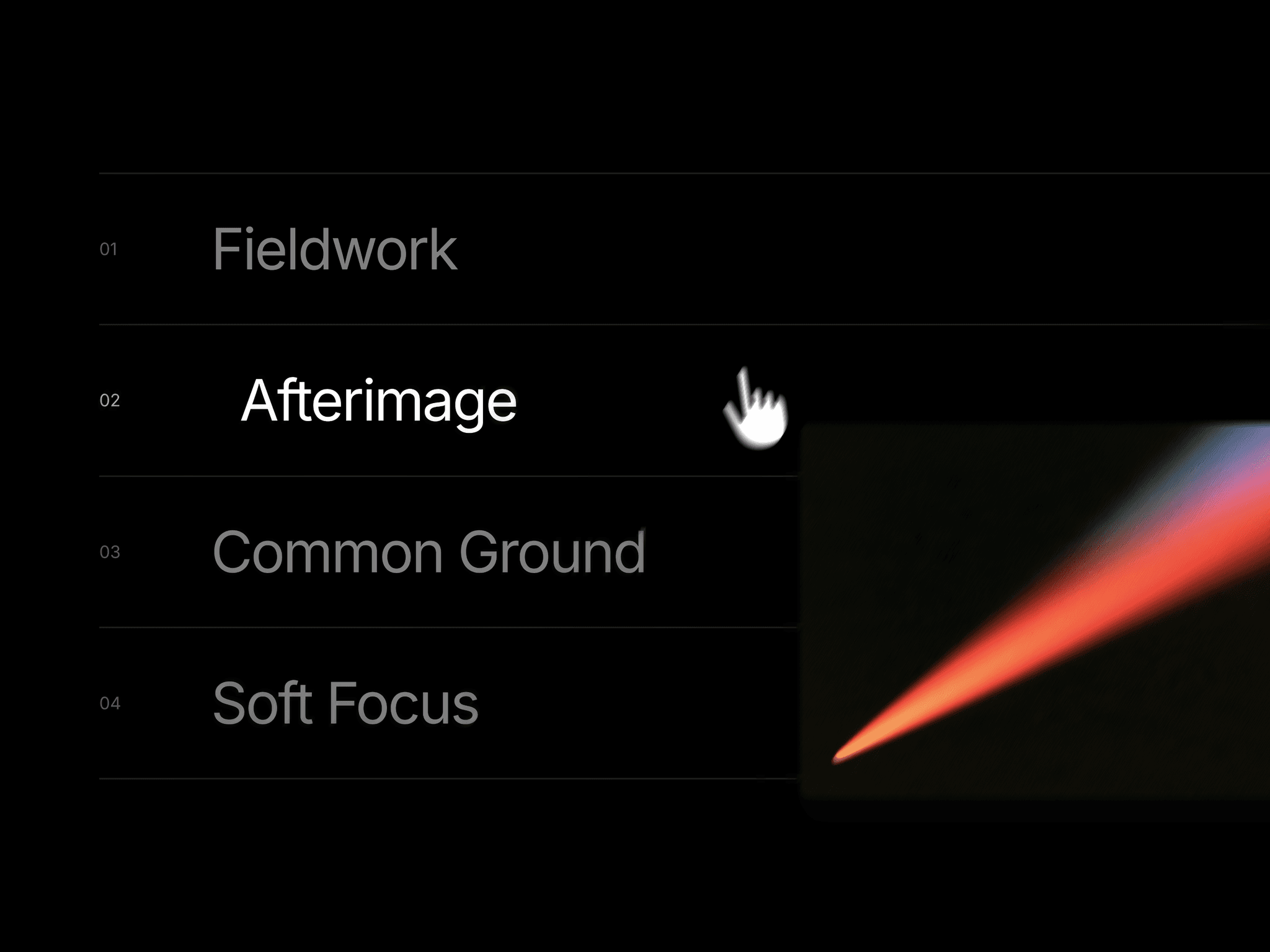
Fullscreen menus and navigation overlays
Sidebar, drawer, and off-canvas navigation
Portfolio and creative studio websites
Agency, architecture, and editorial websites
SaaS and product landing pages
Minimal, light, dark, and monochrome interfaces
Interactive prototypes and UI design systems
Morphing icons and SVG microinteractions
Desktop, tablet, and mobile layouts
Premium Framer templates
Need help?
Questions or feedback? Reach me anytime: matthias@lmvision.de or on X @Matthias_Oel.
Need a matching component?
Explore more interactive components for your next project: