About Orbit Flip Slider
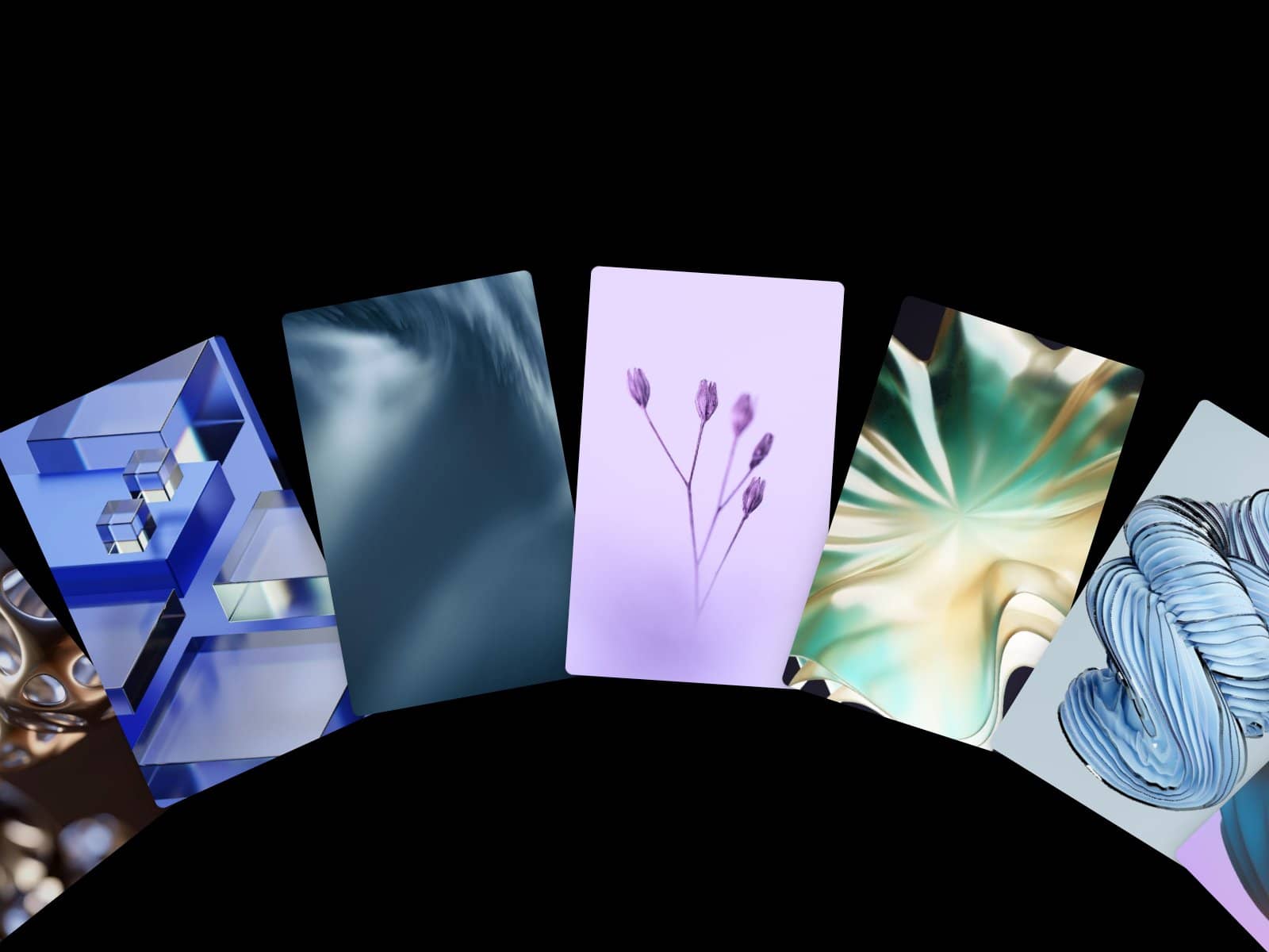
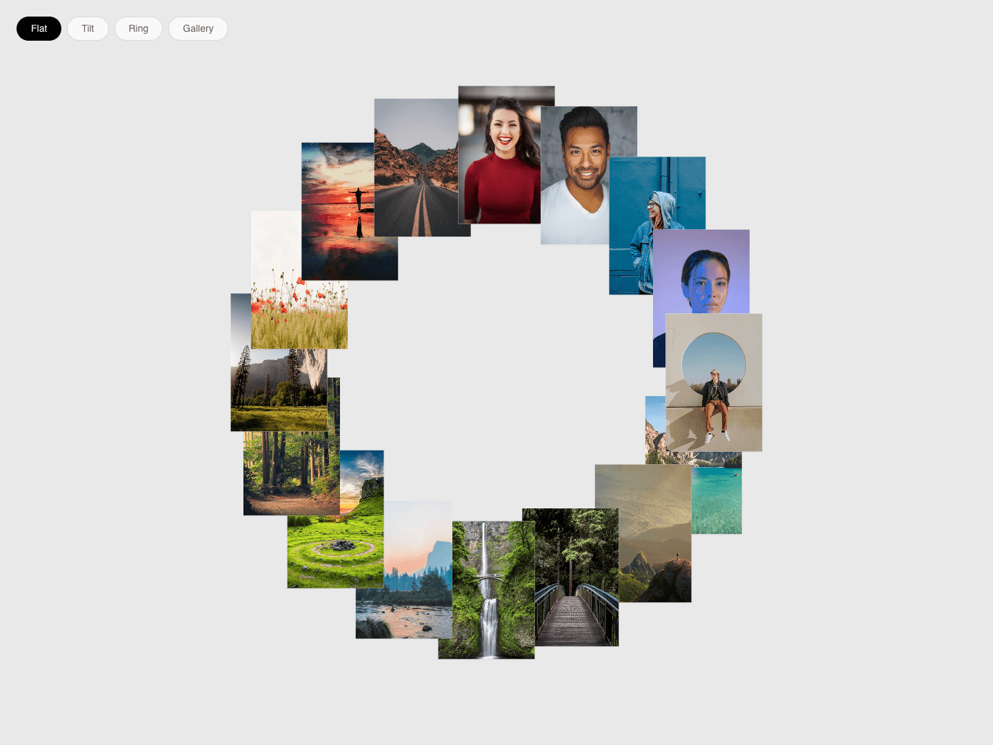
A ring of image cards with four views: Flat, Tilt, Ring and Gallery. Switching views animates every card to its new place. The ring spins slowly and pauses on hover, and hovering a card pops it out with a turn.
Key features:
Four modes switched with on-screen buttons; the buttons can be hidden and the starting mode chosen
Animated transition between modes
Idle spin with adjustable speed and direction; pauses on hover (optional)
Hover pop with adjustable lift and turn angle
Each mode's rotation, radius and scale is adjustable separately
Adjustable card size, gap and corner radius
Up to 40 items; items without an image show a gradient or solid placeholder
Pulls the ring in on frames narrower than 768px
Pauses off-screen; reduced motion stops the spin, transitions and hover pop
How to use:
Drop it into a frame; it fills the frame.
Add images in Items.
Pick a starting mode and card size.
Adjust each mode's settings or hide the mode buttons.