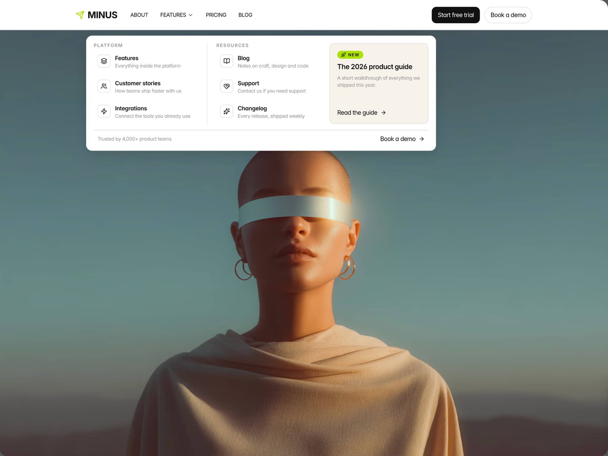
About Pills Showcase
Elevate Your Product Storytelling
The Pills Showcase component is a highly interactive, beautifully animated section designed to highlight your product's best features. Inspired by top-tier tech landing pages, it allows users to explore features, colors, and media seamlessly.
Key Features
Dual Design Modes: Toggle between a sophisticated "Glass & Shadows" look or a clean "Flat Minimal" aesthetic directly from the properties panel.
Scroll-Triggered Animations: Pills elegantly stagger into view only when the component enters the user's viewport.
Interactive Pills: Click or tap to expand feature descriptions with buttery-smooth physics.
Smart Media Syncing: Automatically crossfades between images, looping videos, or solid colors based the active feature, utilizing advanced z-index stacking.
Color Variants: Built-in support for displaying product color swatches that sync directly with your media, complete with dynamic label text (e.g., "Shown in Emerald").
Fully Responsive: Custom mobile breakpoint logic ensures perfect swipe-navigation on phones and precise click-navigation on desktop.
How to Use
Paste the component onto your Framer canvas.
Ensure the parent container has enough height (or is set to Fill/Fit).
Use the right-hand Properties panel to add items under the "Pills" array.
Choose between "Standard Text" or "Color Variants" for each pill to attach specific media or swatches.
Demo