About Screen Split Menu
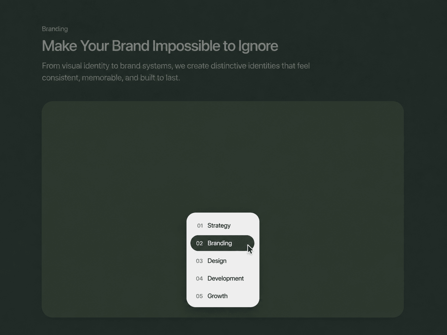
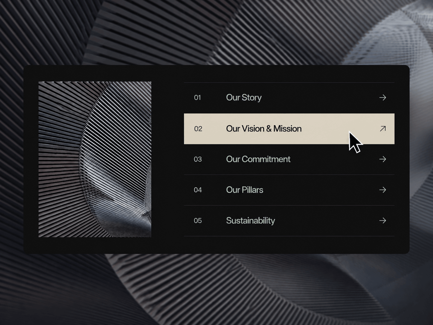
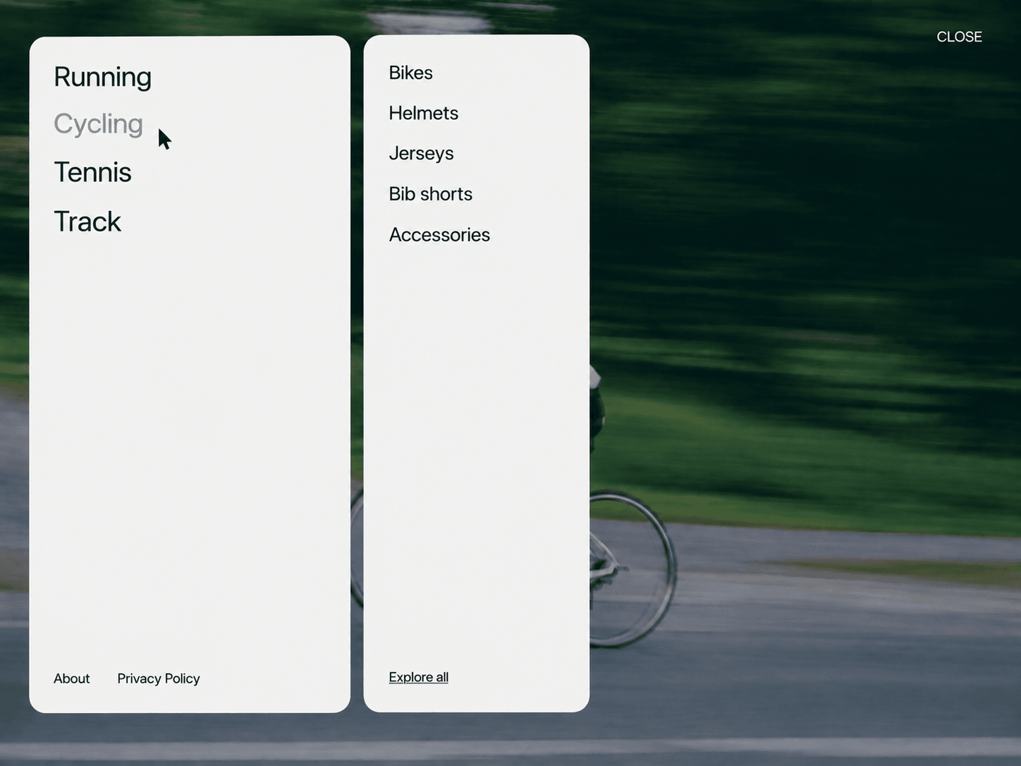
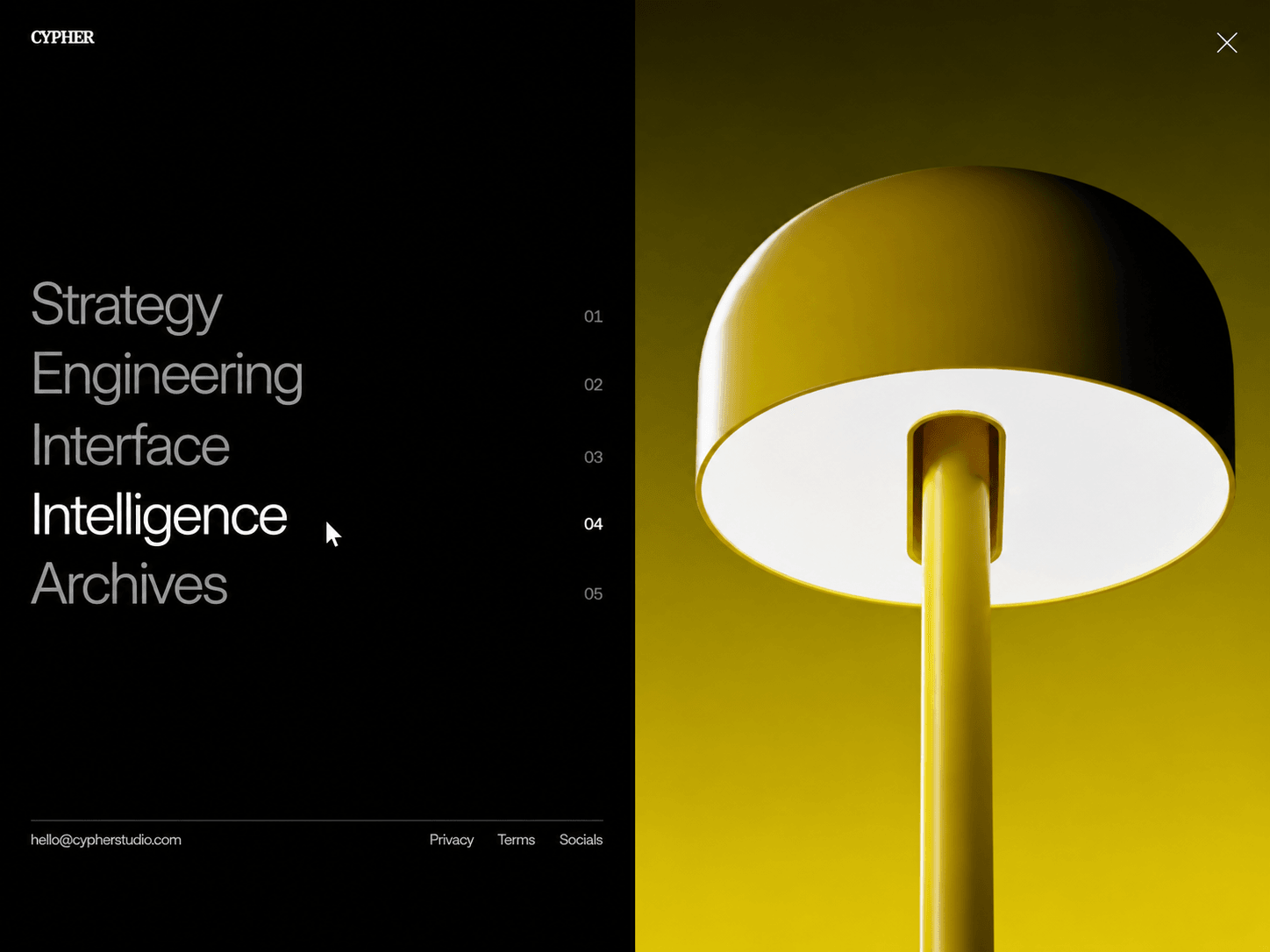
Split Screen Menu is a fullscreen navigation that turns the menu interaction into part of the visual experience. Click the menu icon in the top-right corner and the screen splits from the center, revealing the navigation on one side and a full-bleed image panel on the other.
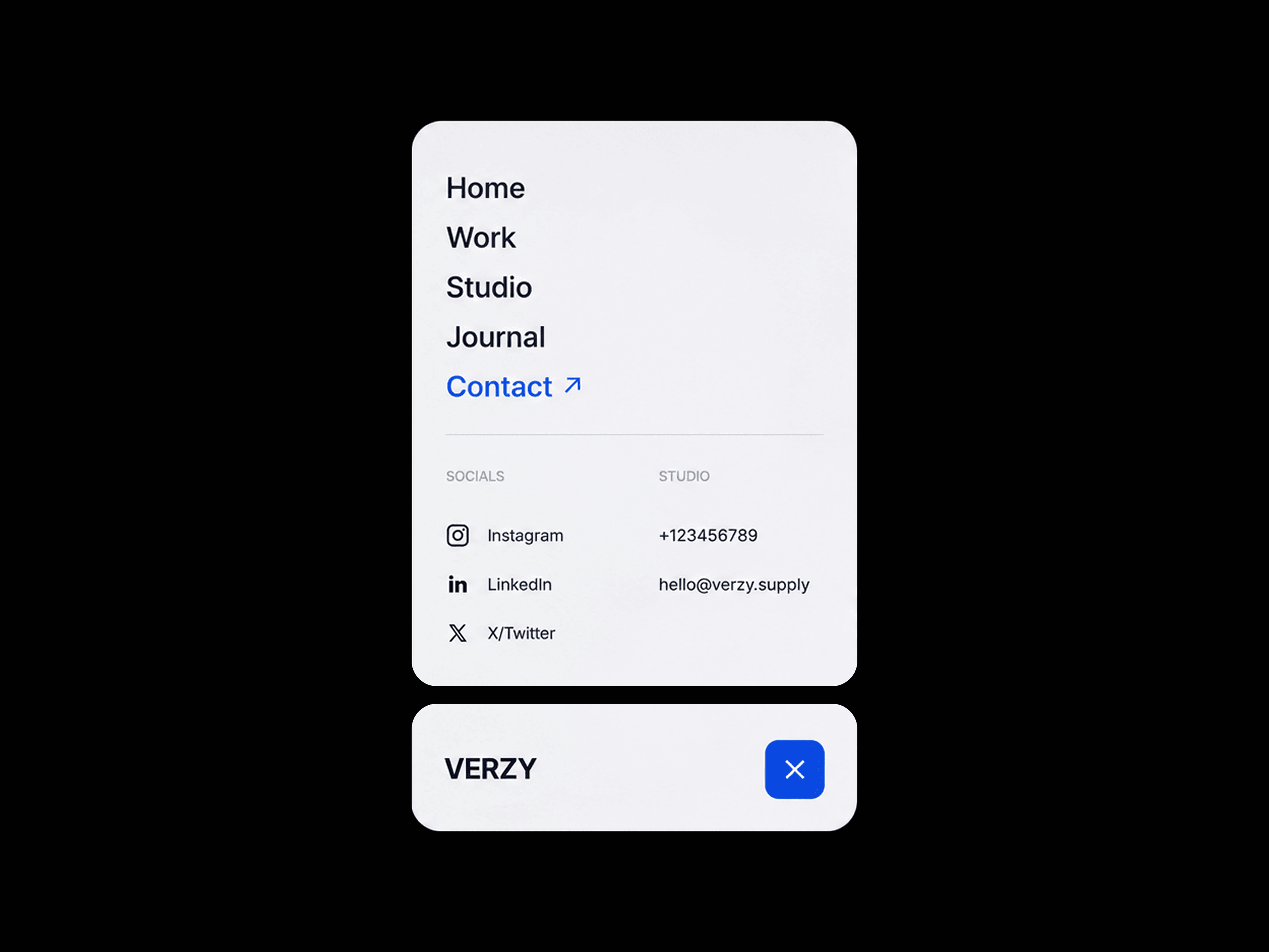
Each navigation item can have its own image, so hovering over an item instantly updates the visual panel. On smaller screens, the layout automatically changes into a single full-screen navigation panel, keeping the interaction clean and usable on mobile.
Features
Full-screen split-screen navigation
Center-out menu animation
Desktop navigation + image panel
Image changes based on hovered item
Smooth image transitions
Numbered navigation items
Animated menu icon
Contact and footer links
Responsive mobile layout
Custom logo support
Custom navigation links
Static-render optimized
Fully Customizable
Customize the entire navigation directly from Framer's property panel. Add your own logo, navigation items, images, links, typography, colors, contact information, and spacing without editing the code.
Customize
Text or image logo
Logo typography and size
Navigation labels and URLs
Individual navigation images
Navigation typography
Item and hover colors
Contact email and links
Panel background colors
Menu icon colors
Page padding and spacing
Mobile layout behavior
How It Works
The menu stays minimal when closed, showing only the logo and menu icon. When opened, the interface expands into two sections: a solid navigation panel and a full-bleed image panel.