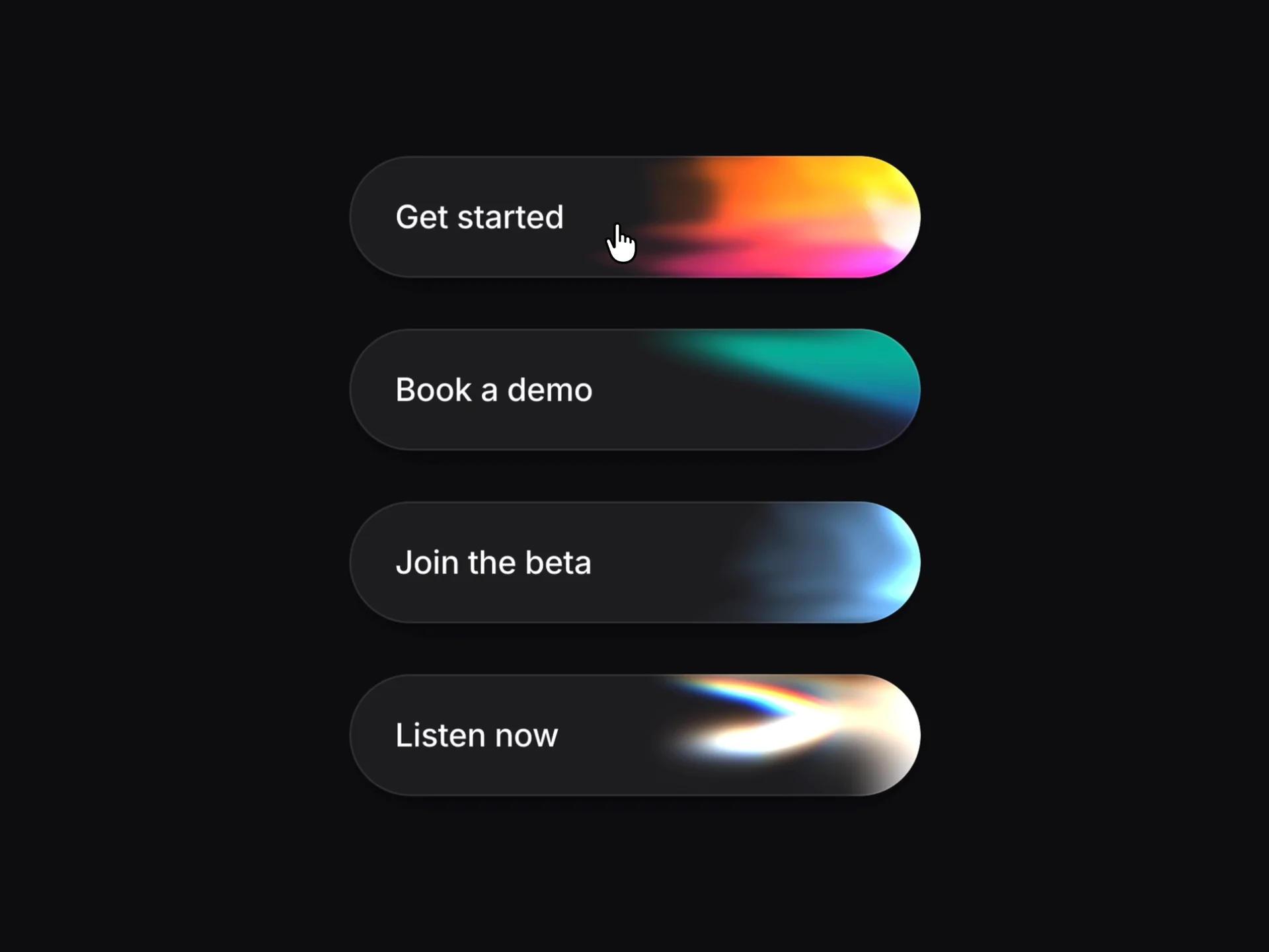
About Shader Buttons
Explore the best Framer components ↗
About
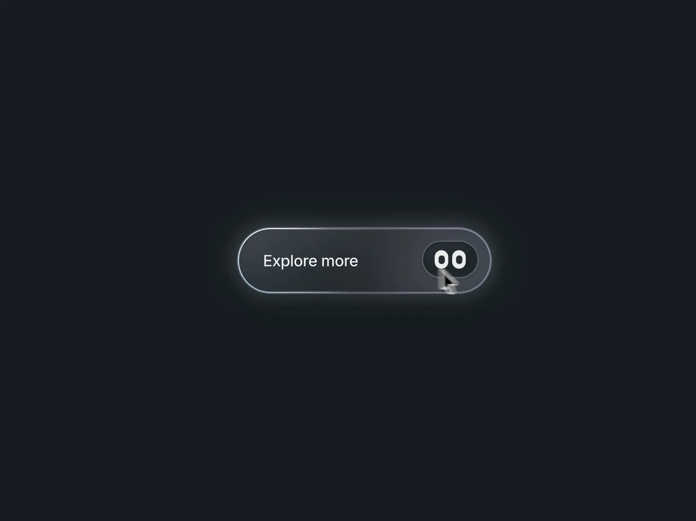
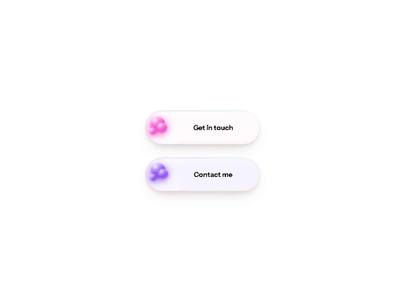
Shader Button is an animated Framer button that adds a flowing shader glow to your calls to action. Colorful light moves across the button surface, bringing depth and a distinctive touch to links, hero sections and product pages.
Choose a subtle look or a vivid glow, then pick how the shader reacts when visitors hover. Use it for an invitation to explore, sign up or get in touch.
What you can customize
Make the button your own by shaping its content, colors and motion around your brand. Choose from 11 ready-made looks or create a custom palette. Adjust the label, optional second line, icon, destination and new-tab behavior.
Fine-tune the button’s padding, corner radius and appearance, then choose a hover response: Swell, Follow, Ignite or none. Create anything from a restrained accent to a colorful focal point, directly in Framer.
Great for (examples)
Bring a little movement to your next project:
Hero sections and landing page CTAs
SaaS products, AI tools and app launches
Creative portfolios and personal websites
Studio, design and digital agency sites
Waitlists, signups and product announcements
Contact buttons and booking links
Dark interfaces and colorful brand experiences
Need help?
Questions or feedback? Reach me anytime: matthias@lmvision.de or on X @Matthias_Oel.
Need a matching component?
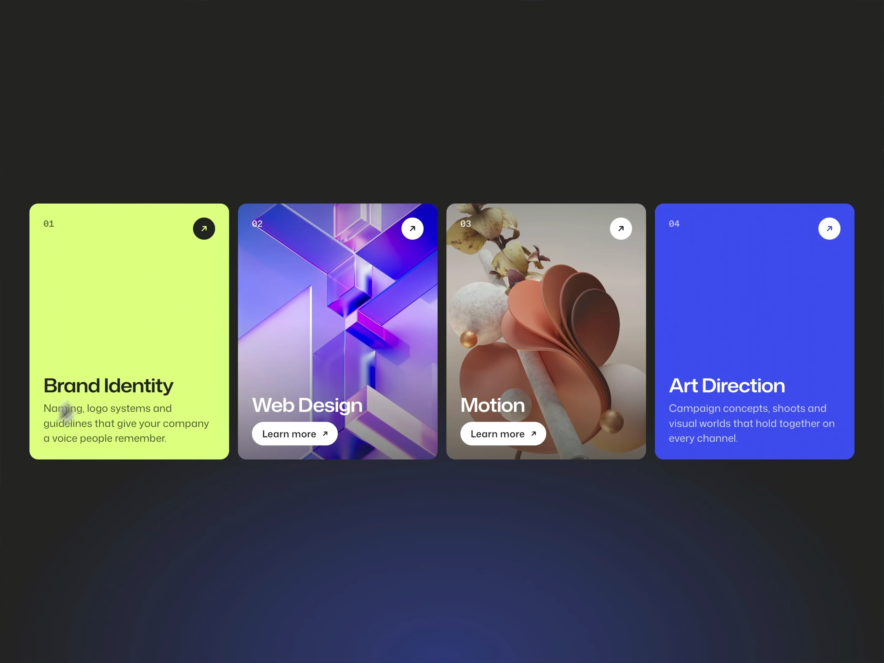
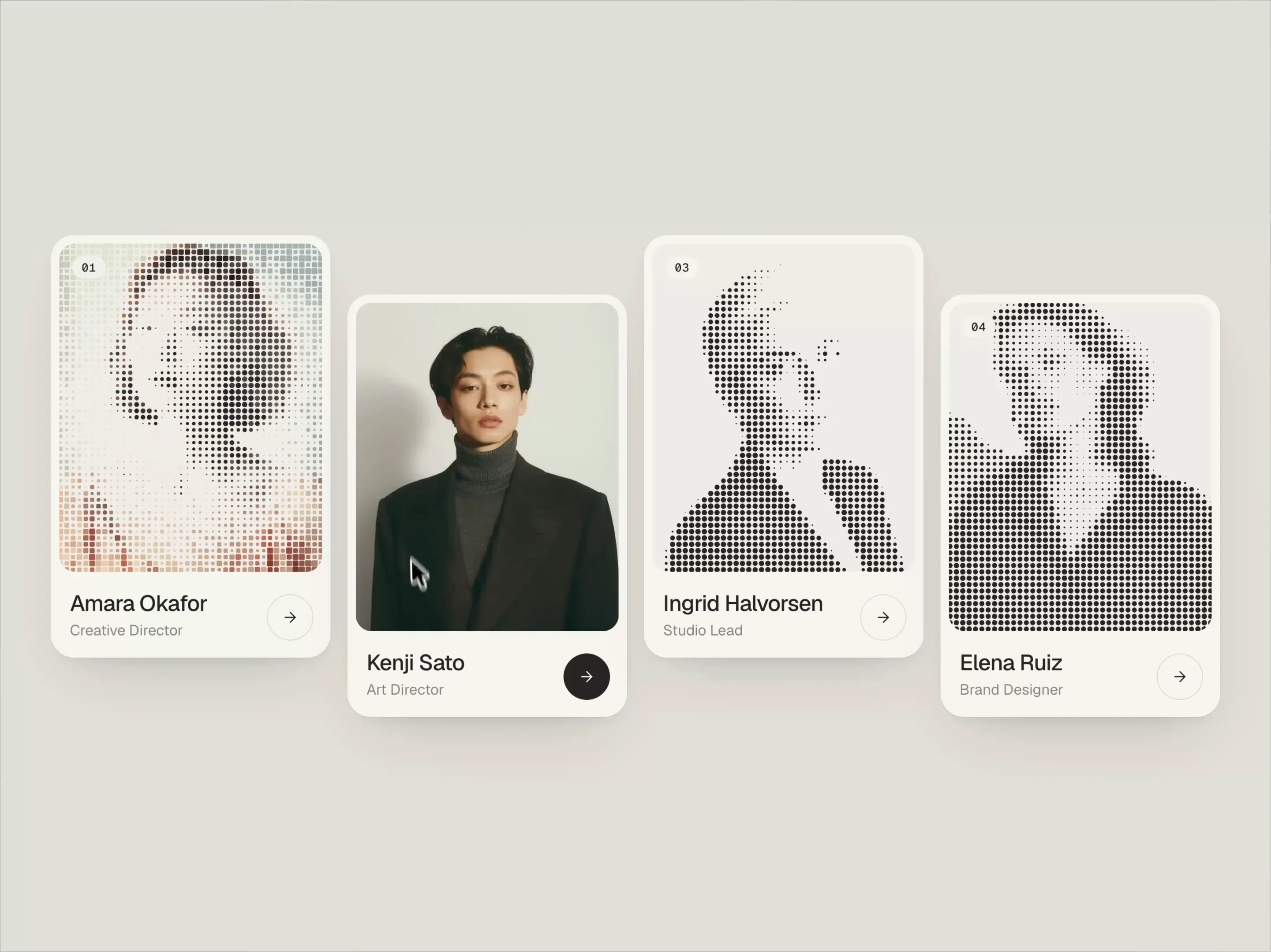
Pair your animated CTA with interactive cards: