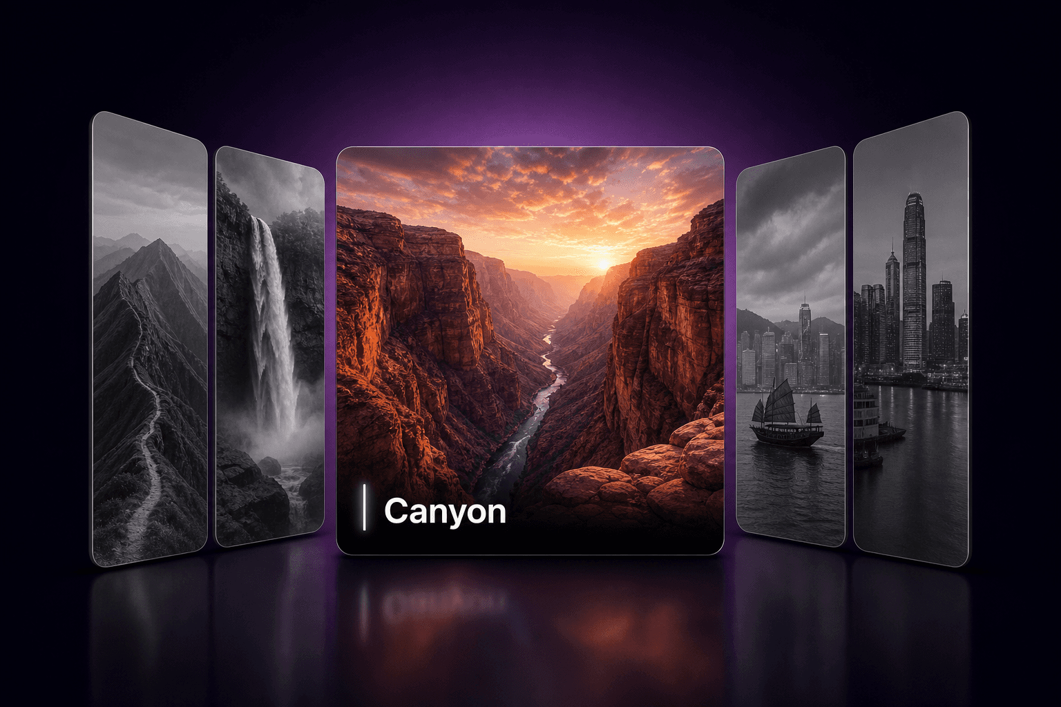
About Gallery Showcase
This is a premium, editorial-style gallery component designed for high-end portfolios and lifestyle showcases. It features a unique split-layout design that combines robust navigation with elegant typography.
Key Features:
Infinite "Treadmill" Navigation: The top section features an edge-to-edge, infinite scrolling strip of thumbnails. It utilizes virtualized rendering to create a seamless loop that never ends, controlled intuitively via vertical mouse scrolling.
Interactive Hover Effects: The thumbnail strip includes a sophisticated physics-based hover interaction. Hovering over an image shrinks it significantly, while simultaneously creating a "wave" effect that subtly shrinks its immediate neighbors.
Smart Split-View Layout: The main content area is divided into a "Boxy" active image on the left and a typographic detail pane on the right. The layout maintains perfect left-alignment with the top strip for a grid-abiding, professional look.
Full Customization:
Typography: Independent controls for "Display Font" (the large counter) and "UI Font" (labels), supporting custom sizes, line heights, and letter spacing.
Dimensions: Precise control over Image Max Width, Max Height, Gap Spacing, and Corner Radius.
Visibility: Toggles to show or hide the "Scroll" notice and the "Range" (e.g., 001 - 010) counter.
Theming: Full color control for text and background to match any brand identity.