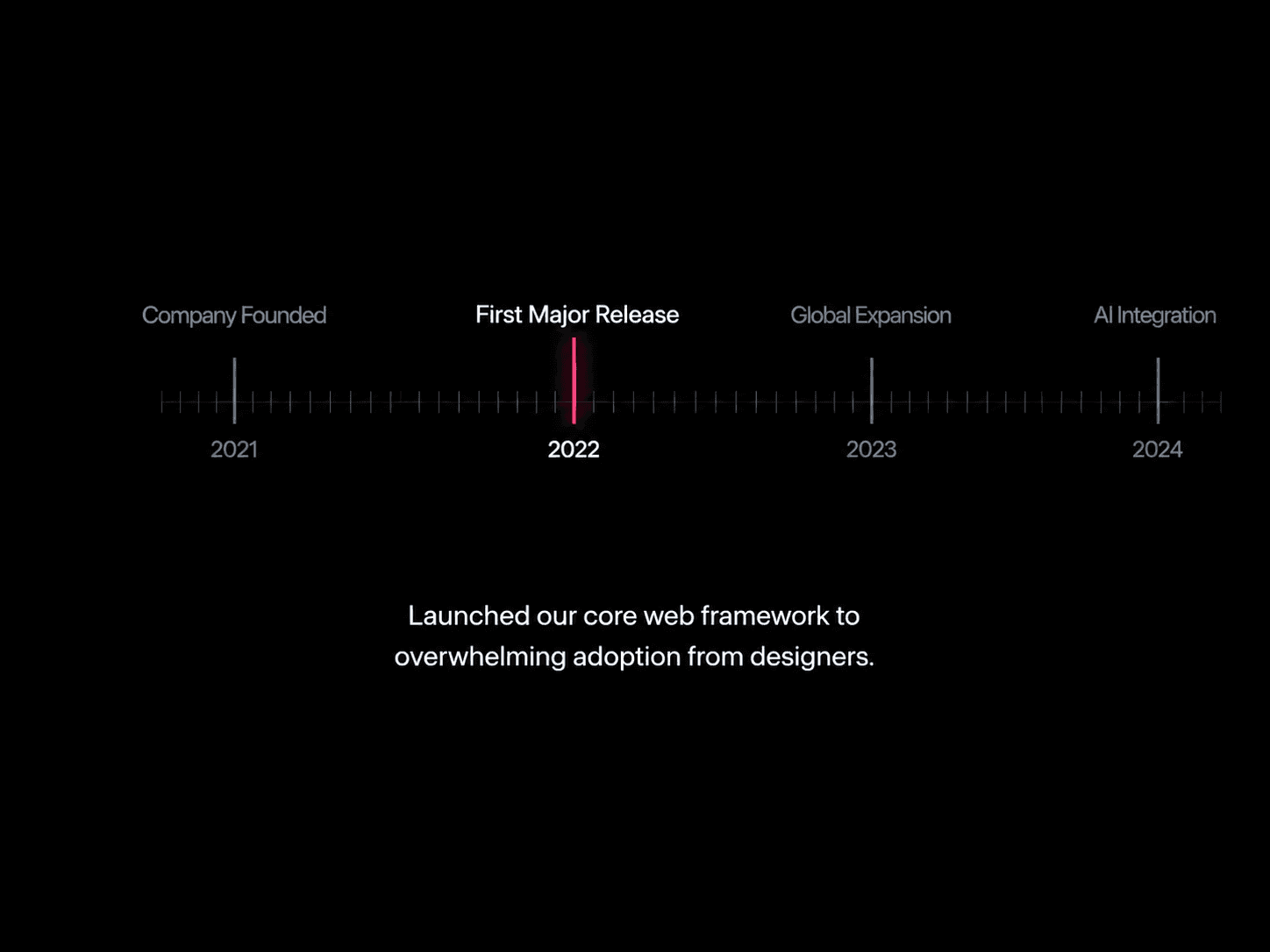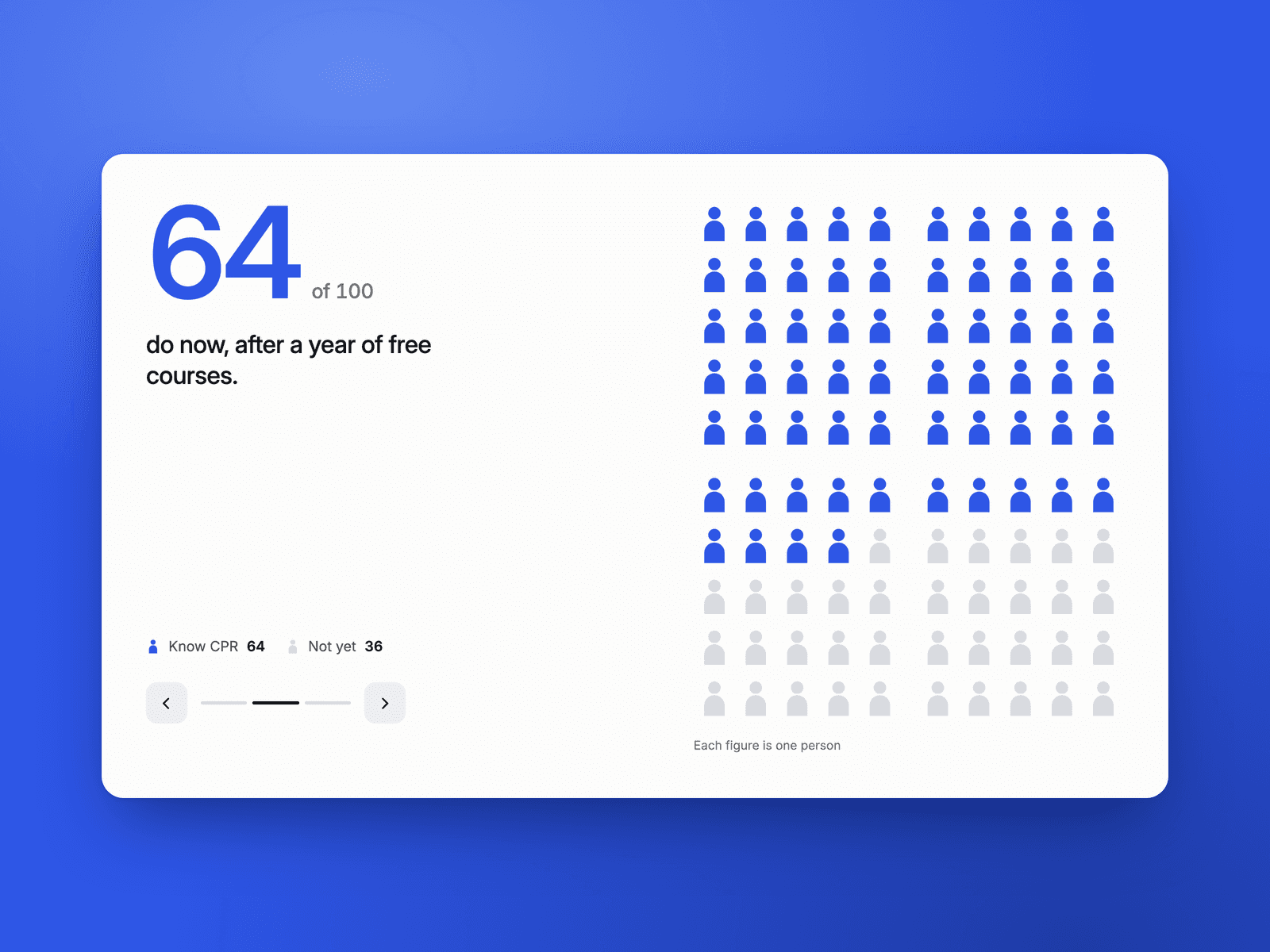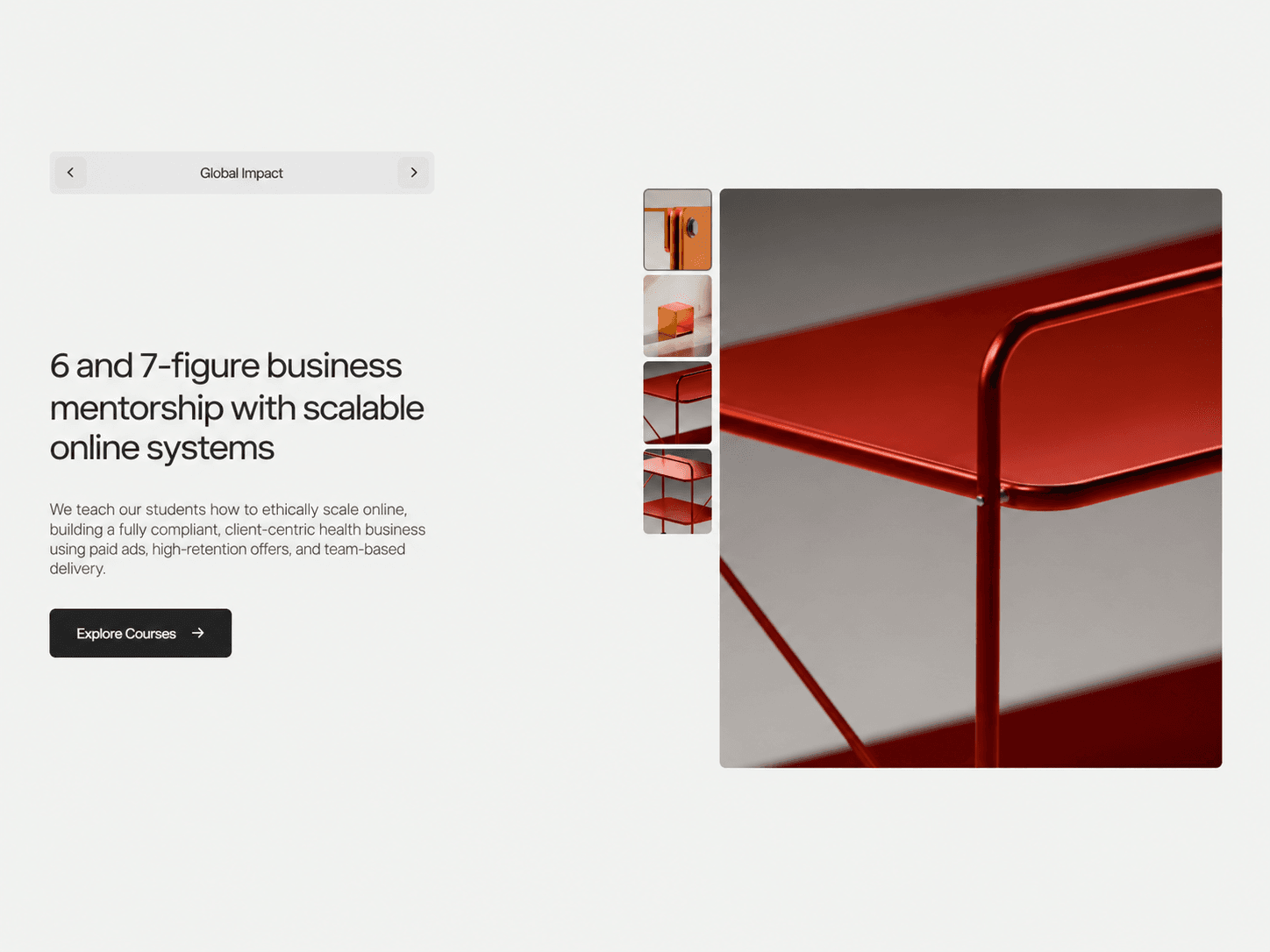
About Split Feature Slider
Feature Showcase – Animated Product Feature Explorer for Framer
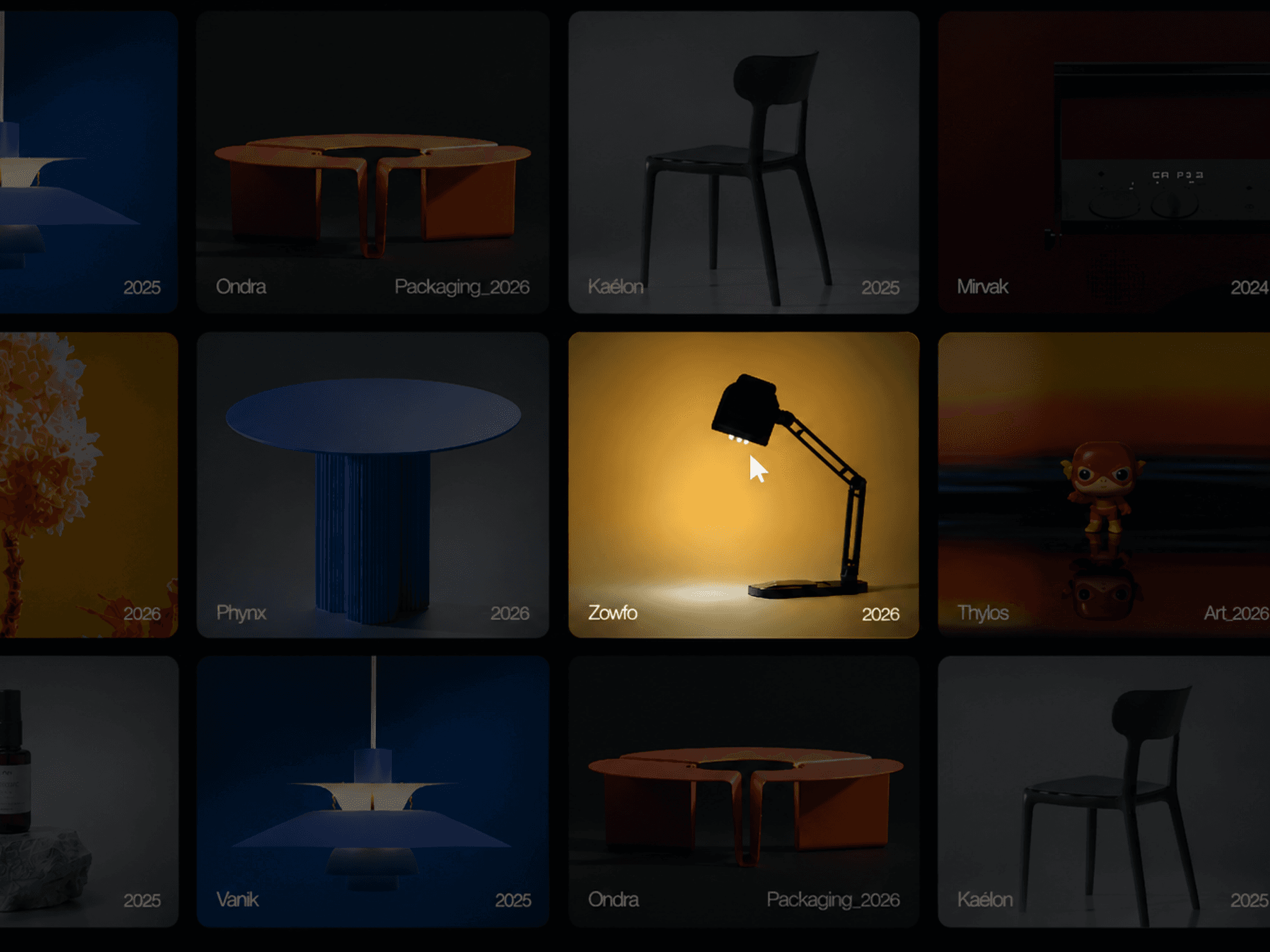
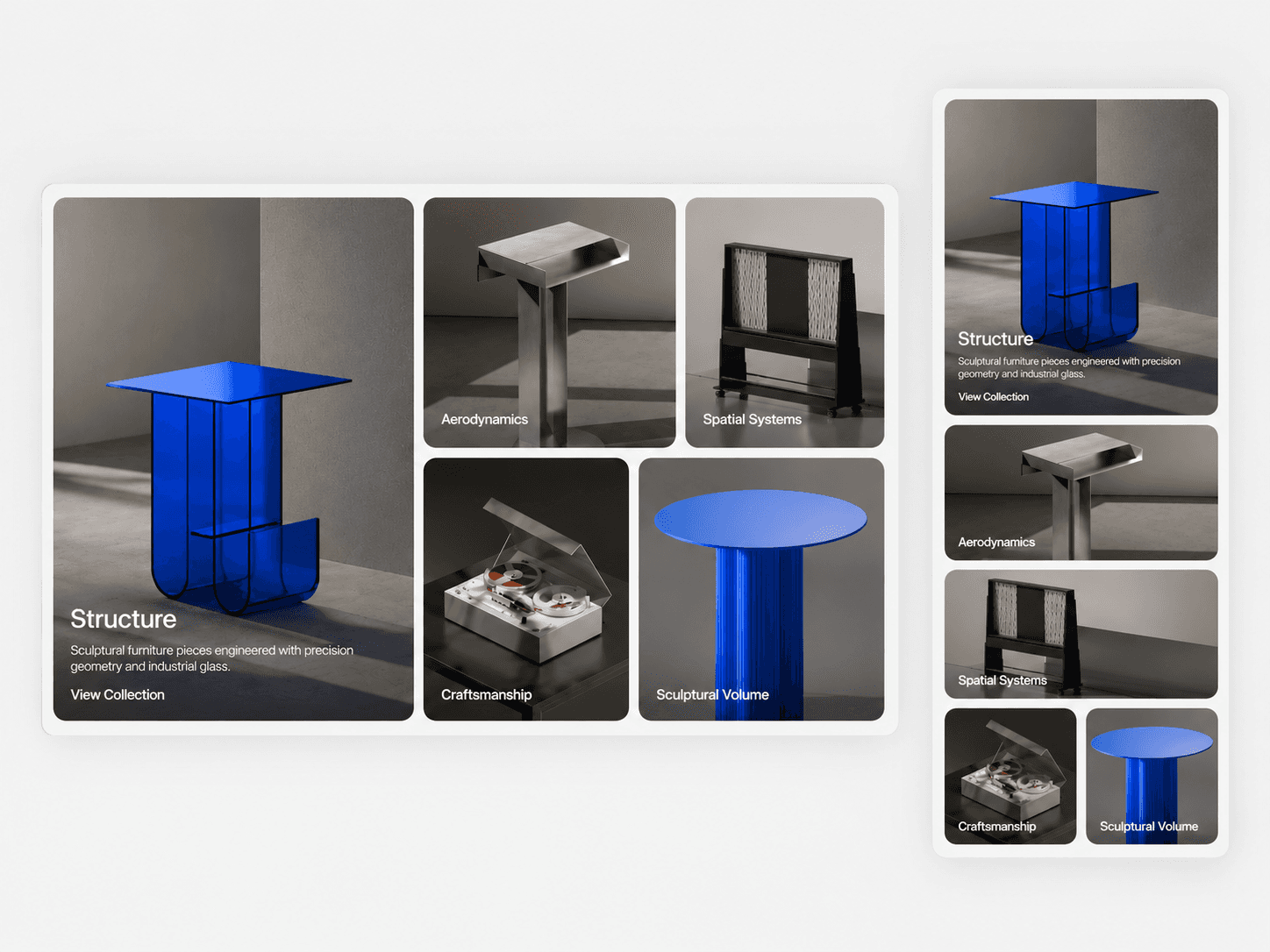
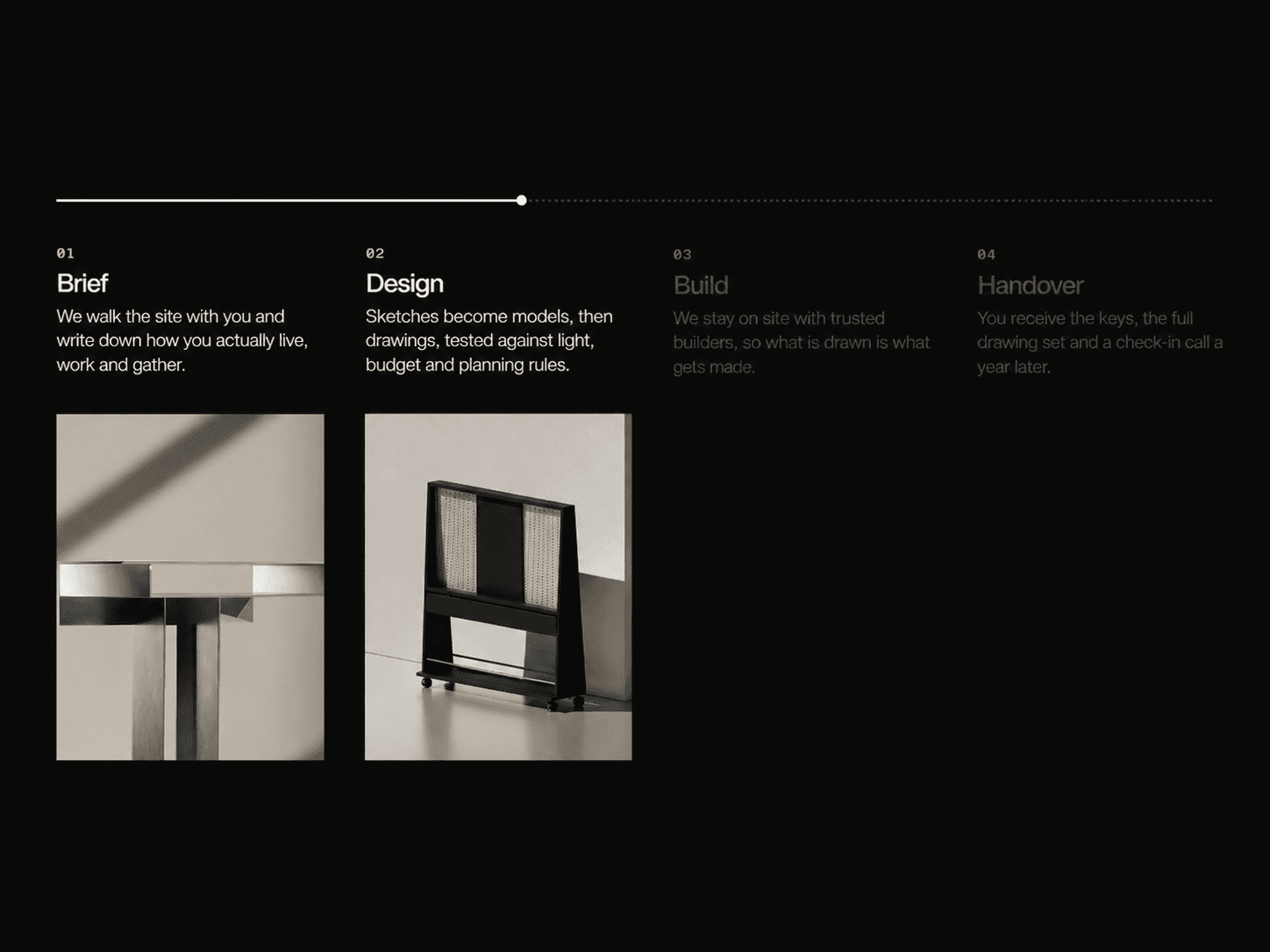
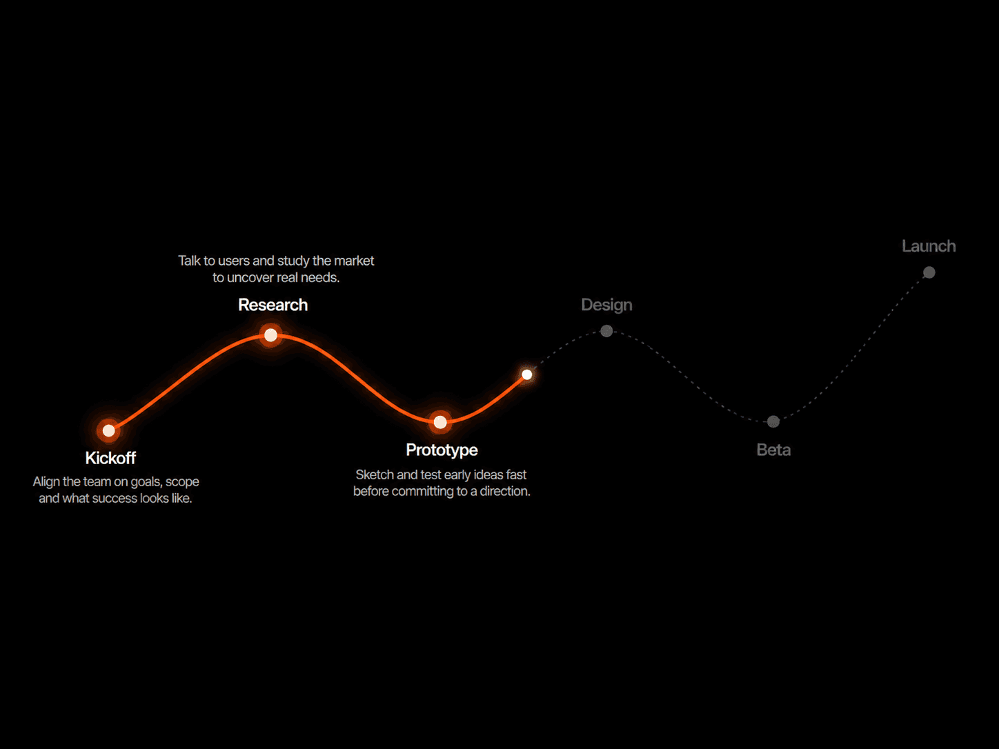
An interactive feature showcase that combines a large image, selectable feature labels, and animated content. Visitors can switch between features to explore images, headings, descriptions, and calls to action.
What you get
Direct component URL to paste into your canvas
Framer component with editable property controls
Interactive feature selector, image gallery, and content panel
Free lifetime updates
Support within 24 hours
Customizable
Content: add up to 8 features, each with a label, heading, description, image, button text, and link
Layout: adjust overall padding, image width, content gap, text spacing, heading width, and description width
Images & Thumbnails: show or hide thumbnails, set thumbnail width, and adjust image corner radius
Selector: customize selector width, height, padding, and corner radius
Typography: control fonts for labels, headings, descriptions, and buttons
Colors: customize the background, text, selector, arrows, button, and active thumbnail
Good to know
Code component for Framer, not a standalone download
Uses Framer Motion for animated transitions
Supports up to 8 feature items
Includes optional autoplay, which pauses when the component is outside the viewport
Automatically switches to a stacked layout below your chosen breakpoint
The Framer canvas shows a static preview without autoplay or animation timers
License: Unlimited personal and client projects. No resale or redistribution.
Refunds: Due to the digital nature of this product, all sales are final, and refunds will not be issued. Please ensure you review all product details carefully before purchasing. If you have any questions or need further clarification, feel free to reach out before completing your purchase.
Questions? support@russetsupply.com