About Split Nav
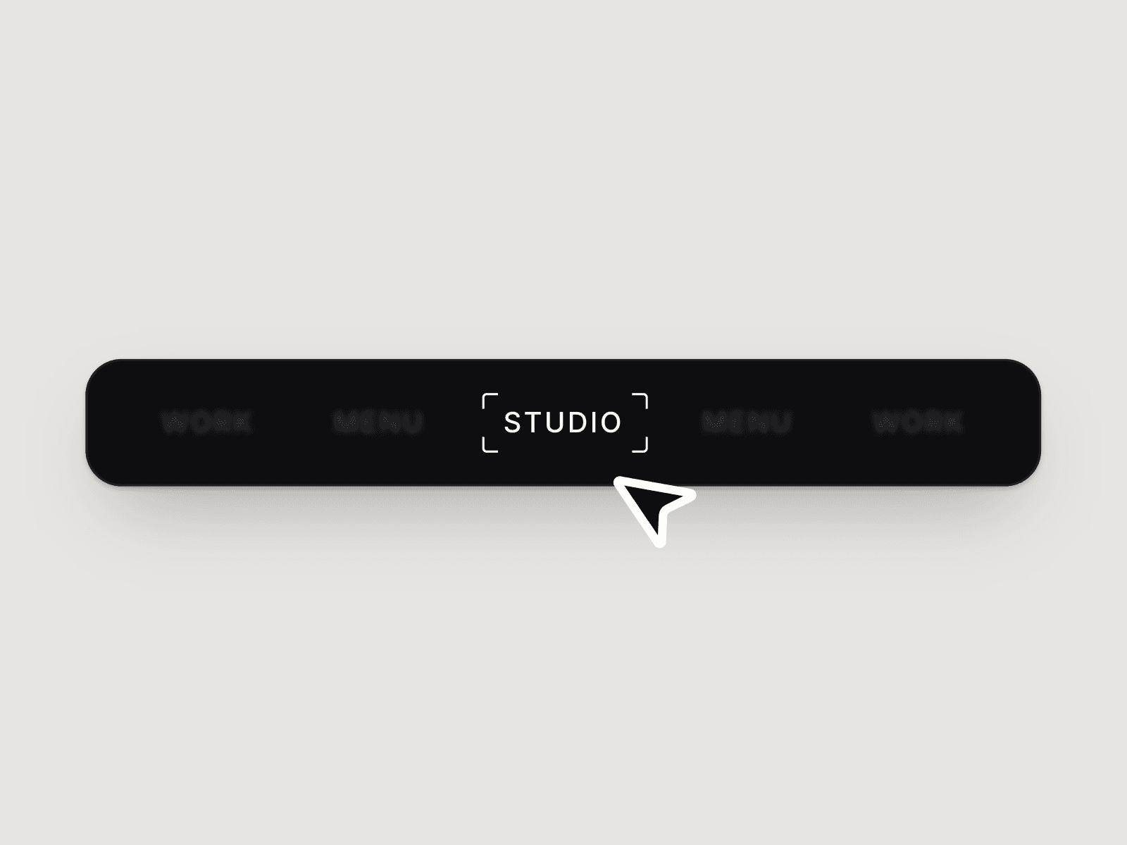
SplitNav is a cinematic navigation component that transforms your layout into a series of full-height vertical panels — each representing a destination on your site. As users hover over a panel, it fluidly expands while adjacent panels compress, creating a tactile, immersive experience powered by spring physics.
Features
- Dynamic panel count — add as many panels as your layout needs
- Per-panel customization — set a unique background image, overlay color, label, and CTA link on each panel
- Spring animation controls — tune stiffness, damping, and mass directly from component properties
- Hover expand ratio — control how dominant the active panel becomes relative to its neighbors
- Click-to-navigate — each panel links to its assigned URL on click
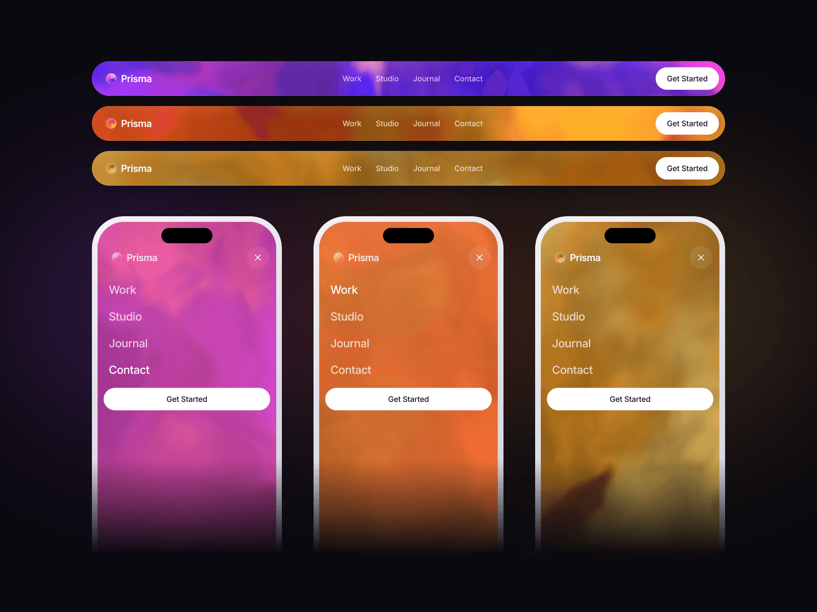
- Overlay theming — adjust overlay color and opacity per panel for contrast or mood
What you can customize
Panels · Media · Overlay color · Label · CTA link · Hover Expand Ratio · Font size · Transition
Ideal for
Portfolio homepages, agency landing pages, multi-brand or multi-product sites, lookbook-style layouts, and any project where navigation itself is part of the visual statement.