About SpotlightHoverCursor
Drag & drop the Spotlight component onto your canvas; set its position to "Absolute" and size it;
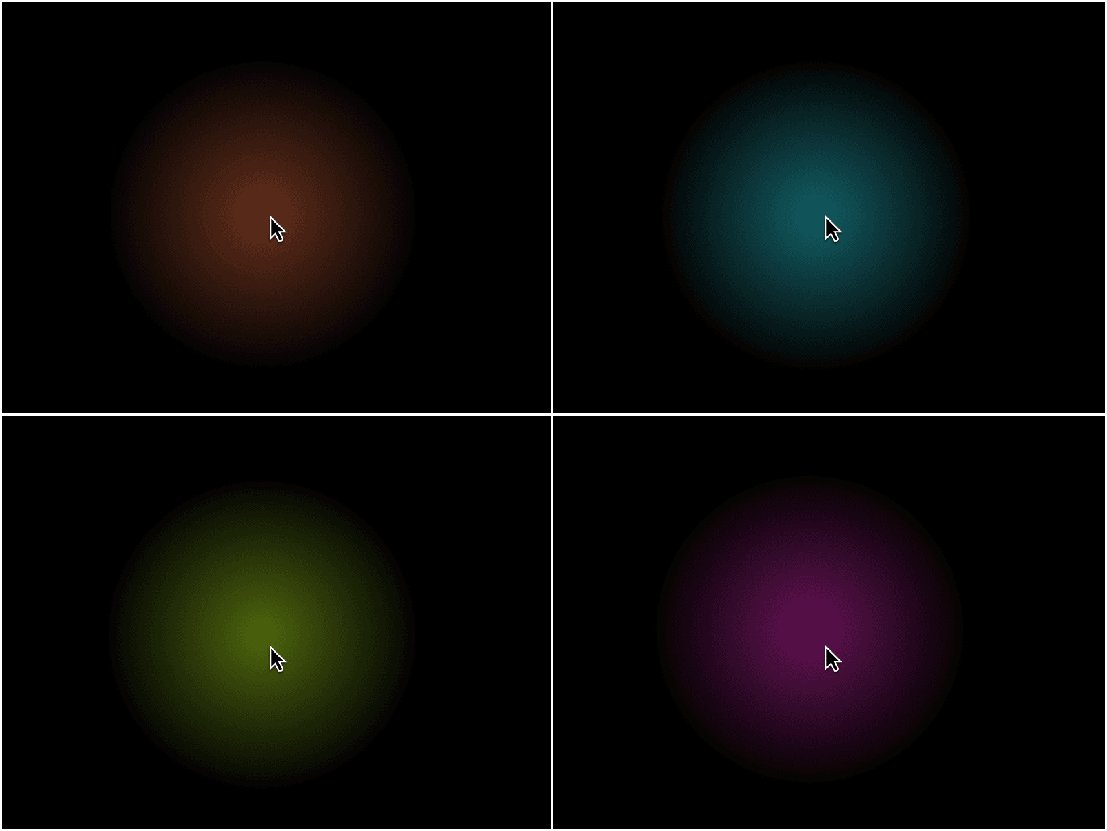
It renders a soft radial glow that follows the cursor inside whatever stack/frame it's placed in.
Customization
಄ Color - set the glow's core hue;
಄ Radius - control how far the glow spreads (50–1000px);
಄ Intensity - set peak brightness (0–1);
಄ Falloff - control how softly the edge fades out (10–100%).
Interaction-safe by design
಄ Never blocks clicks, hovers, or links underneath it;
಄ Text stays fully selectable through the glow;
಄ Hides automatically when navigating by keyboard, so it never covers a focus ring (Tab key);
಄ Skips itself on touch devices, since there's no persistent cursor to follow.