About Stroke Hover
About this Component
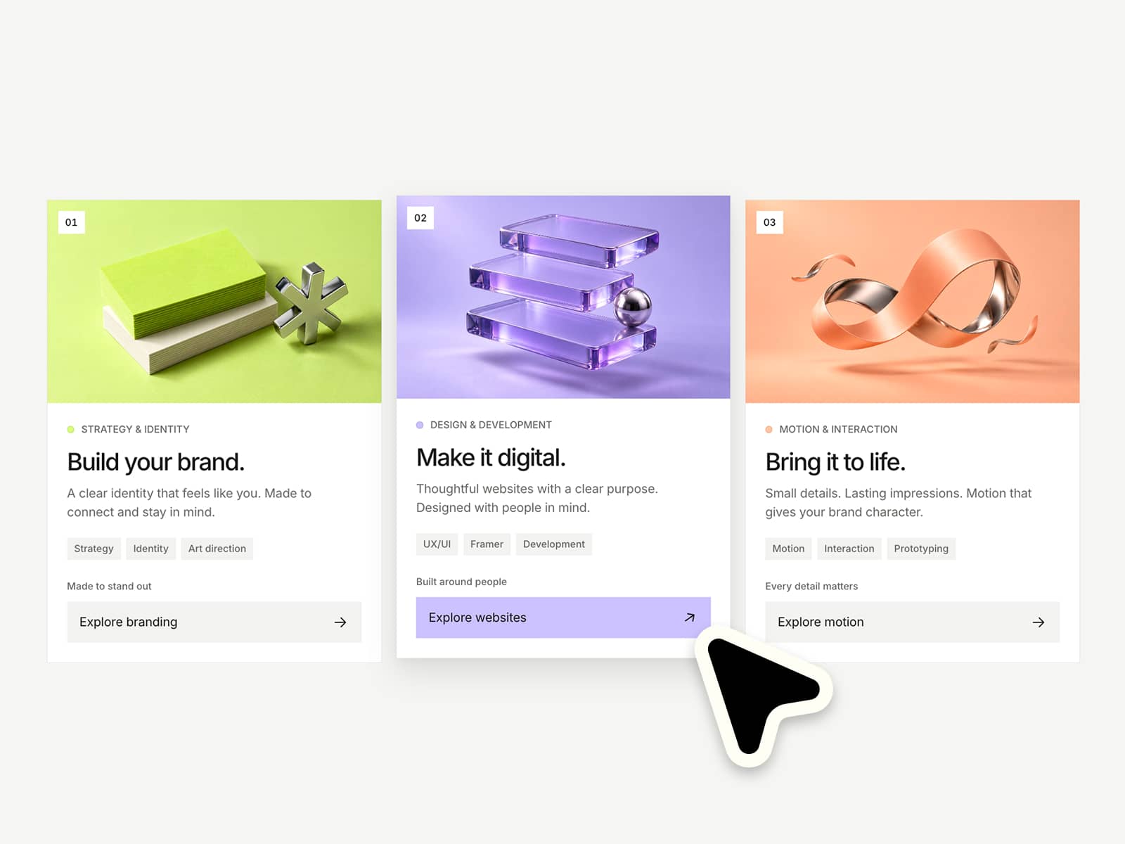
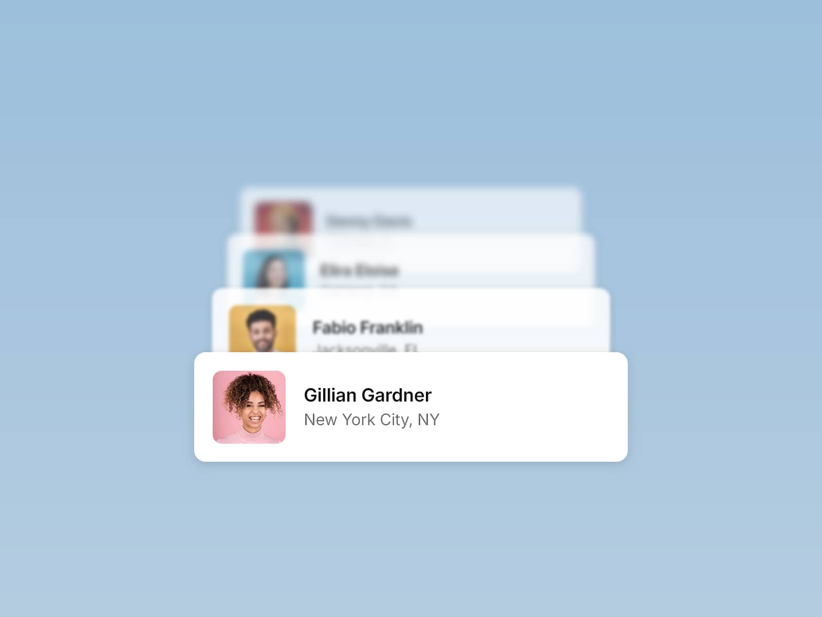
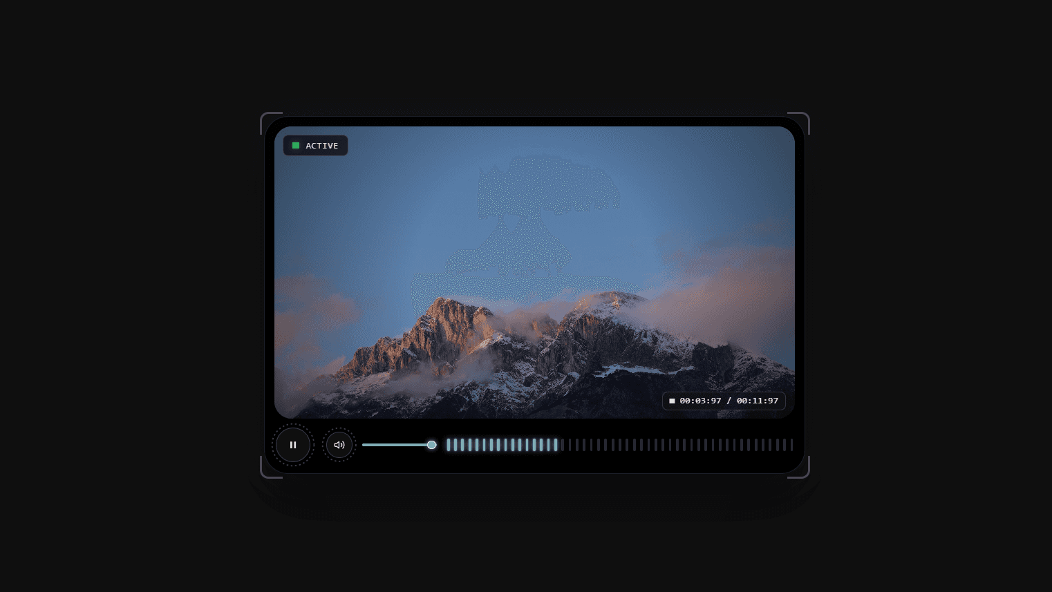
Stroke Hover is a fully responsive, fully customizable card component. You can adjust everything—from layout, texts, images, and videos, hover effects, animation speed, and types—making it perfect for interactive, dynamic UI elements.
Properties
/ Media
Media Type
Media Sourge
Media URL
/ Card
Link
Link Target
Card Radius
Card Padding
/ Stroke
Stroke Color 1
Stroke Color 2
Blend Modes
Easing
/ Text
Heading Content
Subheading Content
Color
Alignment
Easing
Gap
Font
/ Blur
Color
Height
Amount
/ Link Button
Radius
Fill Color
BG Blur Amount
Icon Color
Icon Size
Icon Type
Use cases
Interactive cards · Portfolio previews · Product showcases · Hero sections · Micro-interactions · UI animations · Experimental layouts · Visual storytelling
Refund Policy
All sales of digital products are final and non-refundable.
If you have any questions about the product, please contact me at info@carontefrancesco.it before completing your purchase. I’m happy to help.