About Tilt Card Group
Overview
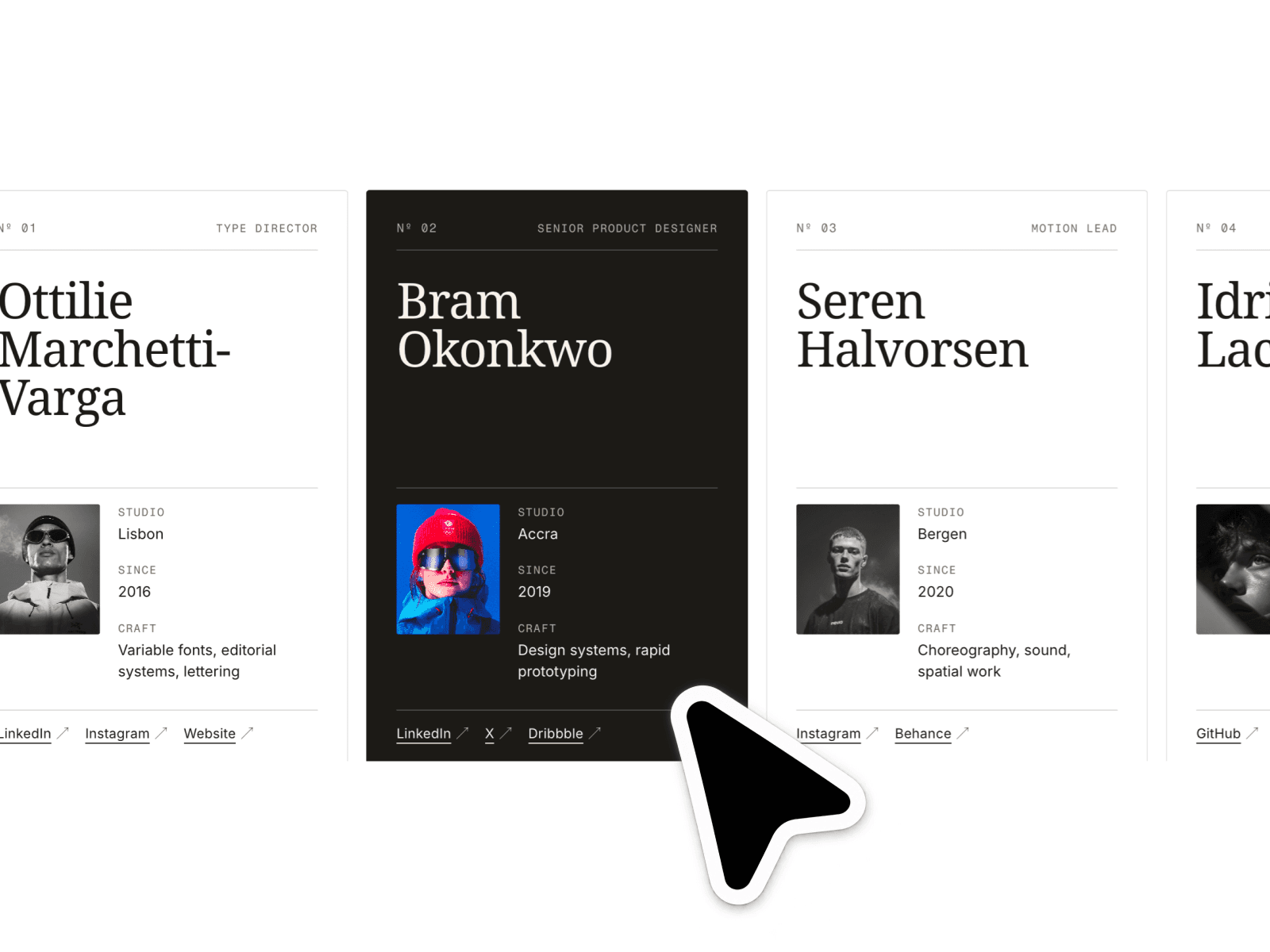
Tilt Card is a fully interactive, deeply customizable card component built for Framer. Each card responds to the user's cursor with a smooth 3D tilt, a shimmer highlight that follows the mouse, and a soft color glow that pulses on hover — all driven by native browser APIs with no external dependencies.
The component ships with three pre-built card styles out of the box — Violet, Rose, and Teal — but every visual property is exposed in the properties panel, so you can make it match any brand in minutes.
What's Included
Unlimited cards — add or remove cards freely from the properties panel. No cap.
3D tilt interaction with configurable angle, perspective, and return spring
Per-card shimmer layer that tracks the cursor position in real time
Hover glare, mesh gradient layer, noise texture, and colored box shadow — all individually toggleable
Four custom cursor styles per card: Plus, Asterisk, Circle, and Square — plus the Default browser cursor
Cursor follows the mouse with a smooth, weighted lag (adjustable per card)
Logo block that accepts either a text glyph or a custom image — never both simultaneously
Clickable arrow button with a URL link field per card
Fully fluid layout — cards shrink gracefully on small screens and grow vertically to fit long content
Every property grouped into labelled sections with plain-language descriptions so you always know what you're editing