About folio - saki
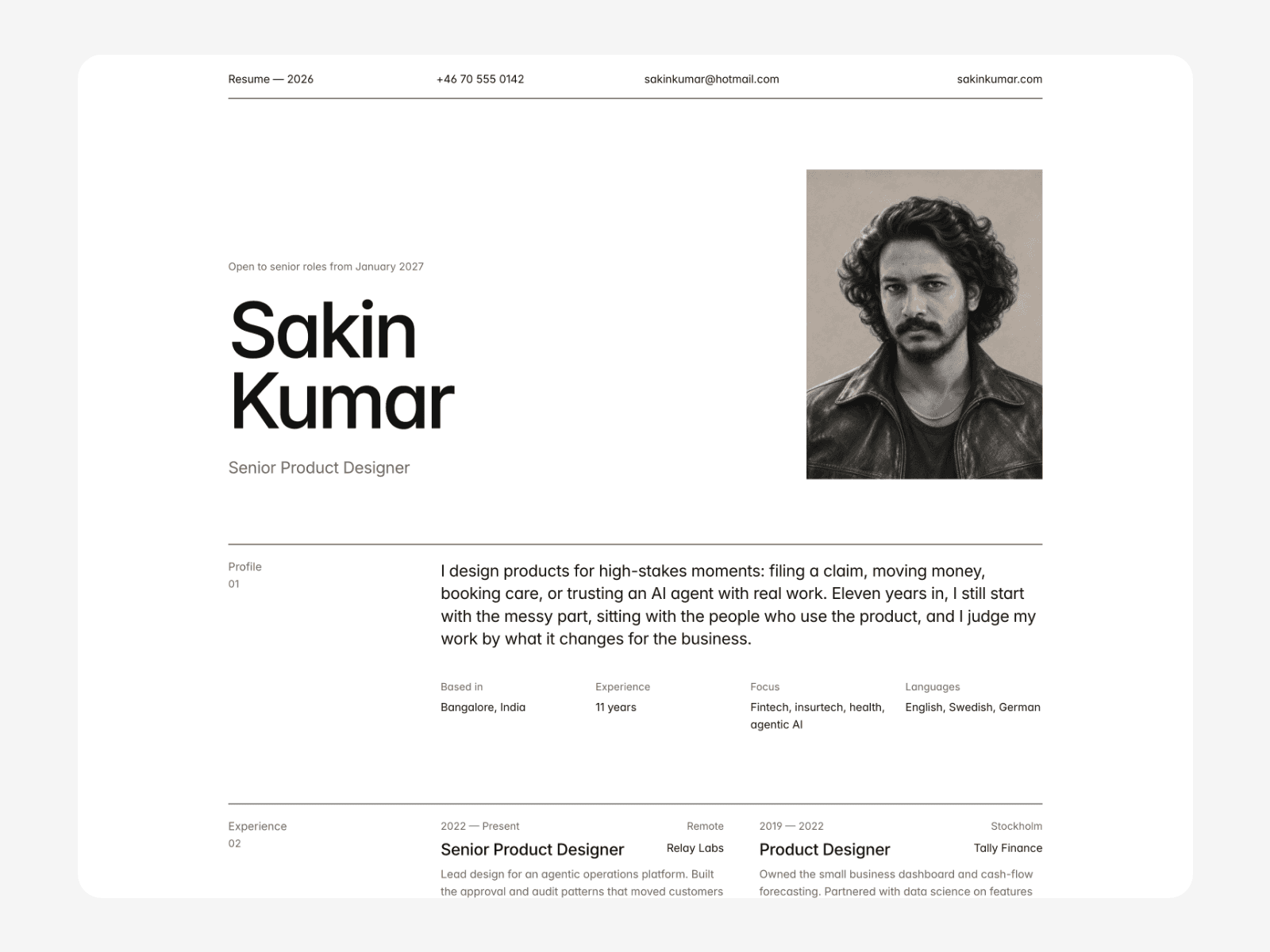
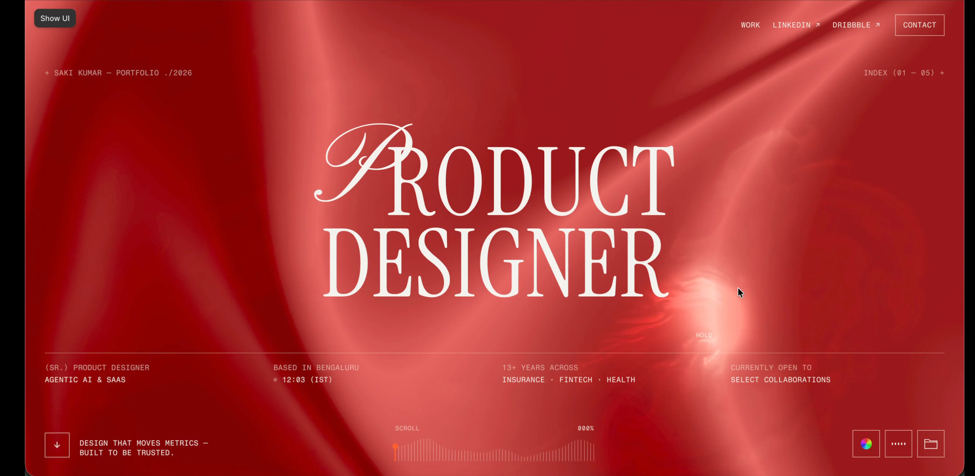
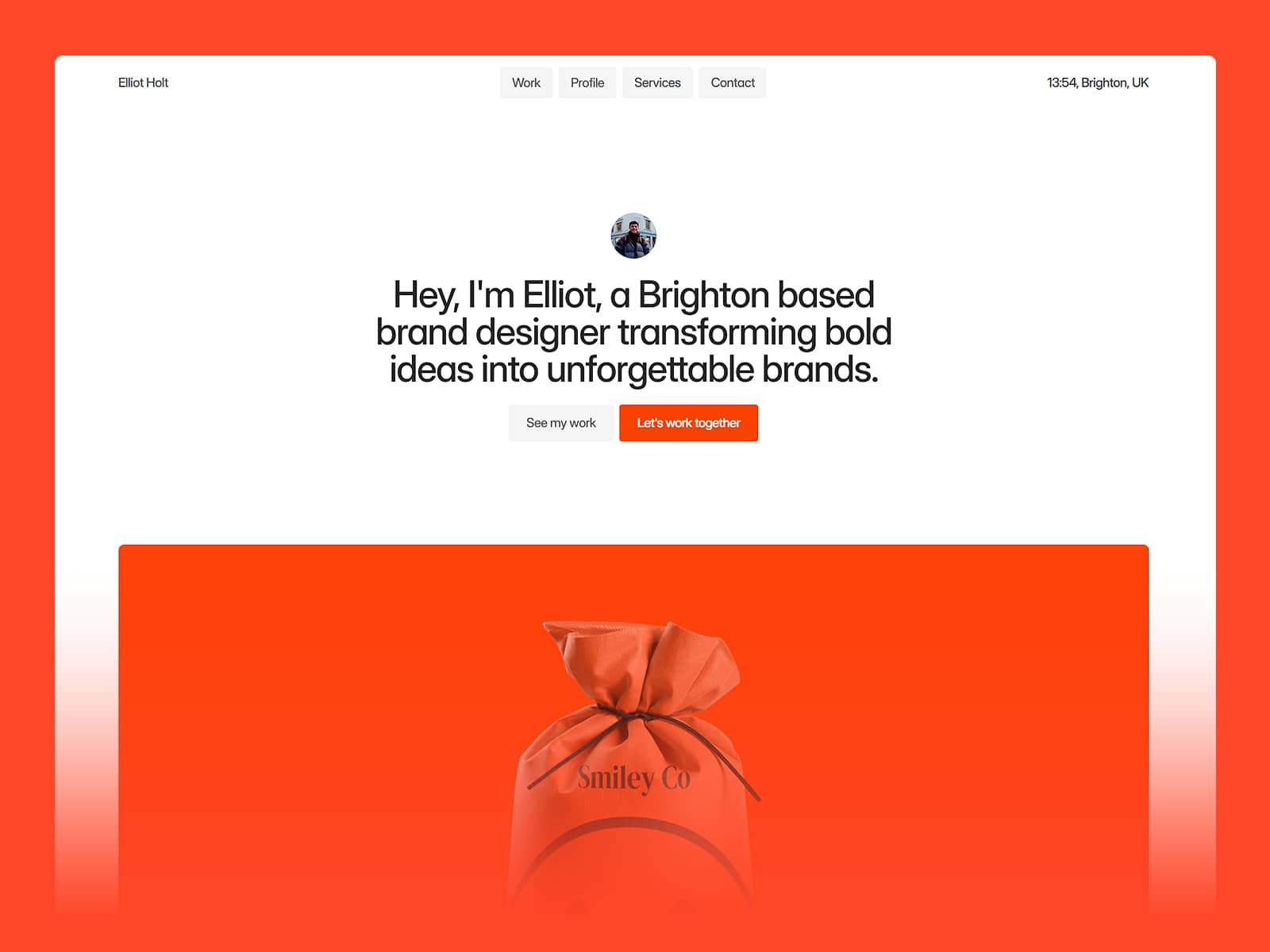
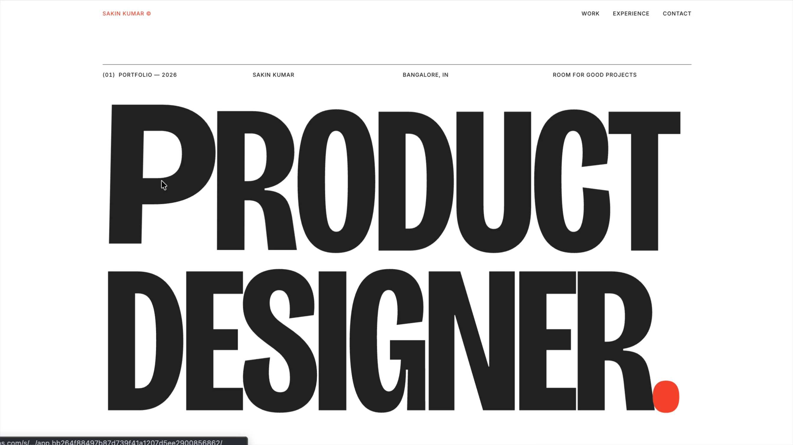
Saki Folio is a minimal portfolio template for product designers, UX designers and UI designers who want their work to speak, not their website. It’s built on the ideas of Swiss design: a strict grid, strong typography, generous white space and one sharp accent colour. It looks calm, confident and deliberate.
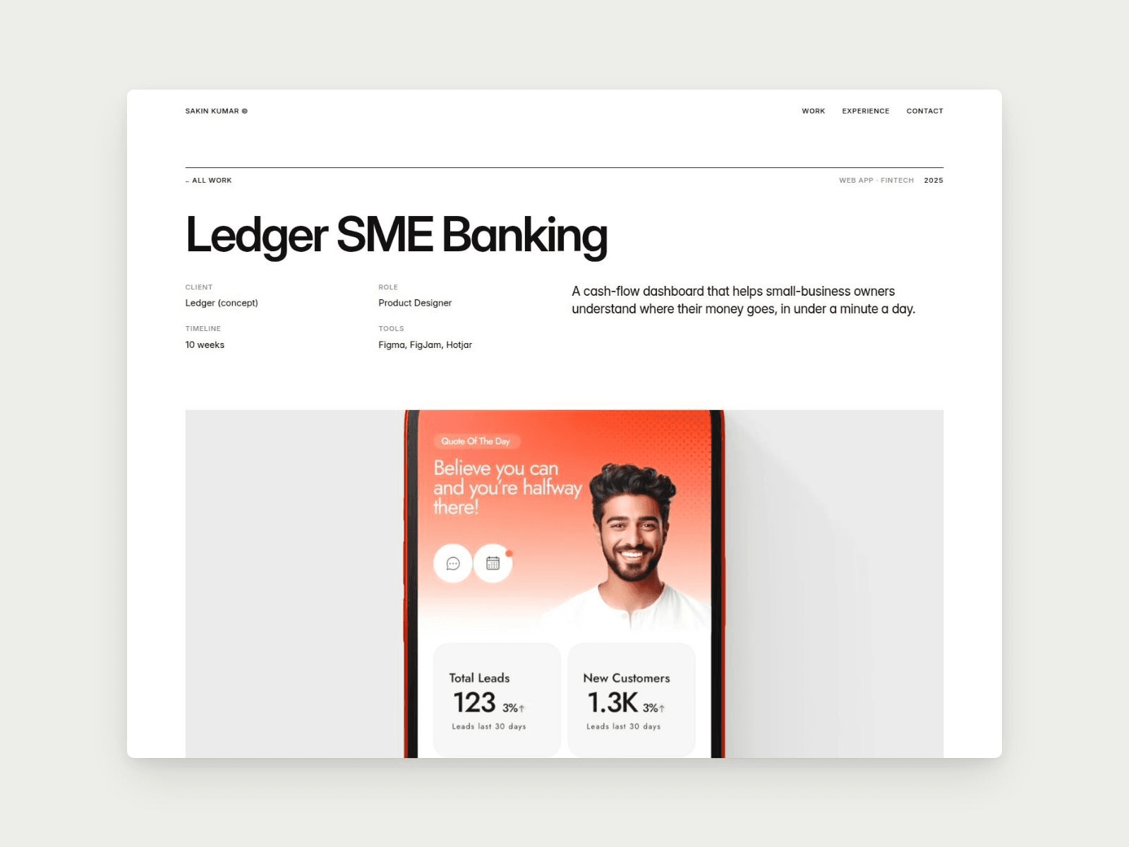
The home page has just three sections, so you can launch in an afternoon. Each project gets a structured case-study page that walks recruiters and clients through your process, from problem to outcome.
What’s inside
Kinetic headline. A custom display headline whose letters swell, widen and lean toward the cursor, with a staggered reveal on load. Weight, width, reach and colour are all editable.
Three-section home page:
Intro: big display type, portrait and a one-line intro
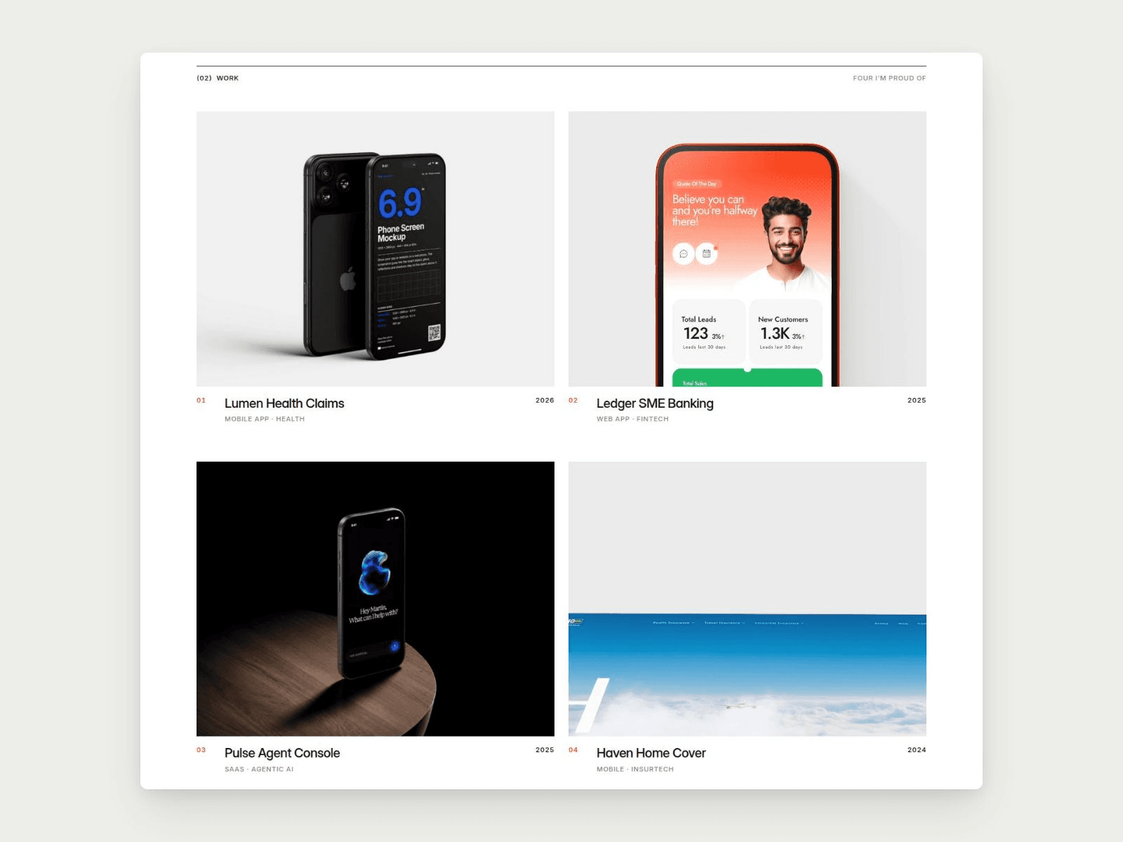
Selected Work: a 2×2 project grid
Experience & Contact: clean timeline rows and a simple sign-off
Images, GIFs or video. Each project cover can be a still, a GIF or a looping muted video. Add a video file in the CMS and it replaces the image automatically.
UX case study page with 8 sections:
Problem
Solution
Process & Workaround
User Journey
Wireframe → Visual Design (side by side)
Prototype (image or video)
Outcome with three key metrics
Next project link
CMS powered. Add, reorder and edit projects without touching the layout. Covers, galleries, metrics, roles, tools and timelines are all fields.
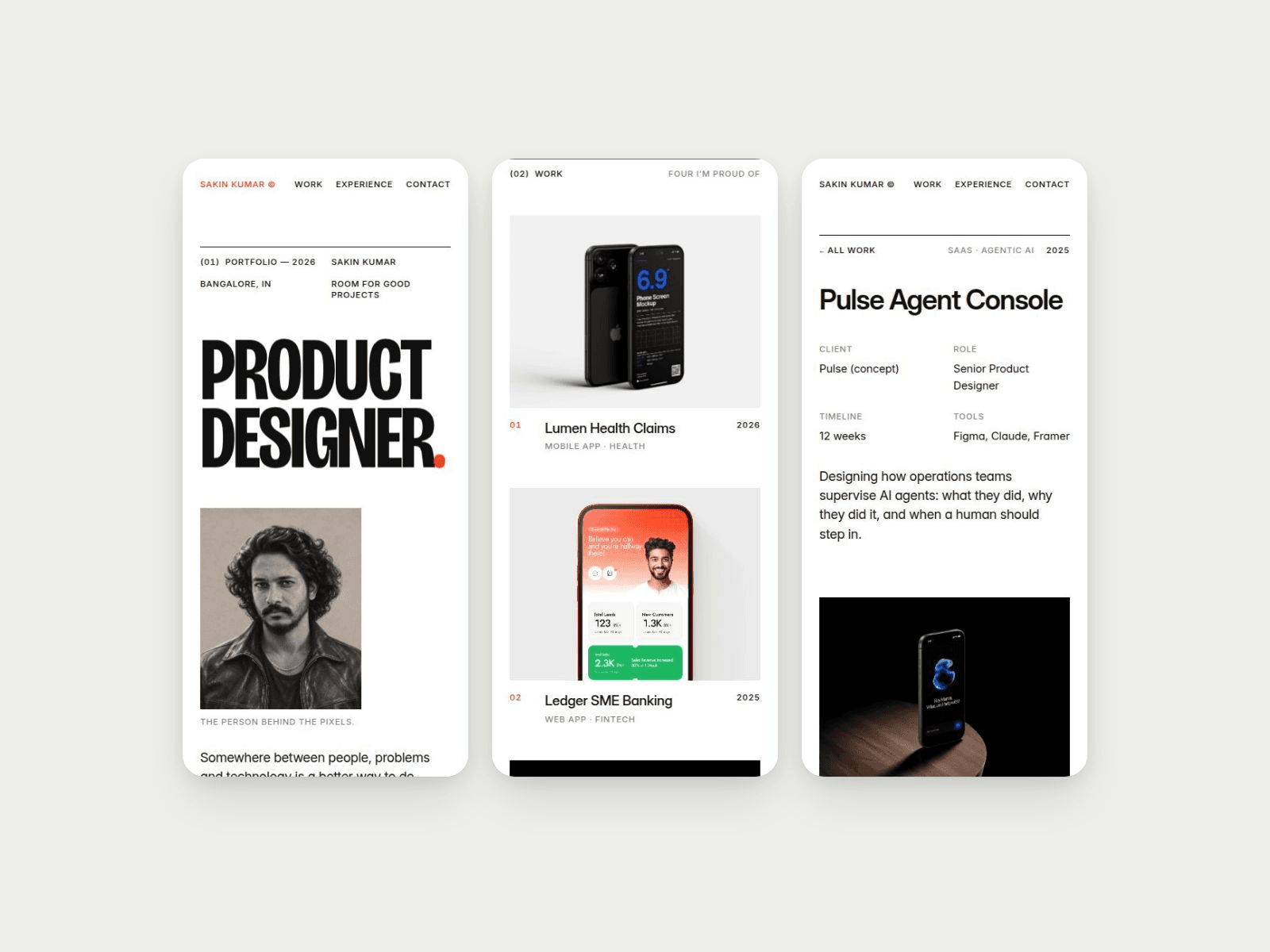
Fully responsive. Hand-tuned desktop, tablet and mobile layouts.
Two colours, two fonts. Ink, white and signal red. Bricolage Grotesque for display, Inter for everything else. Every colour and text style is a reusable style, so you can rebrand in minutes.
Clean structure. A shared top bar and footer, a sticky top bar, smooth scrolling between sections, hover states throughout, and support for reduced motion.
Perfect for: product designers, UX/UI designers, design leads, freelancers and anyone job-hunting who needs a sharp, credible portfolio with real case studies.
More work: https://sakinkumar.com