Gridstack 2 — Portfolio Template
The personal template where every stack clicks into place.


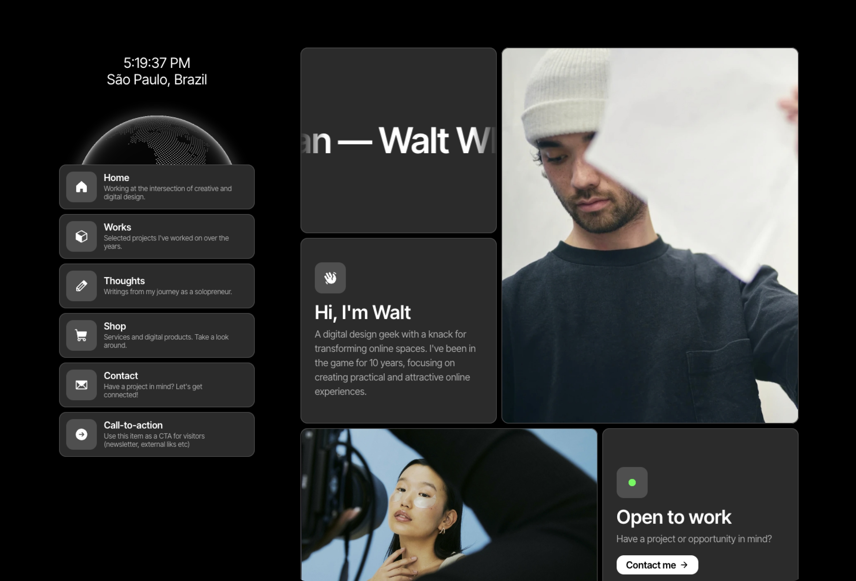
Perfectly pieced together for both desktop and mobile, every corner of your personal site finds its home in Gridstack.
Fit in to stand out
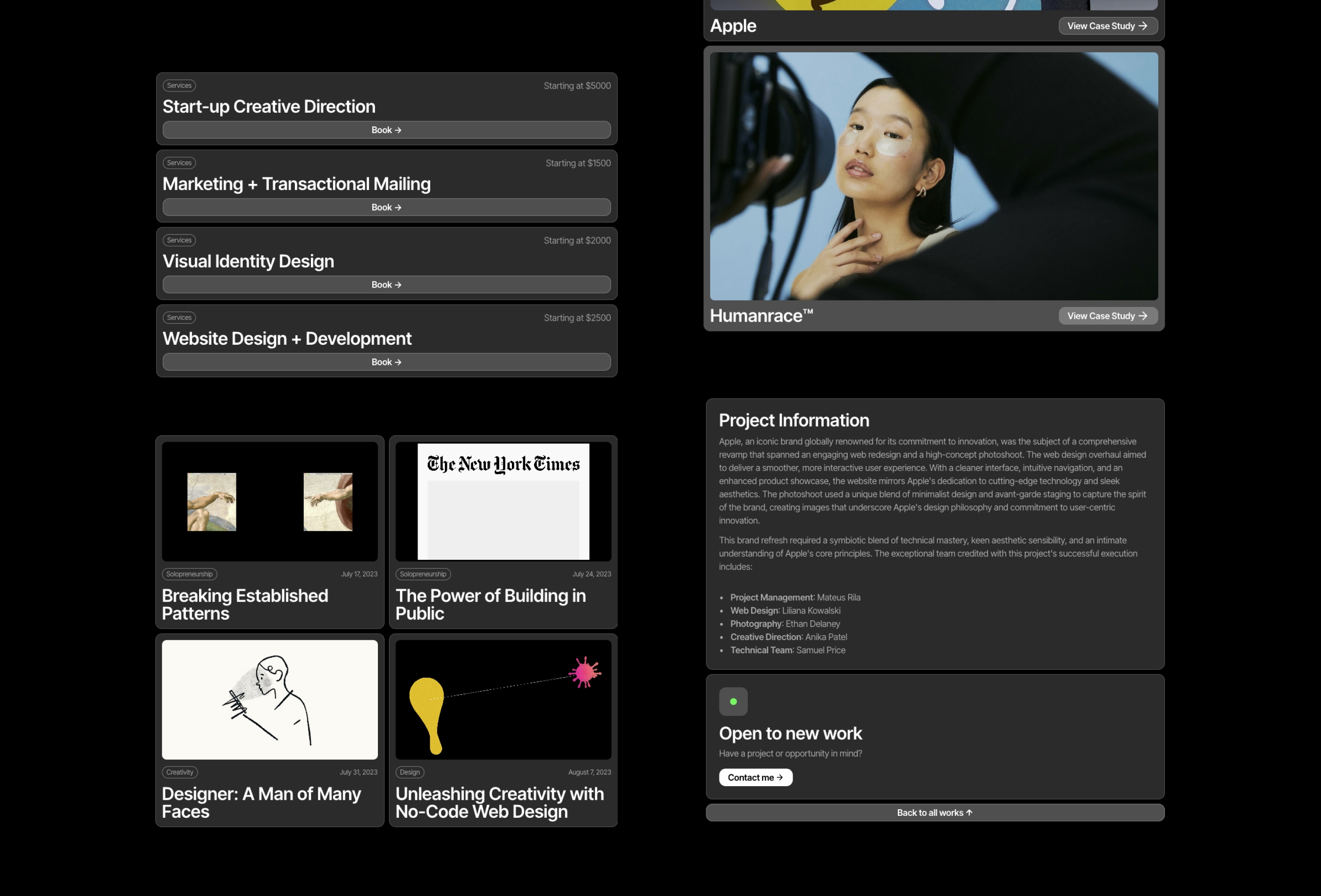
Gridstack is about fitting cards together. It was designed specifically for professionals including designers, solopreneurs, and UX/Product specialists. The template encompasses nine purposeful pages, spaning across Home, Works (portfolio), Thoughts (blog), Shop (for digital products and services), and a Contact.
Visually stunning
Championing the art of subtlety, Gridstack comes with an all-black palette, rounded corners, and pixel-perfect sans serif typography. And yes, styling is no more a chore — the built-in shared features make tweaking color and fonts a breeze. Components and variants are at your fingertips whenever needed.
Fit perfectly, no matter the device
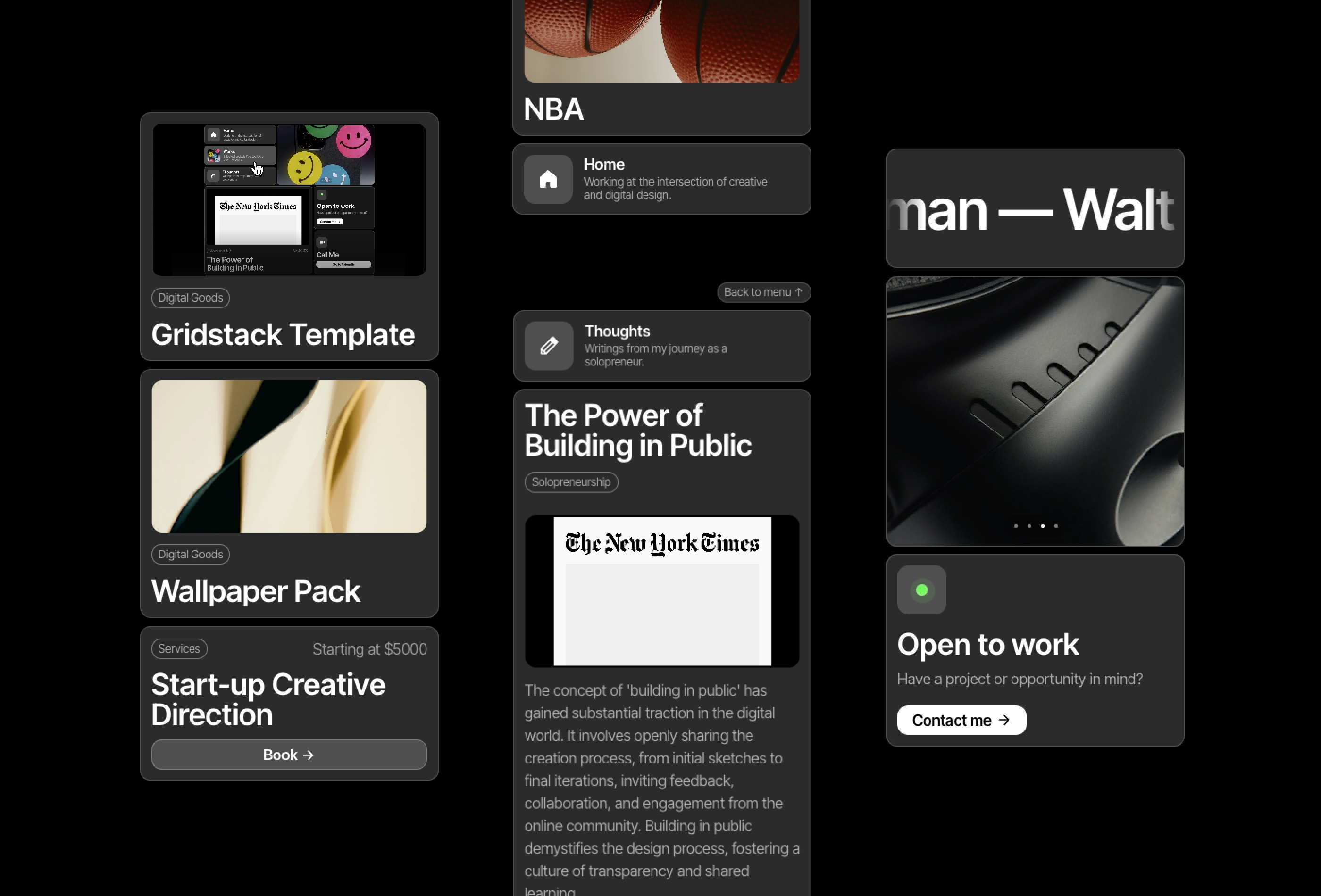
Gridstack was made with mobile first and resposiveness in mind. The bento-style grid adpats seamlessly, as the navigation cards stack right in with the content on mobile. No more awkard overlaying menus.
Vivid Animations and Embedded Features
With Gridstack, expect clean and consistent animations between sections, and let customizable tickers and slideshows breathe life into your pages.
Leveraging Framer's CMS for Dynamic Content
Whether it's your thought-provoking blogs, captivating works, or enticing shop collections, Gridstack's full integration with Framer's CMS ensures your content shines in its best light, always.
Perfect for Your Niche
Personal websites
Design portfolios
Digital product stores
UX/Product showcases
Solopreneur ventures
Features
Become a creator today
Submit a template or plugin, get featured, and get paid – all in just a few clicks.
Connelly Rader
Building Framer Templates in my free time. Framer Expert & Contra Top Independent.
9 Templates

Favorit × Frame
Framer Expert Duo Crafting Client Sites and Minimal Templates With a Premium Touch.
8 Templates
1 Plugin

ena supply
Building visually striking, and highly functional Framer sites.
19 Templates

LottieFiles
1 Plugin

LottieFiles
1 Plugin

Clonify
An ever-growing design library of stunning sections and templates.
27 Templates
1 Plugin


