Anastasia KExpert

Creating Framer websites for hospitality, wellness, and culture brands. Clarity, restraint, intentional detail.
Built it for photographers. Turns out it works for anyone whose portfolio is just images.
Product and still-life shooters. Set designers. 3D artists. Anyone whose work doesn't need a case study wrapped around it — it needs to be seen large, in order, without interruption.
Sorenvale, on the marketplace 👇
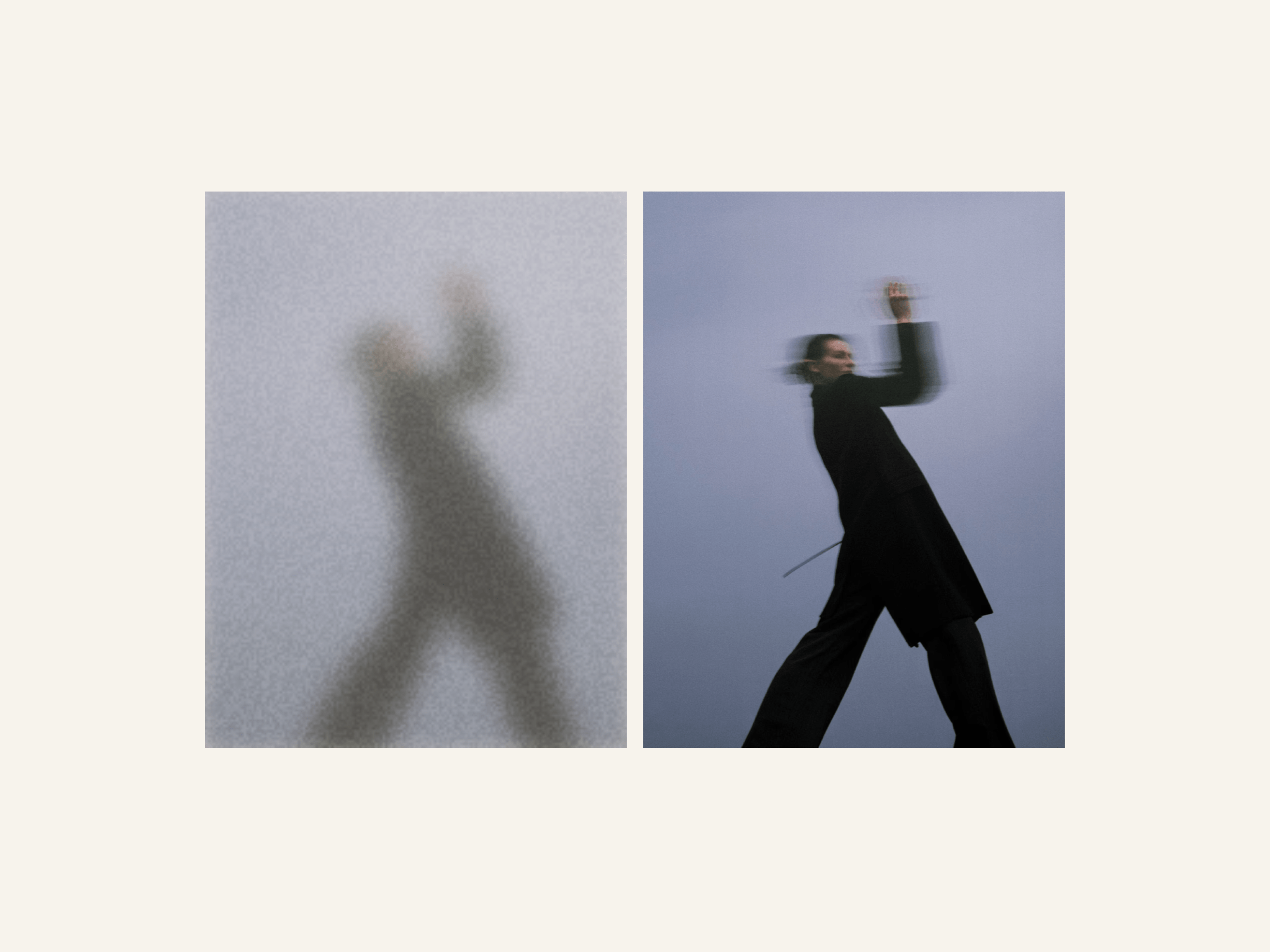
Sorenvale is built around one interaction: move through the project menu and let the images come to you.
Magnetic Images: project images appear and crossfade as you move through the menu, turning navigation into part of the portfolio itself.
Now on the marketplace 👇
A new template is currently in progress. This time, I’m exploring more interactive possibilities for a photographer’s portfolio, following my recent work on a portfolio for a set design studio.
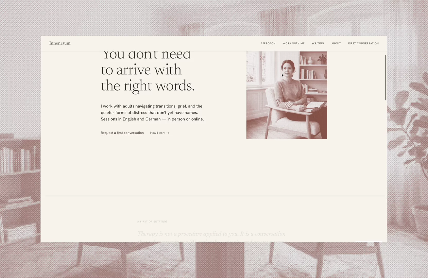
Innenraum — website template for therapists and coaches. Editorial structure, fully written demo content, themed Cal.com booking, grain-reveal images.
Innenraum is live!
A template for therapists, counsellors, and coaches: 12 pages, two CMS collections with fully written demo content (real essays), and prepared EU legal pages.
It's not only a visual layout — the structure itself is part of the template. Sections are sequenced the way trust is built with a client: approach before fees, honest answers before the booking button. Even with every word rewritten, the structure keeps working.
Some things under the hood: a Cal.com booking embed themed through CSS variables, so the calendar inherits the template's tokens — light and dark. The Grain Reveal code component — images resolve from film grain instead of fading. Five color styles with dark values prepared, a full text-style system, named layers throughout.
While building my therapy-practice template, I wanted the hero image to resolve rather than fade — the way film develops. So I made it a component.
Grain Reveal: images surface through dissolving grain and blur, settle into focus once, and stop. Made for editorial and photography sites.
Now on the marketplace 👇
While building my therapy-practice template, I wanted the hero image to resolve rather than fade — the way film develops. So I made it a component.
Grain Reveal: images surface through dissolving grain and blur, settle into focus once, and stop. Made for editorial and photography sites.
Now on the marketplace 👇
Something I noticed while building this template.
Innenraum is a site for a psychotherapy practice — no effects, no gradients, no cards sliding in from anywhere. Text, hairlines, a few photographs, one accent color. Just the essential information, set carefully.
What surprised me is how it felt to work on it. After a while I realized I was resting inside my own file. Most of what we build — and most of what I scroll past every day — is designed to stimulate. Something is always moving, glowing, asking for attention. This one just sits there quietly, and spending hours in it felt closer to reading a book than using the internet.
Now I keep wondering how far this can go. Whether a website can be as visually silent as a printed page and still work — nothing jumping at you, nothing performing.
Do you have any favorite editorial-style websites to share?
Template concept
Pace — a fitness tech concept built around quiet minimalism: clean type, generous spacing, and subtle scroll motion.