

Think back to the early days of the internet, when websites were flat and simple and mainly functioned as some sort of digital brochure. Yes, they provided information, but user engagement wasn’t the focus. Today, modern websites–especially those with 3D web design elements—do more than show information.
3D websites help engage visitors and deliver an immersive experience by tapping into multiple senses–visual, tactile, and audio. A study by Cappasity shows that 3D elements on a website can increase visitors' time on a page by up to six times. And with modern website building tools like Framer, it’s super easy to build 3D websites that increase interactions and engagement without knowing a line of code.
Here are five eye-catching 3D website examples, plus expert tips on using 3D elements in web design to help inspire your next project.
1. tinyPod
tinyPod is a device that turns your Apple Watch into a portable gadget that does everything you’d expect your phone to do–calls, music, maps, and so on. Its website, built on Framer, masterfully uses smooth zoom effects and transitions to explain the innovative product to visitors.
The homepage greets you with simple text and a cloudy sky. But as you scroll, the tinyPod drops into view, thanks to some creative use of zoom effects. Halfway down the website, the tinyPod rotates and combines with other 3D assets–like a human palm and an iPhone–to help users visualize the copy on the screen.
2. Panorama Films
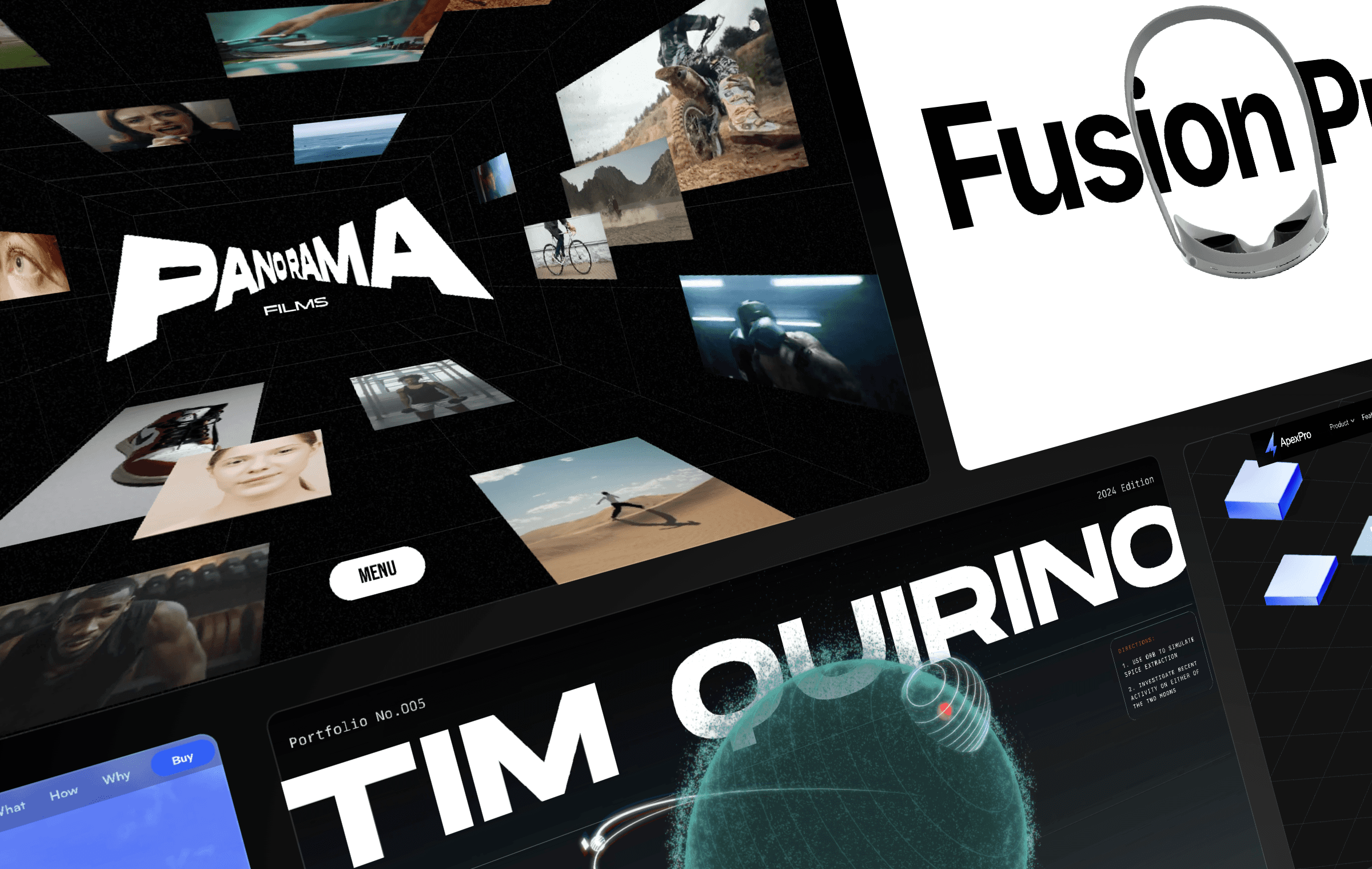
Sometimes, in web design, less is more, and Panorama Films exemplifies this. Panorama Films is a 3D website template from Framer’s library, designed by André Lacerda. The website’s layout is sleek, with a minimalistic black-and-white theme and eye-catching scroll effects, inviting the user to see what happens as they move the cursor about.
Also, on the homepage, instead of overwhelming visitors with text, this website relies on high-quality visuals to communicate that this template is meant for video producers. If you’re a designer seeking inspiration on how to use 3D website elements without compromising design clarity or user engagement, try out this Framer template to spark your creativity.
3. ApexPro
ApexPro is a 3D Framer web design template created by Future Things. This website offers a smooth scrolling experience. Notably, as you scroll into the "Real-Time Collaboration" section, the cursor changes from the usual white arrowhead to a multi-user cursor to demonstrate how ApexPro helps foster real-time collaboration.
Unlike other examples, the 3D element in this website is understated, but this subtlety can help keep visitors focused on the website’s message.
4. FFProduct
FFProduct is a Framer 3D website template designed by Sergio Lavanga for an Extended Reality (XR) device.
The first thing you’ll notice about the website’s design is its Apple-inspired aesthetics–a minimalist interface and clean visuals that keep the focus on the product. As you explore the site, you’ll see objects move, and colors shift dynamically to make it more interesting. This interactive scrolling keeps users engaged and improves their experience on the website.
5. Tim Quirino
As far as portfolio websites go, this one by Tim Quirino will have you engaged from the moment you land on it. Inspired by the movie Dune, Tim showcases his years of web design experience by merging storytelling with 3D visuals to create a website with sci-fi aesthetics.
The first thing you’ll notice is the giant rotating planet orbited by two moons. When you move your cursor, you’ll see that your usual arrowhead design has become a planetary body. You can cause an eclipse on your cursor by moving it between the planet and one of the moons orbiting it.
5 tips on how to add 3D elements to your website
Adding 3D designs to your website may seem like a daunting task, especially if you don’t have coding experience.
But it shouldn’t be. Framer already makes it really easy to add 3D objects to your website. Here are five tips to keep in mind when building your 3D website.
1. Implement loading screens
One of the biggest challenges for 3D websites is balancing loading times with user experience. If your 3D design takes more than ten seconds to load—especially for users with slower connections—consider adding a loading screen. Loading screens keep your users engaged while your 3D assets load asynchronously in the background.
2. Prioritize interactivity
Visitors always remember websites they interact with in some way. The factor behind this is something called Cognitive Load, which is the mental effort it takes a user to do things on your website.
When you strike the right Cognitive Load balance and get your users to participate in your website by clicking, dragging or even just scrolling, you engage multiple senses. And the more senses engaged, the more likely the brain is to remember the experience.
3. Have a fall-back version for older devices and browsers
It’s natural to want every visitor to see your stunning 3D animations. But in reality, not all devices can handle advanced features. If you build your website without these devices in mind, it might crash before a single frame is rendered. As a solution, always include a fallback version of your site without 3D elements to accommodate devices that can’t render them. Use this library, which classifies the GPU in common device types based on their 3D rendering capabilities, as a guide as you design your website.
You should also test your design across multiple devices and viewports to ensure it functions seamlessly, especially on mobile devices where performance limitations are more noticeable. To optimize for different sizes, use an event listener that adjusts object placements and depth based on the device’s viewport. This ensures your 3D design maintains its impact, no matter where it’s viewed.
4. Use minimal aesthetics
Performance issues can limit how 3D design elements render on your website. A 3D object with lots of detail will take more time to load across devices, slowing down overall website load time.
When possible, opt for minimalistic designs that will allow your website to run smoothly and provide a better experience for your users.
5. Use the right tools
To create engaging 3D website designs, you need the right tools in your arsenal. The right 3D design tool allows you to create engaging 3D assets without sacrificing website performance or spending a lot of time coding. One popular tool within the design community is Spline. With Spline, you can create 3D objects without coding skills and then add the 3D objects to your website using Framer.
Build your interactive 3D websites on Framer
Framer allows you to build websites that do more than share information. With stunning templates, effects and plugins, you can create modern, responsive 3D websites without any coding skills. Whether you’re building your portfolio website or looking for new ways to impress your clients with 3D designs, Framer is the perfect tool for creating interactive websites that engage and delight visitors.
Use the examples in this article as inspiration for your next project, and if you want to see even more creative web designs, visit our template gallery to explore our collection of 3D templates. And when you’re ready, sign up to see how easy it is to start building websites that leave a lasting impression.

Step into the future of design
Step into the future of design
Step into the future of design
Join thousands using Framer to build high-performing websites fast.
Join thousands using Framer to build high-performing websites fast.
Join thousands using Framer to build high-performing websites fast.

