

You have a collection of your finest work that showcases your achievement and talents. Now, to get it noticed by potential clients, you need a portfolio that genuinely stands out.
Creating an online portfolio is crucial for any freelancer, designer, or agency. In a sea of skilled creatives, your portfolio needs to be distinctive, engaging, and reflective of your personal style. It should highlight what sets you apart and give potential clients a glimpse of what it’s like to work with you.
To spark your creativity and inspire your own projects, we’ve rounded up 15 of the most impressive portfolio website examples made in Framer. Explore how they built their websites and the unique experiences they’ve crafted for their visitors to make their sites memorable and delightful.
1. Meris Imamovic — Personal Site

Meris Imamovic’s personal site is a masterclass in minimalistic, neat design. The simple layout makes it easy for visitors to navigate his portfolio. Smooth transitions and interactive elements add a dynamic touch, making the browsing experience engaging and intuitive without overwhelming the user.
2. Claudio Guglieri

Claudio Guglieri’s portfolio website showcases the power of refined simplicity in design. The header section displays his best work with an interactive carousel. The uncluttered layout throughout the site also ensures his work and achievements are the focal points. This approach highlights his expertise in digital product design and creates an inviting, memorable user experience.
3. aimpie.

aimpie’s website captures attention with its bold and vibrant design, reflecting the agency’s creativity and innovation. The dynamic animations and interactive elements provide an immersive experience, engaging visitors from the moment they land on the page. The use of large, high-quality visuals combined with a well-organized layout showcases their diverse talents effectively.
4. Antoine Enault

Antoine Enault’s website stands out with its playful and interactive header, where letters move dynamically when your mouse hovers, immediately capturing the visitor’s interest. The overall design is clean and minimalist, making his stunning visual and brand identity work shine. This combination of creativity and usability perfectly reflects Antoine’s expertise in graphic design and visual identities.
5. Analogue Agency

Analogue Agency’s portfolio captivates visitors with its use of high-quality photos and videos, showcasing their design portfolio in a dynamic and engaging manner. The site uses a unique navigation bar and playful transitions between pages, which makes the browsing experience intuitive and immersive. The layout is clean and professional, with its visual contents taking center stage.
6. Jessica Wells Portfolio

Jessica Wells’ portfolio website is a vibrant showcase of her creative expertise and dynamic personality. The use of horizontal scrolling to display her work is both distinct and engaging — a refreshing departure from traditional vertical layouts. Smooth transitions between sections enhance the user experience, making navigation feel fluid and intuitive. The overall design is sleek and modern, highlighting Jessica’s impressive portfolio and award-winning work.
7. SEB® Portfolio

Sebastián Martínez’s portfolio website is a visually stunning showcase of his diverse design work. He uses high-quality images that you can move around the page to prominently feature his creations, providing a clear and engaging view of his portfolio. The site also includes a captivating loading state with bold text effects that automatically draw visitors’ attention.
8. Vishal Krishna

Vishal Krishna’s portfolio website is a lively and engaging showcase of his design talent. A cool loading state creates a sense of anticipation, drawing visitors in from the start. Once loaded, the site impresses with its bold and fun color scheme, featuring eye-catching hues. Hover effects in the portfolio section reveal snapshots of his work when the mouse moves over the names of brands he has collaborated with, adding an interactive element to the website.
9. Elly Hsieh

Elly Hsieh’s portfolio website perfectly blends aesthetics and functionality with a clean web design. This approach gives her work as a product designer the spotlight it deserves. Subtle animations and smooth transitions add a touch of interactivity without distracting from the content. This design not only highlights Elly’s skills but also creates an intuitive and pleasant browsing experience for visitors.
10. Diana Lu

Diana Lu’s website is a delightful mix of creativity and usability, showcasing her skills as an interaction designer. The impressive use of horizontal scroll throughout the site offers a unique and fun browsing experience. Quirky graphics paired with charming animations add a playful touch, reflecting her artistic personality. This combination of innovative scrolling, cute visuals, and smooth animations makes her portfolio both memorable and enjoyable to explore.
11. Chris Lund

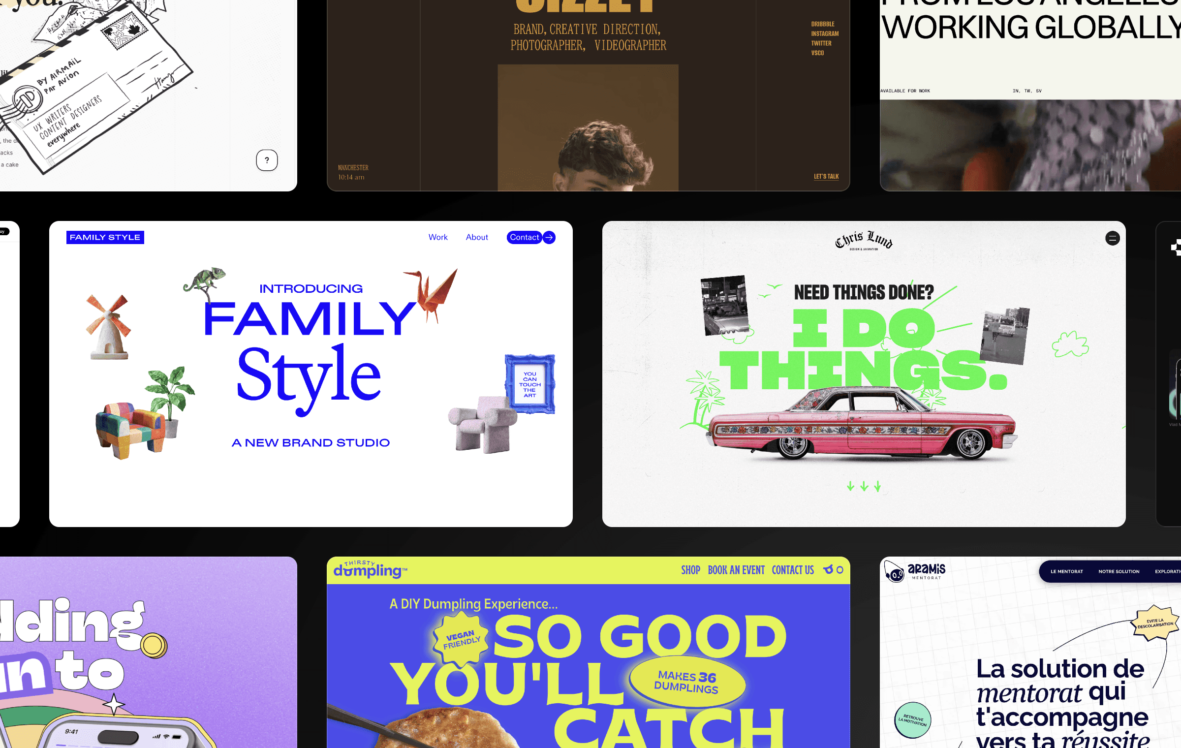
Chris Lund’s portfolio website captivates with its striking graphics and mixed typography styles. Cool animations add a layer of interactivity, making the site feel lively and interactive. This use of bold design elements and smooth animations effectively highlights Chris’s creative skills and makes his portfolio stand out.
12. ashcamp

Agustín Schelstraete’s portfolio website, ashcamp, makes a powerful first impression with its bold header and striking typography. The clean and modern design ensures that the focus remains on Agustín’s impressive work, while the lively text animations enhance the overall browsing experience, demonstrating his creativity and design expertise.
13. Crazy Creative

Crazy Creative’s portfolio website, operated by Nick Jacoy, is playful showcase of his design services. The use of fun bold colors throughout the site creates an energetic and engaging atmosphere. The clean layout and intuitive navigation makes it easy for visitors to explore the range of UI/UX and branding services they offer.
14. Alejandro Mejias

Alejandro Mejias’s website beautifully showcases his diverse design portfolio, reflecting his journey and creative ethos. The high-quality visuals and thoughtful project descriptions provide deep insight into Ale’s experience and design approach. The overall aesthetic is professional yet inviting, making it an excellent platform to highlight his Venezuelan-Australian background and his work based in Melbourne.
15. Jon Hanlan

Jon Hanlan’s personal site is a lively and engaging showcase of his talent as an illustrator and artist. The use of vibrant colors throughout the website immediately captures attention and displays his artistic energy. His portfolio is formatted in a unique grid format, allowing visitors to easily explore his diverse work. This layout, combined with eye-catching visuals, brings Jon's imaginative worlds to life, making his website a delightful and inspiring experience.
Build a standout online portfolio with Framer
Framer makes it easy to create stunning, interactive, and responsive websites without needing any coding knowledge. It’s the perfect tool to build an eye-catching online portfolio that showcases your unique talents and attracts potential clients.
With Framer’s intuitive design interface, you can bring your creative ideas to life easily. Whether you start with a template or create something from scratch, you can customize every element to reflect your personal style and the quality of your work. The result? A professional, engaging portfolio that’s sure to wow your audience.
Need some inspiration? Check out our gallery of successful portfolio websites built with Framer. And if you haven’t already, sign up for a Framer account and start crafting your own impressive portfolio today.
Creating an online portfolio is crucial for any freelancer, designer, or agency. In a sea of skilled creatives, your portfolio needs to be distinctive, engaging, and reflective of your personal style. It should highlight what sets you apart and give potential clients a glimpse of what it’s like to work with you.
To spark your creativity and inspire your own projects, we’ve rounded up 15 of the most impressive portfolio website examples made in Framer. Explore how they built their websites and the unique experiences they’ve crafted for their visitors to make their sites memorable and delightful.
1. Meris Imamovic — Personal Site

Meris Imamovic’s personal site is a masterclass in minimalistic, neat design. The simple layout makes it easy for visitors to navigate his portfolio. Smooth transitions and interactive elements add a dynamic touch, making the browsing experience engaging and intuitive without overwhelming the user.
2. Claudio Guglieri

Claudio Guglieri’s portfolio website showcases the power of refined simplicity in design. The header section displays his best work with an interactive carousel. The uncluttered layout throughout the site also ensures his work and achievements are the focal points. This approach highlights his expertise in digital product design and creates an inviting, memorable user experience.
3. aimpie.

aimpie’s website captures attention with its bold and vibrant design, reflecting the agency’s creativity and innovation. The dynamic animations and interactive elements provide an immersive experience, engaging visitors from the moment they land on the page. The use of large, high-quality visuals combined with a well-organized layout showcases their diverse talents effectively.
4. Antoine Enault

Antoine Enault’s website stands out with its playful and interactive header, where letters move dynamically when your mouse hovers, immediately capturing the visitor’s interest. The overall design is clean and minimalist, making his stunning visual and brand identity work shine. This combination of creativity and usability perfectly reflects Antoine’s expertise in graphic design and visual identities.
5. Analogue Agency

Analogue Agency’s portfolio captivates visitors with its use of high-quality photos and videos, showcasing their design portfolio in a dynamic and engaging manner. The site uses a unique navigation bar and playful transitions between pages, which makes the browsing experience intuitive and immersive. The layout is clean and professional, with its visual contents taking center stage.
6. Jessica Wells Portfolio

Jessica Wells’ portfolio website is a vibrant showcase of her creative expertise and dynamic personality. The use of horizontal scrolling to display her work is both distinct and engaging — a refreshing departure from traditional vertical layouts. Smooth transitions between sections enhance the user experience, making navigation feel fluid and intuitive. The overall design is sleek and modern, highlighting Jessica’s impressive portfolio and award-winning work.
7. SEB® Portfolio

Sebastián Martínez’s portfolio website is a visually stunning showcase of his diverse design work. He uses high-quality images that you can move around the page to prominently feature his creations, providing a clear and engaging view of his portfolio. The site also includes a captivating loading state with bold text effects that automatically draw visitors’ attention.
8. Vishal Krishna

Vishal Krishna’s portfolio website is a lively and engaging showcase of his design talent. A cool loading state creates a sense of anticipation, drawing visitors in from the start. Once loaded, the site impresses with its bold and fun color scheme, featuring eye-catching hues. Hover effects in the portfolio section reveal snapshots of his work when the mouse moves over the names of brands he has collaborated with, adding an interactive element to the website.
9. Elly Hsieh

Elly Hsieh’s portfolio website perfectly blends aesthetics and functionality with a clean web design. This approach gives her work as a product designer the spotlight it deserves. Subtle animations and smooth transitions add a touch of interactivity without distracting from the content. This design not only highlights Elly’s skills but also creates an intuitive and pleasant browsing experience for visitors.
10. Diana Lu

Diana Lu’s website is a delightful mix of creativity and usability, showcasing her skills as an interaction designer. The impressive use of horizontal scroll throughout the site offers a unique and fun browsing experience. Quirky graphics paired with charming animations add a playful touch, reflecting her artistic personality. This combination of innovative scrolling, cute visuals, and smooth animations makes her portfolio both memorable and enjoyable to explore.
11. Chris Lund

Chris Lund’s portfolio website captivates with its striking graphics and mixed typography styles. Cool animations add a layer of interactivity, making the site feel lively and interactive. This use of bold design elements and smooth animations effectively highlights Chris’s creative skills and makes his portfolio stand out.
12. ashcamp

Agustín Schelstraete’s portfolio website, ashcamp, makes a powerful first impression with its bold header and striking typography. The clean and modern design ensures that the focus remains on Agustín’s impressive work, while the lively text animations enhance the overall browsing experience, demonstrating his creativity and design expertise.
13. Crazy Creative

Crazy Creative’s portfolio website, operated by Nick Jacoy, is playful showcase of his design services. The use of fun bold colors throughout the site creates an energetic and engaging atmosphere. The clean layout and intuitive navigation makes it easy for visitors to explore the range of UI/UX and branding services they offer.
14. Alejandro Mejias

Alejandro Mejias’s website beautifully showcases his diverse design portfolio, reflecting his journey and creative ethos. The high-quality visuals and thoughtful project descriptions provide deep insight into Ale’s experience and design approach. The overall aesthetic is professional yet inviting, making it an excellent platform to highlight his Venezuelan-Australian background and his work based in Melbourne.
15. Jon Hanlan

Jon Hanlan’s personal site is a lively and engaging showcase of his talent as an illustrator and artist. The use of vibrant colors throughout the website immediately captures attention and displays his artistic energy. His portfolio is formatted in a unique grid format, allowing visitors to easily explore his diverse work. This layout, combined with eye-catching visuals, brings Jon's imaginative worlds to life, making his website a delightful and inspiring experience.
Build a standout online portfolio with Framer
Framer makes it easy to create stunning, interactive, and responsive websites without needing any coding knowledge. It’s the perfect tool to build an eye-catching online portfolio that showcases your unique talents and attracts potential clients.
With Framer’s intuitive design interface, you can bring your creative ideas to life easily. Whether you start with a template or create something from scratch, you can customize every element to reflect your personal style and the quality of your work. The result? A professional, engaging portfolio that’s sure to wow your audience.
Need some inspiration? Check out our gallery of successful portfolio websites built with Framer. And if you haven’t already, sign up for a Framer account and start crafting your own impressive portfolio today.
Creating an online portfolio is crucial for any freelancer, designer, or agency. In a sea of skilled creatives, your portfolio needs to be distinctive, engaging, and reflective of your personal style. It should highlight what sets you apart and give potential clients a glimpse of what it’s like to work with you.
To spark your creativity and inspire your own projects, we’ve rounded up 15 of the most impressive portfolio website examples made in Framer. Explore how they built their websites and the unique experiences they’ve crafted for their visitors to make their sites memorable and delightful.
1. Meris Imamovic — Personal Site

Meris Imamovic’s personal site is a masterclass in minimalistic, neat design. The simple layout makes it easy for visitors to navigate his portfolio. Smooth transitions and interactive elements add a dynamic touch, making the browsing experience engaging and intuitive without overwhelming the user.
2. Claudio Guglieri

Claudio Guglieri’s portfolio website showcases the power of refined simplicity in design. The header section displays his best work with an interactive carousel. The uncluttered layout throughout the site also ensures his work and achievements are the focal points. This approach highlights his expertise in digital product design and creates an inviting, memorable user experience.
3. aimpie.

aimpie’s website captures attention with its bold and vibrant design, reflecting the agency’s creativity and innovation. The dynamic animations and interactive elements provide an immersive experience, engaging visitors from the moment they land on the page. The use of large, high-quality visuals combined with a well-organized layout showcases their diverse talents effectively.
4. Antoine Enault

Antoine Enault’s website stands out with its playful and interactive header, where letters move dynamically when your mouse hovers, immediately capturing the visitor’s interest. The overall design is clean and minimalist, making his stunning visual and brand identity work shine. This combination of creativity and usability perfectly reflects Antoine’s expertise in graphic design and visual identities.
5. Analogue Agency

Analogue Agency’s portfolio captivates visitors with its use of high-quality photos and videos, showcasing their design portfolio in a dynamic and engaging manner. The site uses a unique navigation bar and playful transitions between pages, which makes the browsing experience intuitive and immersive. The layout is clean and professional, with its visual contents taking center stage.
6. Jessica Wells Portfolio

Jessica Wells’ portfolio website is a vibrant showcase of her creative expertise and dynamic personality. The use of horizontal scrolling to display her work is both distinct and engaging — a refreshing departure from traditional vertical layouts. Smooth transitions between sections enhance the user experience, making navigation feel fluid and intuitive. The overall design is sleek and modern, highlighting Jessica’s impressive portfolio and award-winning work.
7. SEB® Portfolio

Sebastián Martínez’s portfolio website is a visually stunning showcase of his diverse design work. He uses high-quality images that you can move around the page to prominently feature his creations, providing a clear and engaging view of his portfolio. The site also includes a captivating loading state with bold text effects that automatically draw visitors’ attention.
8. Vishal Krishna

Vishal Krishna’s portfolio website is a lively and engaging showcase of his design talent. A cool loading state creates a sense of anticipation, drawing visitors in from the start. Once loaded, the site impresses with its bold and fun color scheme, featuring eye-catching hues. Hover effects in the portfolio section reveal snapshots of his work when the mouse moves over the names of brands he has collaborated with, adding an interactive element to the website.
9. Elly Hsieh

Elly Hsieh’s portfolio website perfectly blends aesthetics and functionality with a clean web design. This approach gives her work as a product designer the spotlight it deserves. Subtle animations and smooth transitions add a touch of interactivity without distracting from the content. This design not only highlights Elly’s skills but also creates an intuitive and pleasant browsing experience for visitors.
10. Diana Lu

Diana Lu’s website is a delightful mix of creativity and usability, showcasing her skills as an interaction designer. The impressive use of horizontal scroll throughout the site offers a unique and fun browsing experience. Quirky graphics paired with charming animations add a playful touch, reflecting her artistic personality. This combination of innovative scrolling, cute visuals, and smooth animations makes her portfolio both memorable and enjoyable to explore.
11. Chris Lund

Chris Lund’s portfolio website captivates with its striking graphics and mixed typography styles. Cool animations add a layer of interactivity, making the site feel lively and interactive. This use of bold design elements and smooth animations effectively highlights Chris’s creative skills and makes his portfolio stand out.
12. ashcamp

Agustín Schelstraete’s portfolio website, ashcamp, makes a powerful first impression with its bold header and striking typography. The clean and modern design ensures that the focus remains on Agustín’s impressive work, while the lively text animations enhance the overall browsing experience, demonstrating his creativity and design expertise.
13. Crazy Creative

Crazy Creative’s portfolio website, operated by Nick Jacoy, is playful showcase of his design services. The use of fun bold colors throughout the site creates an energetic and engaging atmosphere. The clean layout and intuitive navigation makes it easy for visitors to explore the range of UI/UX and branding services they offer.
14. Alejandro Mejias

Alejandro Mejias’s website beautifully showcases his diverse design portfolio, reflecting his journey and creative ethos. The high-quality visuals and thoughtful project descriptions provide deep insight into Ale’s experience and design approach. The overall aesthetic is professional yet inviting, making it an excellent platform to highlight his Venezuelan-Australian background and his work based in Melbourne.
15. Jon Hanlan

Jon Hanlan’s personal site is a lively and engaging showcase of his talent as an illustrator and artist. The use of vibrant colors throughout the website immediately captures attention and displays his artistic energy. His portfolio is formatted in a unique grid format, allowing visitors to easily explore his diverse work. This layout, combined with eye-catching visuals, brings Jon's imaginative worlds to life, making his website a delightful and inspiring experience.
Build a standout online portfolio with Framer
Framer makes it easy to create stunning, interactive, and responsive websites without needing any coding knowledge. It’s the perfect tool to build an eye-catching online portfolio that showcases your unique talents and attracts potential clients.
With Framer’s intuitive design interface, you can bring your creative ideas to life easily. Whether you start with a template or create something from scratch, you can customize every element to reflect your personal style and the quality of your work. The result? A professional, engaging portfolio that’s sure to wow your audience.
Need some inspiration? Check out our gallery of successful portfolio websites built with Framer. And if you haven’t already, sign up for a Framer account and start crafting your own impressive portfolio today.

Step into the future of design
Step into the future of design
Step into the future of design
Join thousands using Framer to build high-performing websites fast.
Join thousands using Framer to build high-performing websites fast.
Join thousands using Framer to build high-performing websites fast.

