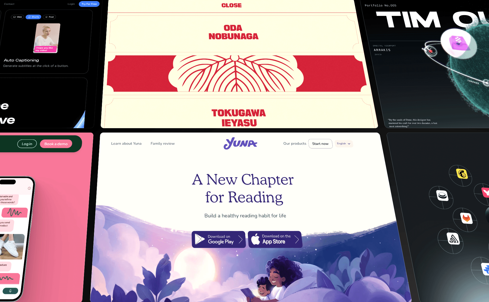


In the early days of the internet, websites were mainly a static collection of text and images. Not anymore. Website animation has unlocked a level of storytelling, interaction, and emotional engagement that static designs just can’t match.
Animations do more than just look cool—they enhance the user experience. Whether it’s guiding attention, creating a sense of flow, or making interactions more intuitive, the right animations and interactivity can transform a static page into something that inspires users and drives action.
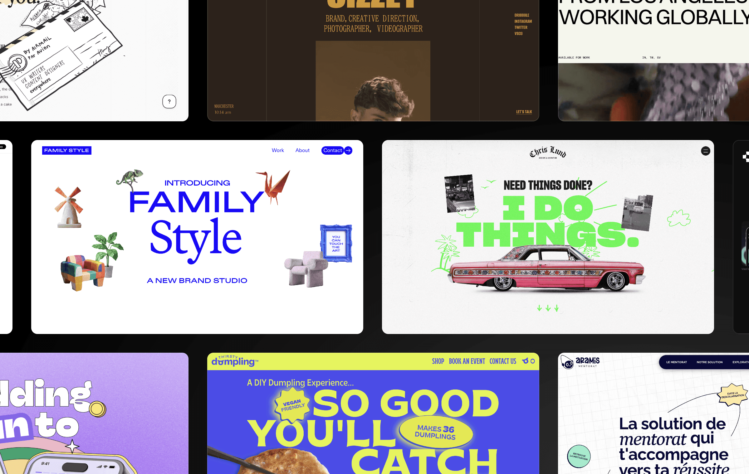
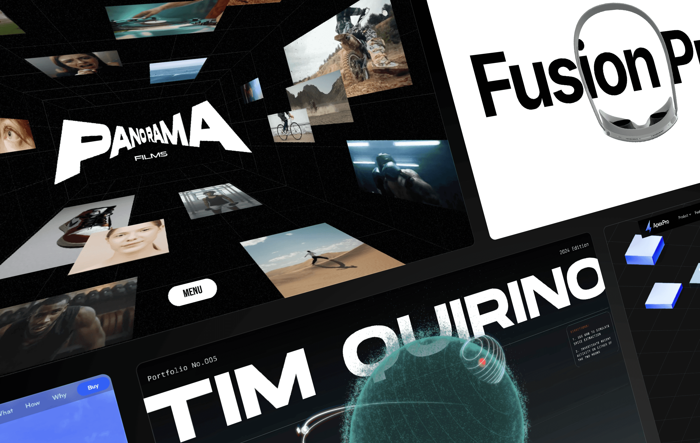
To inspire your next project, we’ve collected a set of stunning website animation examples from the Framer gallery. Explore how different types of animations—like hover effects, scroll-triggered transitions, and background animations—can differentiate your brand, enhance your user experience, and supercharge your conversion rates.
1. Background Animations
Adding background animations gives your website a sense of dynamism and interactivity. These effects can be subtle, as in the case of gradient animations; they can also be central to the design of your page, as many parallax backgrounds are. Either way, background animations are a way to enhance your site’s visual flow and set the tone as your visitors explore your site.
Example — Yuna
Yuna is an app that lets you create personalized, interactive children’s stories tailored to the age of your child. Parents say it fosters a love of reading and helps kids practice creativity and imagination. Yuna’s website does an excellent job of communicating that sense of wonder through storybook-like animations.
Parallax backgrounds play a big role here: three layers, moving at different speeds, show a parent reading to their child with colorful, slow-moving leaves and clouds in the foreground. As you scroll through the website, other visual features—like entrance animations and bouncing icons—reinforce this sense of playfulness.
2. Hover Effects
By using hover effects, you can signal to users which objects are clickable and important. Plus, it makes the experience of browsing your site more dynamic and engaging, while giving you a chance to reinforce your brand. Hover effects can be subtle, like adjusting the color, size, and orientation of buttons and menus, or more overt.
Example — Unifiers of Japan
Unifiers of Japan is a highly-stylized website full of impressive animations. While its highlight is probably the dynamic figures from Japanese history who transform into samurais, the website also does a compelling job of integrating its branding into each detail of the user experience.
For example, the menu is populated by two sorts of hover effects. First, a subtle line appears under the word “Menu” when you hover over it. Second, hovering over each menu item causes the menu item to be smoothly replaced by a graphic. Each of these little interactions helps the website feel responsive to what users need while adding polish to the brand experience.
3. Page Transitions
Under normal circumstances, navigating from one part of a website to another isn’t much cause for fanfare: you just click a link and the next page loads. Page transitions—like having the next page smoothly fade in or slide in—add polish and professionalism to what is normally a routine experience.
Example — Dynex
Dynex, a blockchain company focused on quantum computing, has a website that deals with some of the most technical subjects you can find. (Neuromorphic computing, anyone?) If there was ever a site that needed to look especially “tech-y,” this is it.
Fortunately, Dynex nails the details. Its sleek, futuristic aesthetic is on brand. Even the page transitions are thoughtfully designed: when you click a menu item, a smooth left-to-right animation fades the new page in. Page transitions aren’t always top of mind when launching a website project, but visitors do notice them (even if subconsciously) and they add to your site’s overall brand experience.
4. Entrance Animations
Landing on a website with a wall of text can feel overwhelming. While breaking up your messaging with whitespace and images is a good first step, you can also use entrance animations to subtly direct your users’ attention and guide them through your website step by step. Frequently-used entrance animations include slide-ins, fade-ins, and pop-up effects.
Example — Tellet
When you load Tellet’s website, all of the above-the-fold components fade upwards, including a heading, image, description, and call to action. As you scroll down, it gets even more dynamic: graphics and statistics shoot out of the product in a right-to-left animation, giving users a chance to absorb each piece of data without getting overwhelmed.
Entrance animations can feel tacky if overused, but if you apply them in a measured way, they can feel like an extension of your brand. Tellet’s brand—full of bright, neon colors and friendly language—fits nicely with the playful entrance animations the website uses.
5. Loading Animations
Website visitors aren’t patient: as page load time goes from one to three seconds, the probability of a bounce increases 32%, according to Google. Even more of your users will head elsewhere as your page load times get longer. Loading animations help by reducing perceived wait times. They can be simple, like a progress bar that shows how quickly the site is loading, or complex, like “skeleton screen” animations that show a rough outline of your website before filling in the details.
Example — Coding for Designers
We’ve all seen boilerplate loading screens with nondescript spinning wheels. Coding for Designers, an online education business, takes a different approach: its loading screen reinforces its brand with the animated message “Learn, Design, Code!” Once loading is complete, the loading screen slides up seamlessly to reveal the website.
Unlike a standard loading screen, this branded version lets visitors know they’re in the right place. (It almost feels like one of those short intros YouTube channels have before their videos start.) It’s totally non-disruptive and fully on-brand.
6. Scroll-Triggered Animations
When you browse a static website, you’re responsible for guiding yourself. But with scroll-based elements and transitions, the website acts more like an interactive slide deck: each scroll downward directs your attention purposefully toward a new topic. It’s a more immersive experience that avoids overwhelming users, since they can consume information in bite-sized chunks.
Example — tinyPod
Remember the classic click wheel on the original iPod? Apparently the creators of tinyPod do too: their product is an Apple Watch case that transforms the watch’s form factor into something resembling a miniature version of Apple’s 2001-era iPod. It’s a fascinating idea that takes a little explaining, which makes it the perfect candidate for a “storytelling”-style landing page driven by scroll-triggered animations.
The first thing you see upon loading the page is the tinyPod descending from the clouds and rotating in a series of scroll-based animations. Then, it shows off its features and highlights apps like Phone, Music, and Messaging. Finally, the tinyPod lands in a user’s hand next to messaging explaining why you might want to buy it.
7. Microinteractions
Microinteractions are small, often subtle, animations triggered by user actions. Tooltips, accordion menus, hover effects, password strength indicators, and validation messages are all forms of microinteractions because they provide guidance and let users know their actions have been recognized. The goal of microinteractions is primarily to boost usability, but it’s also a chance to add personality to your design.
Example — Ozone
Ozone, an AI video creation tool, is so full of microinteractions that a single section of the homepage boasts three examples. There’s a video editing animation that transforms your cursor when you hover over it; a widget that shows you what the product’s output looks in different formats; and a subtle icon scaling animation that emphasizes the tool’s collaborative features.
8. Mouse-Triggered Animations
Mouse-triggered animations add an extra layer of interactivity to your website. With mouse tracking effects, elements move in reaction to the position of the cursor; other common mouse-triggered animations include 3D object rotations and parallax effects.
By responding directly to user input, mouse-triggered animations can create a more immersive experience, encourage users to linger on certain sections of the website, and open the door to a new level of functionality.
Example — GitBook
GitBook is a great example of a site that gets the basics right—it has a clean design, plenty of white space, and a thoughtful color palette—while also using snazzy animation effects to enhance the experience.
Each section of GitBook’s landing page has a corresponding image to demonstrate the features of the product; even better, the image is 3D and follows your cursor as you navigate the page. Beyond feeling high-tech, this interactivity draws the attention of users and helps them engage with each section.
9. Interactive Product Animations
Instead of requiring users to schedule a demo or watch a product walkthrough, you can demonstrate your product’s value in just a few seconds with interactive product animations. Whether you guide users through your product’s functionality step by step or demonstrate a single core feature in a hands-on way, product animations help users understand your product and boost conversion rates.
Example — Cradle
Cradle is a biotechnology company that allows you to “design improved variants of your target protein sequence with just a few clicks.” It’s a product that serves a highly-specific and technical purpose; while Cradle’s target audience of biotech teams is no doubt knowledgeable on this subject, it’s always helpful to demystify complex products by demonstrating them.
On Cradle’s website, you can interact with a mock version of its product, complete with a target protein sequence and other variables. Upon clicking a button labeled “Generate variants,” an animation simulates the process of generating variants. This animation serves as a simple mini-demo that helps users understand the product—and boosts trust—in just a few seconds.
10. Text Animations
Like entrance animations, text animations are not only a stylistic tool but a way to direct the attention of users as they explore your website. They make it easier to engage users as they browse your website while also opening up design, branding, and storytelling possibilities. Popular text animations include the typewriting effect, text fade, and text slide-in.
Example — Biograph
Biograph is a personalized health company with services that start at $7,000. Accordingly, its design feels premium—and sophisticated text effects contribute to that feeling. When you load the homepage, the heading text slowly comes into focus. As you scroll down the page, other headings transform from out of focus to in focus, adding a sense of mystery and luxury—and nudging visitors to slow down and pay attention.
11. 3D Effects
If you’re really looking to create a striking first impression, consider adding 3D effects to your website. Applying depth and rotation to objects can help capture your users’ attention and make your website more immersive. On eCommerce websites, for example, it’s standard practice to give users the option to use their mouse to rotate products. Other popular 3D website animations include interactive infographics, flip cards, and 3D image galleries.
Example — Tim Quirino’s Portfolio
Tim Quirino, a product designer, uses eye-catching three-dimensional effects—built with Framer with an embedded Spline animation—that make his portfolio feel more like a science fiction video game than a website. (The space-themed animation he designed is based on the move Dune: Part Two.) As you explore the website and navigate to different planets and moons, your cursor transforms into images representing each of Tim’s different projects. Clicking on each image opens up a new page describing the project in detail.
Is chasing orbiting moons the most efficient way to browse a portfolio? Perhaps not. But this creative use of 3D animation and hover effects succeeds at wowing visitors right when they arrive, and sets a bold tone as users browse the rest of the portfolio.
How to Boost User Engagement with Website Animations
With Framer, you can easily add engagement-boosting animations while balancing creativity, usability, performance, and accessibility. Here are some practical tips to get started.
1. Give Each Animation A Purpose
It’s easy to overuse animation. If bouncing logos and parallax backgrounds don’t fit with your brand, you can keep things simple—don’t animate your site just because you can.
Instead, make sure each animation improves your user experience, enhances your brand experience, or both. Start by using subtle animations like hover effects, which help users understand which areas of the site are interactive. Later, add advanced effects like scroll-triggered animations to manage the flow of information that users see.
2. Keep Users Engaged with Microinteractions
Framer’s animation features let you use microinteractions to drive user engagement and incorporate your brand throughout your design.
Start by incorporating interactive calls-to-action that change color, grow, or pulse based on users’ behavior. For example, a pulsating “Buy Now” button can draw attention and prompt users to take action. You can also add subtle animations that provide reinforcement when users complete tasks or input information correctly.
3. Prioritize Performance and Load Times
Framer offers lightweight animations and lazy loading for off-screen content, helping your website run smoothly even with multiple animations.
But it’s still important to check page load times to make sure your user experience isn’t compromised. If you’re experiencing poor performance, consider switching to lightweight CSS animations, enabling lazy loading, and optimizing any images and videos you’ve uploaded; you may also need to reduce the number of animations you’re using.
4. Ensure Accessibility
Some users get motion sickness when viewing website animations. Avoid excessive flashing and rapid movement; parallax scrolling, auto-playing videos, and transform animations are all possible triggers too. You can include animations—while still catering to all users—by instructing your website to provide reduced motion if users have expressed that preference in their browser settings.
Framer makes this easy: just go to Site Settings → Accessibility and click “Disable movement animations if the user prefers reduced motion.” This gets rid of transform and layout animations while keeping more subtle opacity and background color animations.
5. Use Animations to Tell a Story
Animations can guide users through a narrative, making the experience more immersive. With Framer, you can create sequential animations to walk users through your story, keep them engaged, and help them understand your value.
As in the tinyPod example earlier in this article, scroll-triggered animations are an ideal storytelling tool because they let you orchestrate text, images, and objects to align with each step of the user’s journey. Microinteractions can also be an instrumental storytelling tool, especially when they drive engagement during key parts of your story.
Make your website come alive with Framer’s animations
With Framer, you can go beyond static design and transform your website into a dynamic experience that captivates users from the moment they land on your page.
By incorporating hover effects, scroll-triggered transitions, and other animations, you can enhance your site’s aesthetic appeal, guide user behavior, and boost conversion rates.
Ready to make your site come alive with animations? Get inspiration from our latest examples in the Framer animations gallery, kickstart your design with one of our templates, and sign up for a Framer account to start animating your website today.

Step into the future of design
Step into the future of design
Step into the future of design
Join thousands using Framer to build high-performing websites fast.
Join thousands using Framer to build high-performing websites fast.
Join thousands using Framer to build high-performing websites fast.

