What are Code Components?
Code Components are React Component that can extend Framers capabilities by rendering directly on the canvas, in the preview, and on your published site. They are written directly in Framer using the built-in code editor and preview. Watch the video below to learn about the principles of creating code components.
Please note, components must use React 18 compatible code.

Core Features
Property Controls – Manipulate component props visually.
Auto-Sizing – Custom sizing options to work well in any layout.
Sharing – Shareable with a unique, versioned URL.
Basics
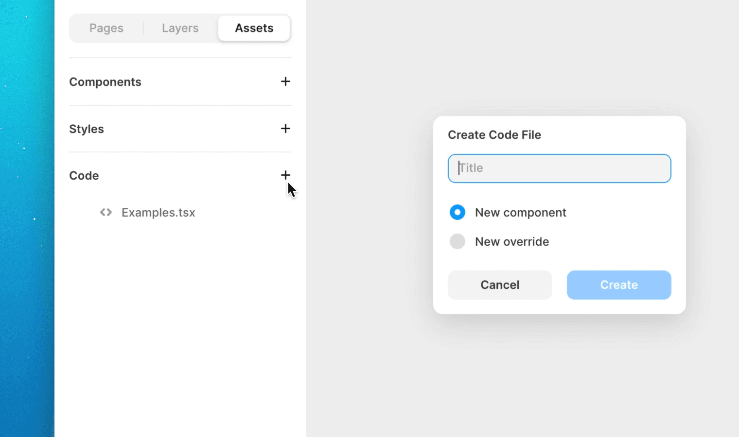
To create a new code component, go to the assets panel and select Code. Then, click Create Code File. You'll be presented with a new code file that exports a single React component.
To preview your component in real time while editing, click the top right preview button to get a split preview of your work. The preview will automatically refresh when changes to your component are saved.