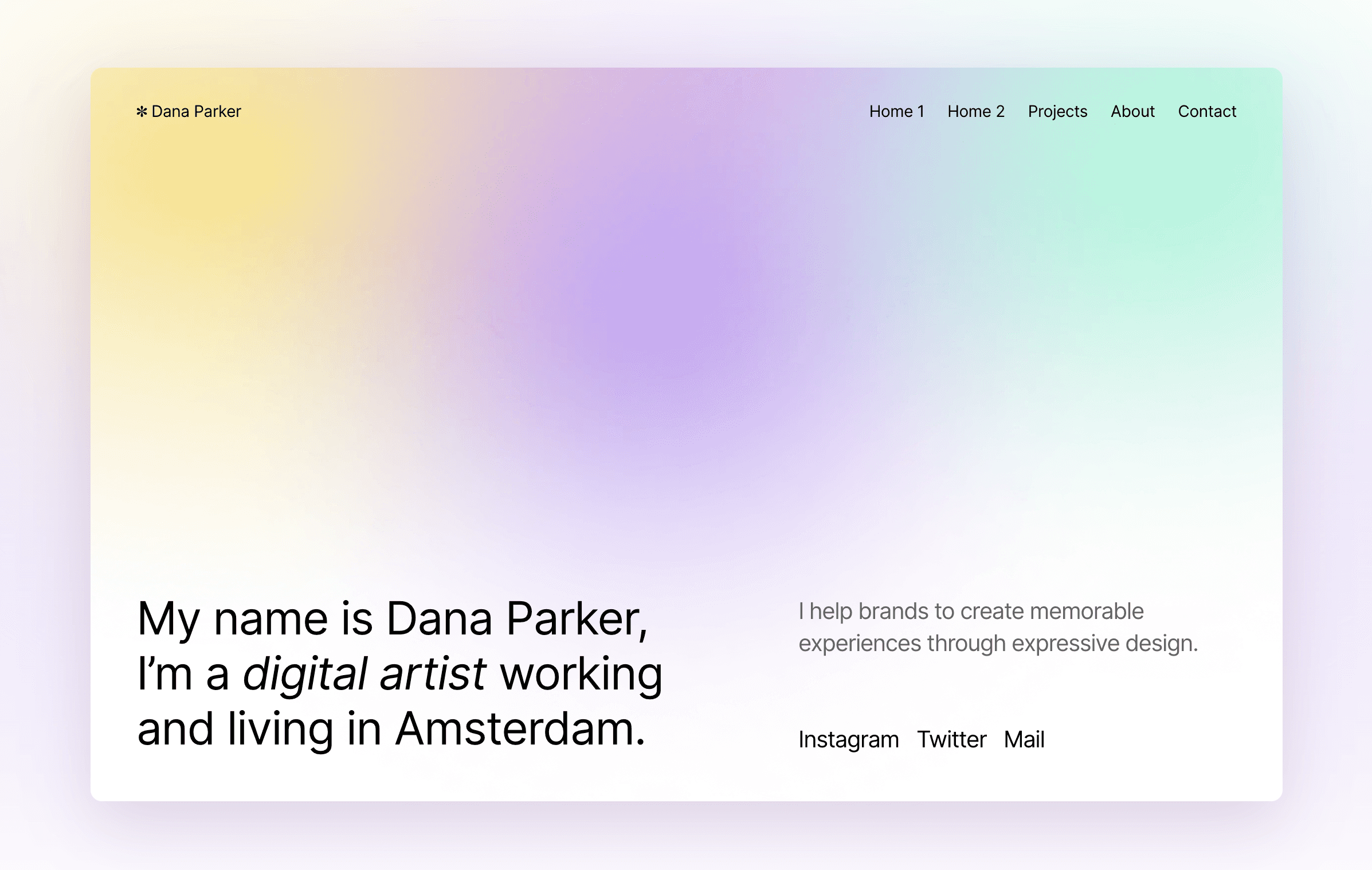


In this article, we will explore the updated Dana Portfolio Template, which now includes the latest Framer features, making it the perfect tool for designers to showcase their work in a sleek and stylish manner.
Introducing the Updated Dana Portfolio Template
As a designer, having an impressive portfolio website is crucial in showcasing your work to potential clients and employers. And what better way to do that than with a sleek and stylish portfolio template like Dana? The good news is, it's free! And it just got a fresh update, incorporating the latest features from Framer.
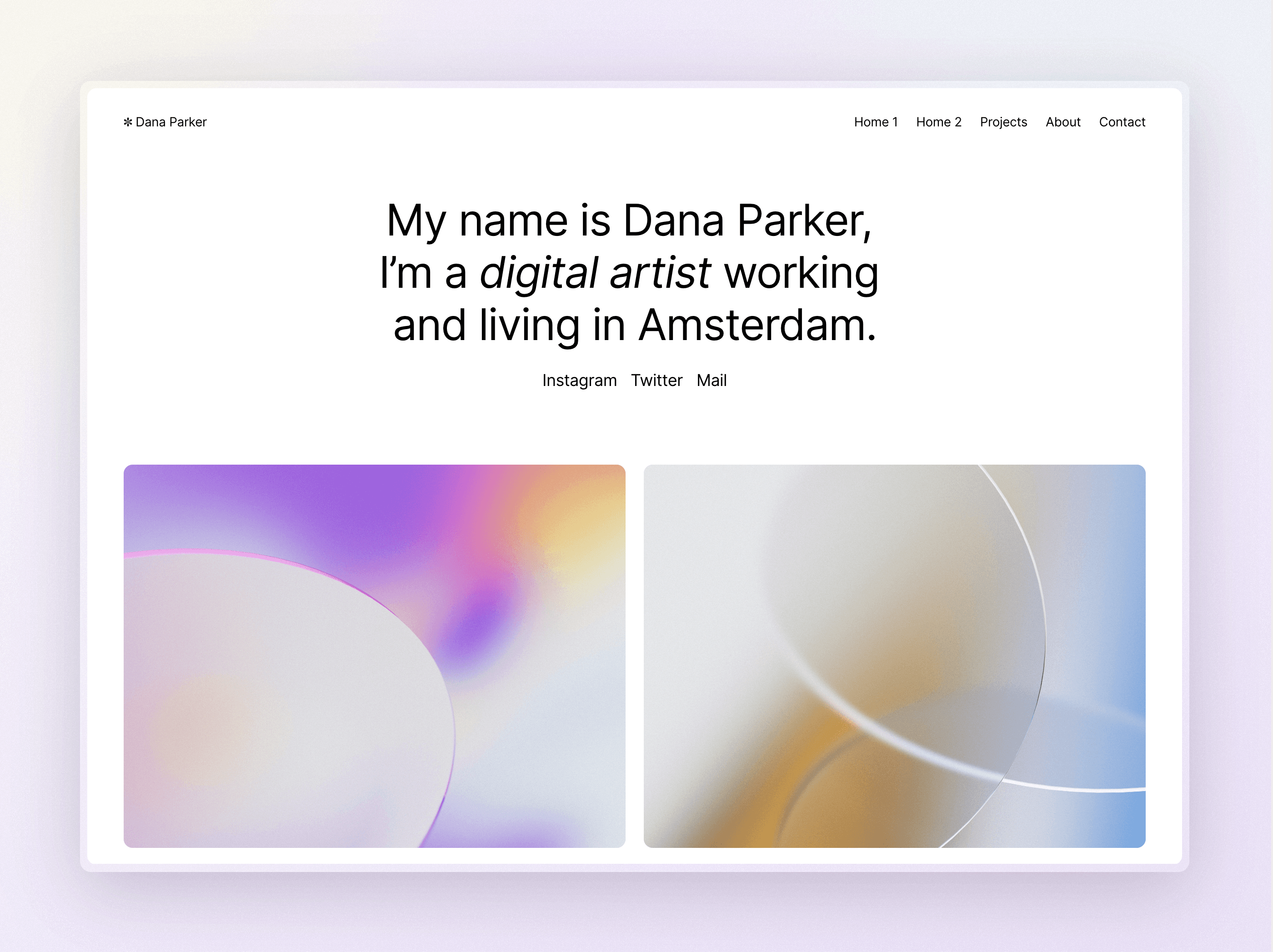
Automatic Switching between Light and Dark Themes
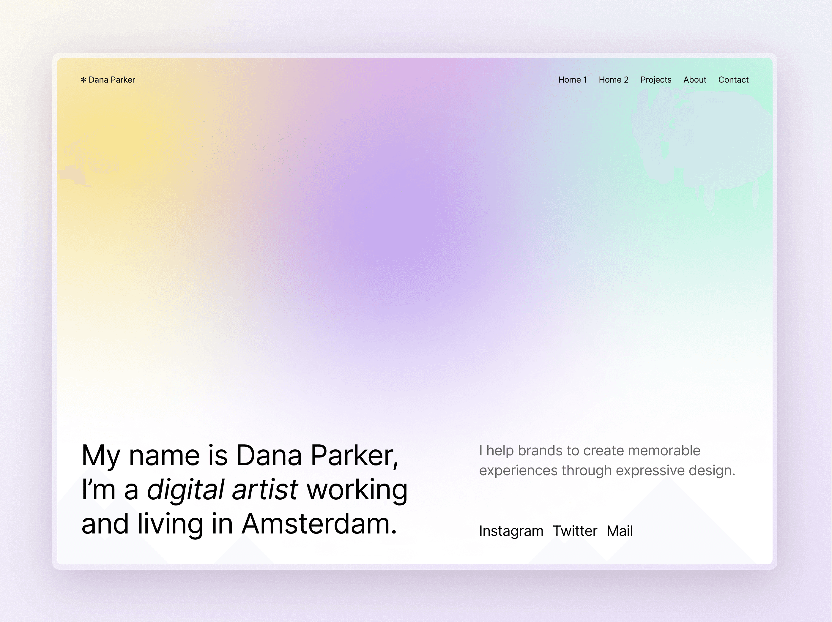
One of the most notable updates is the automatic switching between light and dark themes based on your system preferences. This means that visitors to your website will see the most appropriate theme based on their device settings - whether it's light or dark. This feature provides a seamless user experience, making it easier for visitors to navigate your website without straining their eyes.
Project Pages that Adjust Layout Based on CMS Settings
In addition, the project pages now adjust their layout based on the CMS settings of each item. This means that your portfolio items will look great, regardless of their format or size, ensuring that your work is showcased in the best possible way.
Customizable Hero Section
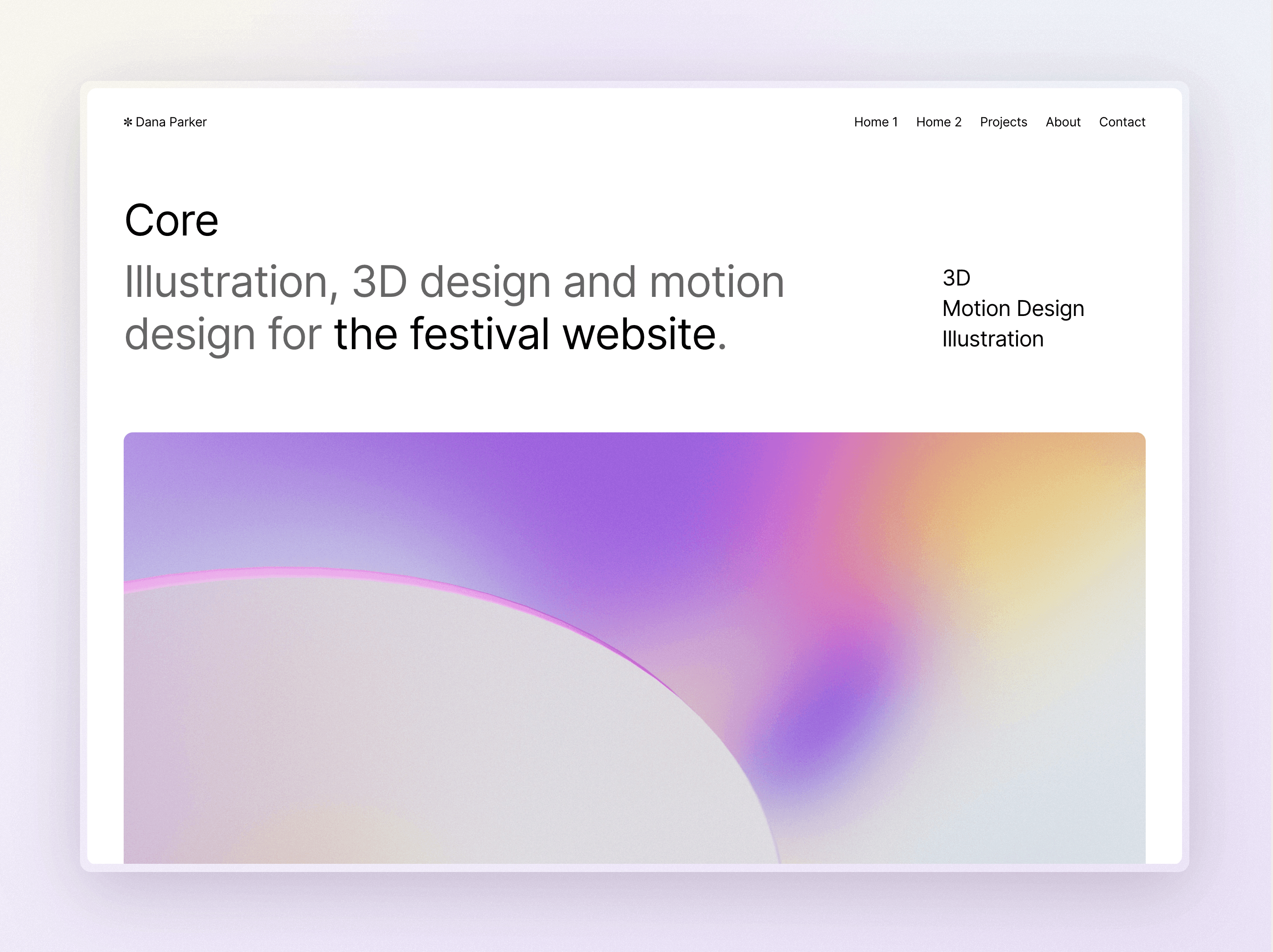
And let's not forget about the hero section. With the new update, you can easily spruce it up by swapping the gradients which are already included in the project. This simple yet effective change can add a touch of creativity and uniqueness to your website, making it stand out from the rest.
Introducing the Updated Dana Portfolio Template
As a designer, having an impressive portfolio website is crucial in showcasing your work to potential clients and employers. And what better way to do that than with a sleek and stylish portfolio template like Dana? The good news is, it's free! And it just got a fresh update, incorporating the latest features from Framer.


Automatic Switching between Light and Dark Themes
One of the most notable updates is the automatic switching between light and dark themes based on your system preferences. This means that visitors to your website will see the most appropriate theme based on their device settings - whether it's light or dark. This feature provides a seamless user experience, making it easier for visitors to navigate your website without straining their eyes.
Project Pages that Adjust Layout Based on CMS Settings
In addition, the project pages now adjust their layout based on the CMS settings of each item. This means that your portfolio items will look great, regardless of their format or size, ensuring that your work is showcased in the best possible way.
Customizable Hero Section
And let's not forget about the hero section. With the new update, you can easily spruce it up by swapping the gradients which are already included in the project. This simple yet effective change can add a touch of creativity and uniqueness to your website, making it stand out from the rest.
Introducing the Updated Dana Portfolio Template
As a designer, having an impressive portfolio website is crucial in showcasing your work to potential clients and employers. And what better way to do that than with a sleek and stylish portfolio template like Dana? The good news is, it's free! And it just got a fresh update, incorporating the latest features from Framer.


Automatic Switching between Light and Dark Themes
One of the most notable updates is the automatic switching between light and dark themes based on your system preferences. This means that visitors to your website will see the most appropriate theme based on their device settings - whether it's light or dark. This feature provides a seamless user experience, making it easier for visitors to navigate your website without straining their eyes.
Project Pages that Adjust Layout Based on CMS Settings
In addition, the project pages now adjust their layout based on the CMS settings of each item. This means that your portfolio items will look great, regardless of their format or size, ensuring that your work is showcased in the best possible way.
Customizable Hero Section
And let's not forget about the hero section. With the new update, you can easily spruce it up by swapping the gradients which are already included in the project. This simple yet effective change can add a touch of creativity and uniqueness to your website, making it stand out from the rest.

Step into the future of design
Step into the future of design
Step into the future of design
Join thousands using Framer to build high-performing websites fast.
Join thousands using Framer to build high-performing websites fast.
Join thousands using Framer to build high-performing websites fast.

