

Do you ever find yourself feeling nostalgic for the early days of the internet? The days of slow dial-up connections, ASCII art, and dithered images may seem like a distant memory, but for some, they hold a special place in their hearts.
I recently took my love for the old internet to the next level by creating a personal website with the Macintosh Classic vibe in Framer. In this blog post, I'll take you through my process and the tools I used to create this throwback design.
Creating the Macintosh Classic Vibe with Framer
One of the key elements of my design is the use of ASCII art and the dither effect. Shout-out to Alex Harris for creating a fantastic image-dithering tool called Ditherit, which I use often in my designs. These effects give the design a retro feel and harken back to the early days of the internet.
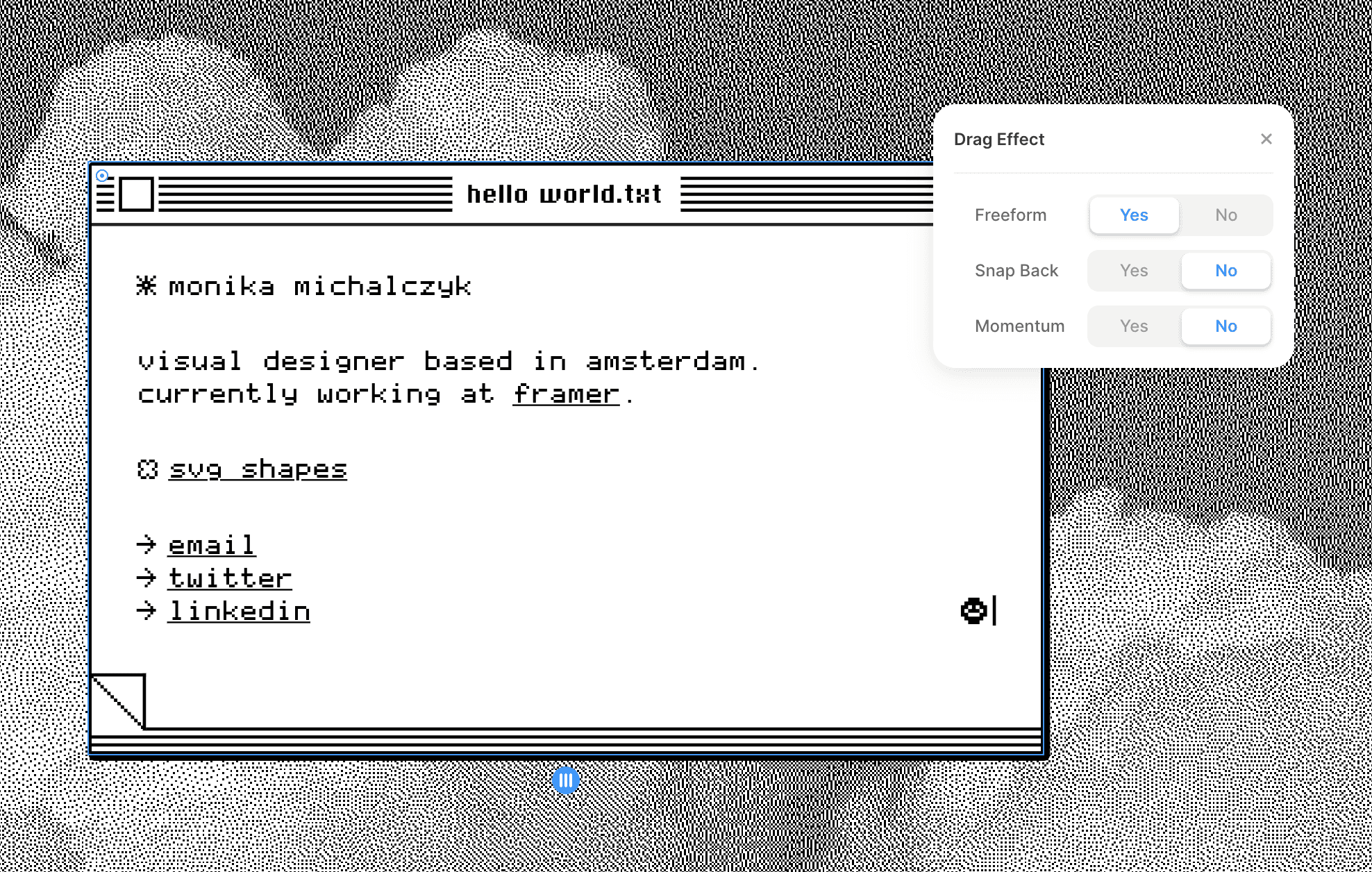
I use the Drag Effect in Framer to move icons and windows around on the page, just like on a desktop computer. It only takes a few clicks to set up – simply go to Effects → Drag and customize the settings to your liking.
Designing for Mobile Devices
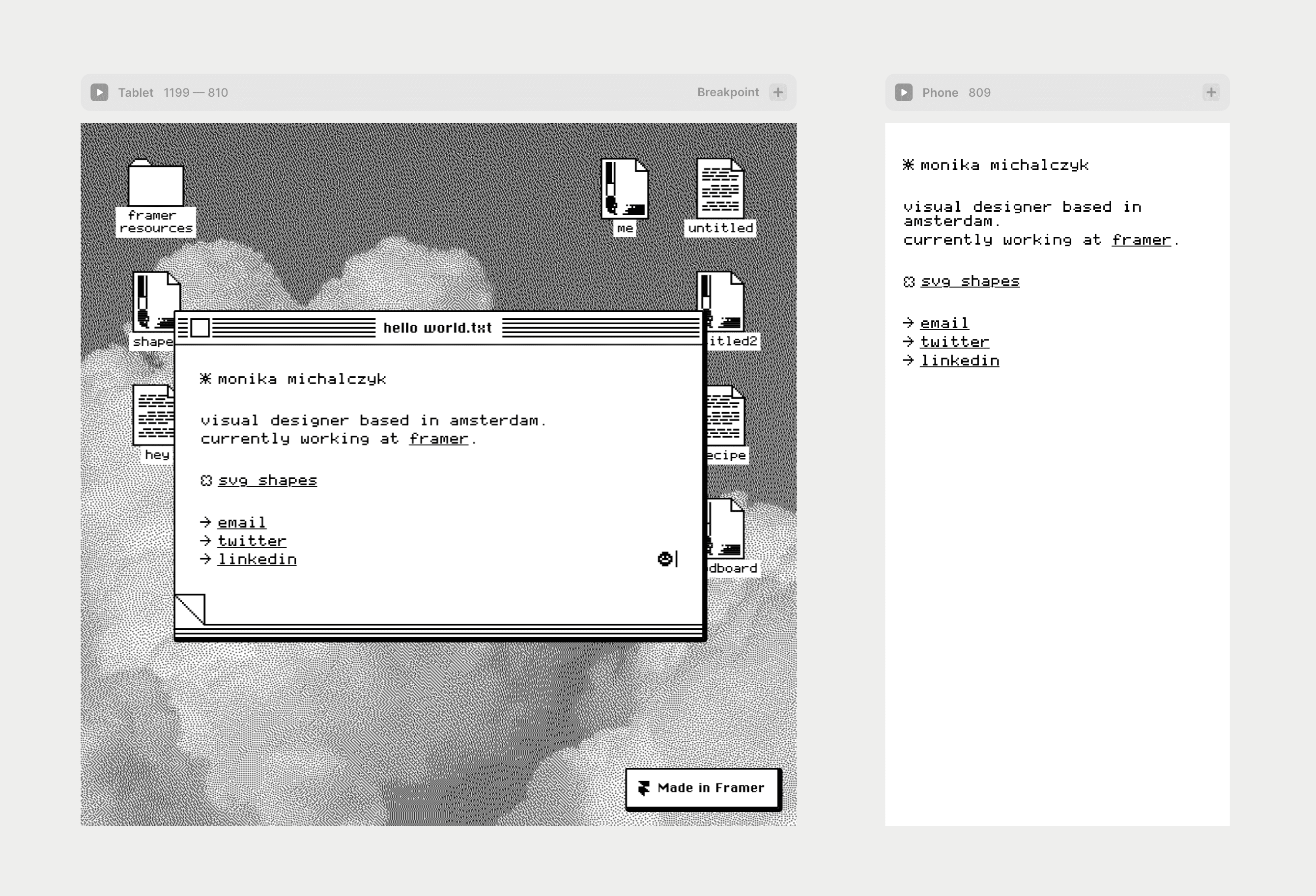
While the Macintosh Classic design is perfect for desktop computers, it doesn't necessarily translate well to mobile devices. The desktop UI lacks practicality on smaller screens. However, with Framer, creating breakpoints is a breeze, allowing me to simplify the design for smaller screens.
Using Components in Framer
To make my design more dynamic, I used components in Framer to create multiple file types and modify the name of each file. This allows me to quickly and easily make changes to the design without having to manually update each element.
Recreating the Iconic Windows XP UI
In closing, I pose a challenge to my followers: to recreate the iconic Windows XP UI in Framer. This would be a fun project for anyone looking to flex their design skills and pay homage to the early days of the Internet.

Conclusion
The early days of the internet may be long gone, but they still hold a special place in the hearts of many. My Macintosh Classic design is a tribute to this era, and my use of Framer makes it easy for anyone to create their own throwback designs.
I recently took my love for the old internet to the next level by creating a personal website with the Macintosh Classic vibe in Framer. In this blog post, I'll take you through my process and the tools I used to create this throwback design.
Creating the Macintosh Classic Vibe with Framer
One of the key elements of my design is the use of ASCII art and the dither effect. Shout-out to Alex Harris for creating a fantastic image-dithering tool called Ditherit, which I use often in my designs. These effects give the design a retro feel and harken back to the early days of the internet.
I use the Drag Effect in Framer to move icons and windows around on the page, just like on a desktop computer. It only takes a few clicks to set up – simply go to Effects → Drag and customize the settings to your liking.

Designing for Mobile Devices
While the Macintosh Classic design is perfect for desktop computers, it doesn't necessarily translate well to mobile devices. The desktop UI lacks practicality on smaller screens. However, with Framer, creating breakpoints is a breeze, allowing me to simplify the design for smaller screens.

Using Components in Framer
To make my design more dynamic, I used components in Framer to create multiple file types and modify the name of each file. This allows me to quickly and easily make changes to the design without having to manually update each element.
Recreating the Iconic Windows XP UI
In closing, I pose a challenge to my followers: to recreate the iconic Windows XP UI in Framer. This would be a fun project for anyone looking to flex their design skills and pay homage to the early days of the Internet.

Conclusion
The early days of the internet may be long gone, but they still hold a special place in the hearts of many. My Macintosh Classic design is a tribute to this era, and my use of Framer makes it easy for anyone to create their own throwback designs.
I recently took my love for the old internet to the next level by creating a personal website with the Macintosh Classic vibe in Framer. In this blog post, I'll take you through my process and the tools I used to create this throwback design.
Creating the Macintosh Classic Vibe with Framer
One of the key elements of my design is the use of ASCII art and the dither effect. Shout-out to Alex Harris for creating a fantastic image-dithering tool called Ditherit, which I use often in my designs. These effects give the design a retro feel and harken back to the early days of the internet.
I use the Drag Effect in Framer to move icons and windows around on the page, just like on a desktop computer. It only takes a few clicks to set up – simply go to Effects → Drag and customize the settings to your liking.

Designing for Mobile Devices
While the Macintosh Classic design is perfect for desktop computers, it doesn't necessarily translate well to mobile devices. The desktop UI lacks practicality on smaller screens. However, with Framer, creating breakpoints is a breeze, allowing me to simplify the design for smaller screens.

Using Components in Framer
To make my design more dynamic, I used components in Framer to create multiple file types and modify the name of each file. This allows me to quickly and easily make changes to the design without having to manually update each element.
Recreating the Iconic Windows XP UI
In closing, I pose a challenge to my followers: to recreate the iconic Windows XP UI in Framer. This would be a fun project for anyone looking to flex their design skills and pay homage to the early days of the Internet.

Conclusion
The early days of the internet may be long gone, but they still hold a special place in the hearts of many. My Macintosh Classic design is a tribute to this era, and my use of Framer makes it easy for anyone to create their own throwback designs.

Step into the future of design
Step into the future of design
Step into the future of design
Join thousands using Framer to build high-performing websites fast.
Join thousands using Framer to build high-performing websites fast.
Join thousands using Framer to build high-performing websites fast.


