How to make templates easier to edit?
Designing a beautiful template is only half the story. The other half is ensuring that anyone can update, customize, and maintain it with ease.
By structuring your template thoughtfully and providing clear, responsive components, you’ll create a more enjoyable experience for both new users and seasoned pros. Here are some best practices to consider:
Use component variables
If your template includes elements that appear repeatedly—such as product cards or testimonial blocks—it’s wise to convert these into components with variables. A variable-based component ensures that the overall layout remains consistent while allowing editors to adjust details like text, images, or background colors for each instance.
For instance, if you have a grid of team members, each team card might feature a name, a photo, and a brief description. By linking these fields to variables, you enable editors to quickly replace content without changing the underlying structure. This method not only saves time but also minimizes the risk of design inconsistencies. Conversely, truly global sections, like a footer that remains unchanged, can stay as a single master component without variables, since universal edits will always update across the site in one go.
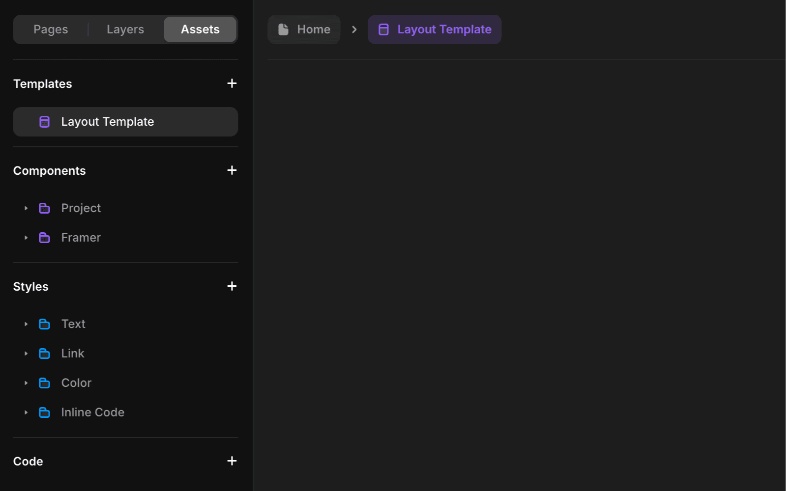
Use layout templates
For site-wide structures like headers, footers, and page padding, Layout Templates come in handy. By placing shared elements in a central layout file, you streamline future edits and maintain uniform spacing across every page. This approach is especially effective for top-level patterns, such as navigation or footers, that should remain consistent throughout the site.
Layout Templates are particularly beneficial for large or growing sites, where many pages share a common design. By consolidating the universal layout, you minimize the need to edit each page individually later. This not only simplifies global changes but also reduces the risk of accidental mismatches, ensuring your template always appears coherent and professionally assembled.
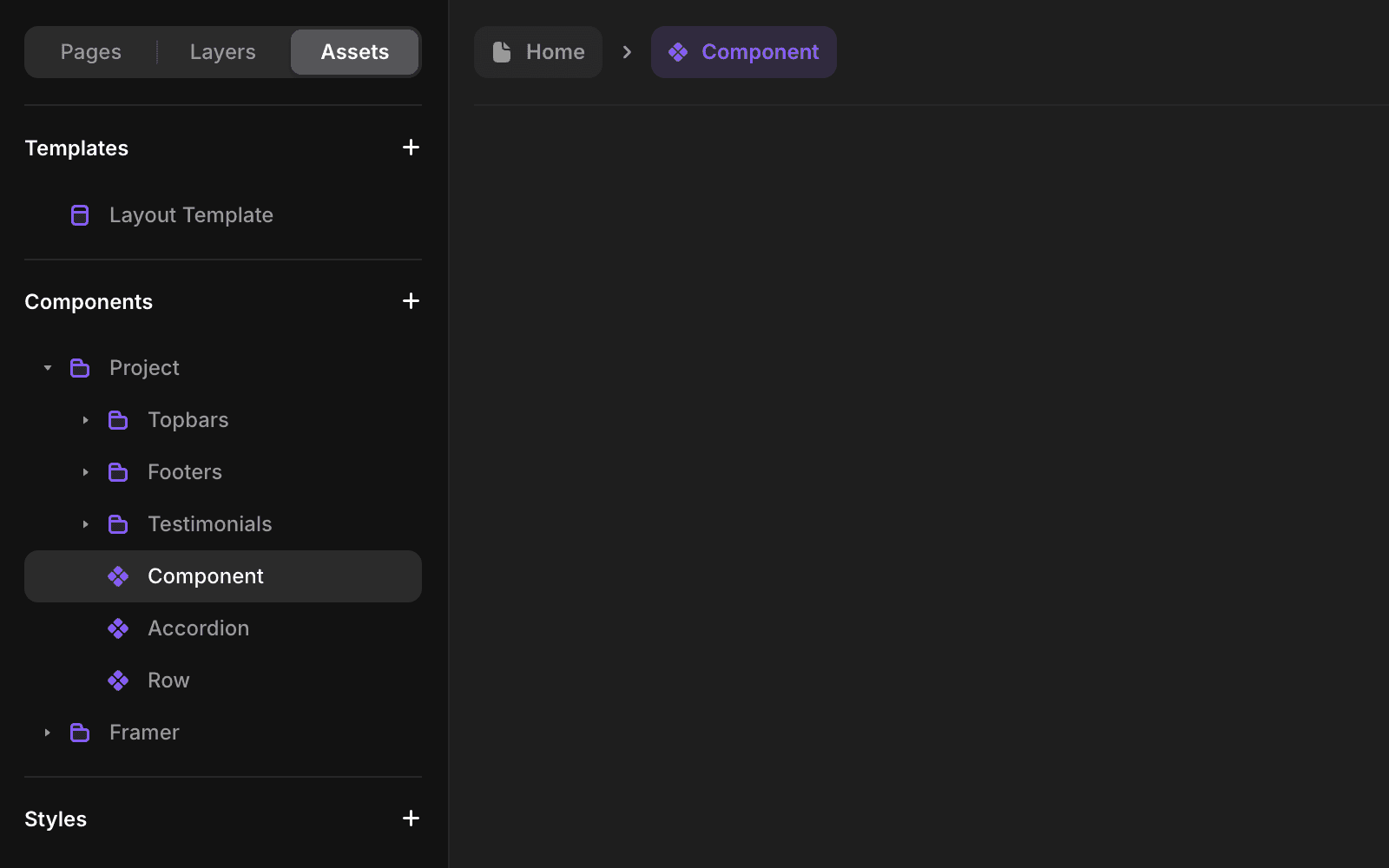
Structure CMS collections
If your template utilizes a CMS for content, such as blog posts, projects, or e-commerce items, take a moment to label each field clearly. This reduces guesswork about what belongs where. Consider adding brief explanations or guidelines for important fields, such as recommended image sizes or character limits.
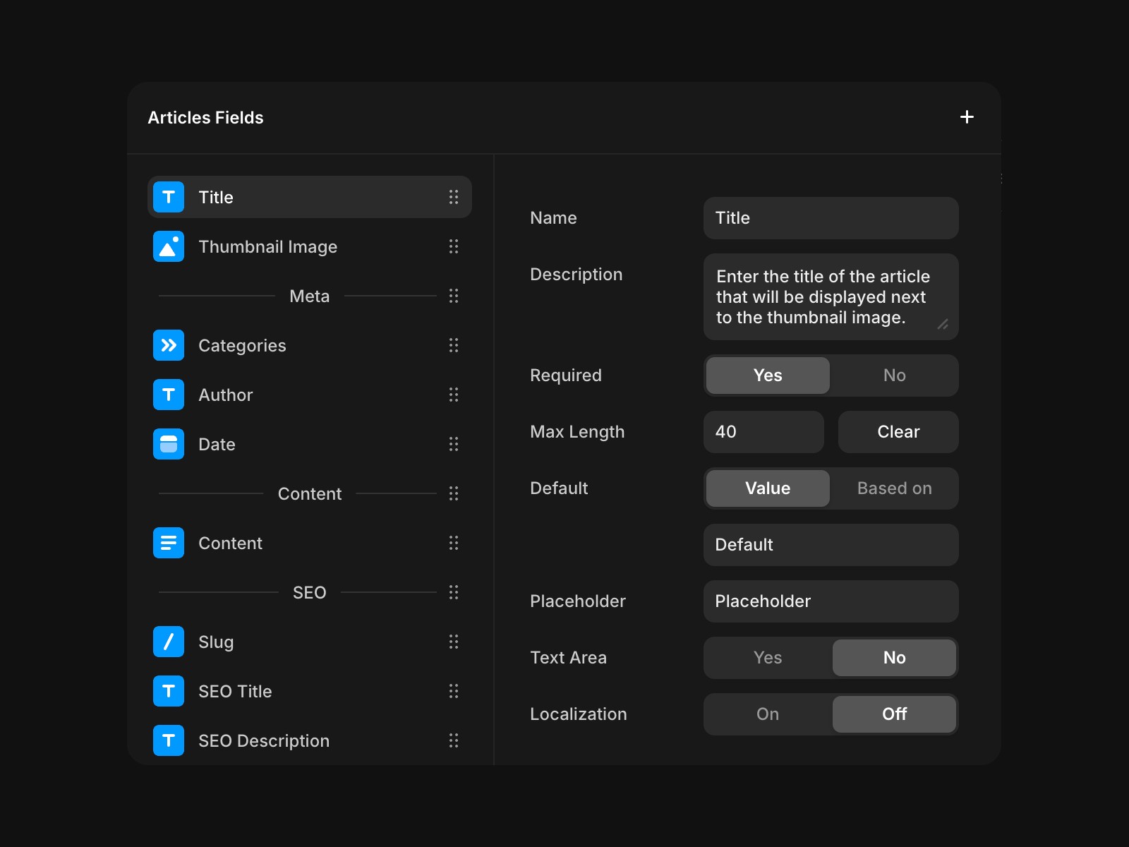
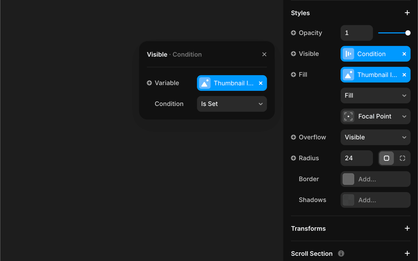
You can set up conditional visibility to keep optional sections hidden if someone doesn’t provide information. This approach maintains a polished appearance for pages, even if an editor chooses to skip certain fields in the CMS.
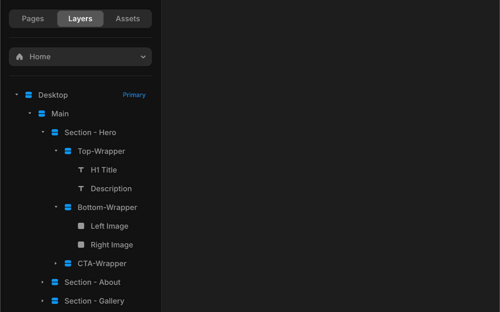
Organize layers and use clear naming
A well-organized layer structure is essential for quick edits. Descriptive labels, such as “Hero Section” or “Footer Container”, are far more helpful than generic names like “Frame 12”. Editors can focus on making actual changes instead of sifting through random labels.
Similarly, nesting components in logical, grouped folders is a simple step that keeps everything organized. This small effort significantly helps new users feel confident navigating your file.
Keep layouts flexible and responsive
Responsive design ensures your template accommodates a variety of devices, from desktop screens to smartphones. In Framer, this means utilizing tools like Stacks and fluid constraints, which allow elements to adapt seamlessly to different viewport sizes. By setting only a few key breakpoints—typically one for tablets and one for mobile—you prevent editors from managing multiple variations for similar screen sizes.
This approach keeps your template manageable. Editors don’t need to worry about reworking the layout for numerous breakpoints, allowing them to make changes with confidence. Ultimately, a more fluid layout fosters consistency and saves time, making your template much more appealing to anyone who needs to customize it for their specific requirements.
Minimizing custom code
While Framer supports custom code for advanced features, it’s wise to keep it as minimal as possible. Overly complex scripts or large code blocks can intimidate editors without a technical background. Whenever you include custom code, add brief comments explaining its purpose and how to modify it safely. This approach allows others to make small adjustments without compromising core functionality.
Provide brief documentation
Even if your setup seems intuitive, a short “Read Me” document or a few in-template notes can significantly reduce guesswork. Simple explanations, such as how to update component variables or where to find CMS fields, ensure that future editors can make changes with confidence. By providing some guidance, you help maintain design integrity and minimize the risk of unintentional errors.
Want to know more about templates?
Head over to our Creators Help Center articles and read more:
If you need help or assistance, or have specific questions about templates, please email us at creators@framer.com.
FAQ
How can I make my Framer templates easier to edit for others?
Structure your template thoughtfully by using component variables for repeated elements, organizing layers with clear naming, and providing brief documentation or in-template notes. This approach helps both new users and seasoned pros make changes confidently and reduces the risk of design inconsistencies.
What are the benefits of using layout templates in Framer?
Layout Templates are useful for site-wide structures like headers, footers, and page padding. By placing shared elements in a central layout file, you streamline future edits, maintain uniform spacing across every page, and minimize the need to edit each page individually. This ensures consistency and simplifies global changes.
How should I set up CMS collections in my Framer template?
Label each CMS field clearly and consider adding brief explanations or guidelines, such as recommended image sizes or character limits. You can also set up conditional visibility to keep optional sections hidden if information isn’t provided, maintaining a polished appearance even when some fields are skipped.
Updated